Logo Review Guide
How to Review a Logo Design: A Practical Checklist
Learn how to review a logo design with a clear process for clarity, distinctiveness, typography, scalability, contrast, and real-world brand use.
A practical framework for designers, founders, and clients
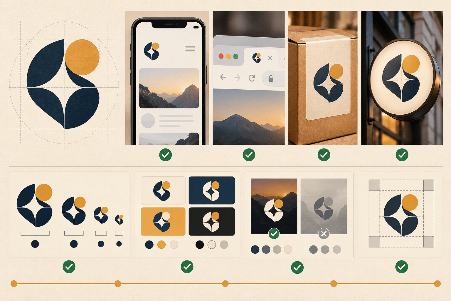
Start with the brief, not your personal taste
Before looking for flaws, write down the logo’s job. Who is the audience? What should the brand feel like? Where will the mark appear first: a website header, app icon, package, storefront, or social profile? A logo can be attractive and still be wrong for its audience or context. Use the brief as the filter for every later observation.
1. Check the first read
Show the logo for a few seconds and ask what the viewer noticed first. Look for a clean silhouette, a readable wordmark, and a clear relationship between symbol and type. If every detail competes for attention, the logo may need stronger hierarchy. Replace “it feels off” with a visible observation such as “the symbol and wordmark have equal emphasis, so the eye has no clear starting point.”
2. Test clarity and relevance
A logo does not need to illustrate the product literally, but it should support the brand’s intended character. Ask whether the mark fits the category without disappearing into it, whether the idea remains understandable without a long explanation, and whether it can still work if the business expands. Avoid rewarding an obvious symbol merely because its meaning is easy to describe.
3. Compare it with real competitors
Place the logo beside five to ten direct or adjacent competitors at the same size. Hide the names and look at the row like a customer would. Which marks are easy to confuse? Which feature could customers remember? Distinctiveness is not the same as novelty: a restrained mark with one ownable proportion or letterform can outperform a strange but unreadable symbol.
4. Inspect typography, spacing, and balance
For a wordmark or lockup, inspect letter spacing, weight, alignment, case, and the space between symbol and type. Look for accidental tangencies, uneven counters, awkward joins, and a symbol that overwhelms the name. Check the design at normal viewing distance as well as close up; mathematical alignment does not always create optical balance.
5. Test size, contrast, and one-color use
Review the mark at 16px, 32px, 64px, and a larger display size. Test light and dark backgrounds, solid black, solid white, and a busy image if photography is part of the identity. Thin strokes, small counters, gradients, and fine details often disappear first. If the primary lockup fails at small sizes, define a compact or icon-only version instead of shrinking it indefinitely.
6. Review the complete logo system
Check that the team has a vector master, practical exports, a full lockup, a compact lockup or symbol, one-color artwork, and clear-space guidance where the applications require them. These variants do not mean the primary logo failed; they let the identity work in different contexts. Compare proportions, line weights, spacing, and color behavior across every version.
7. Put the logo into real applications
Review the mark in a website navigation bar, mobile or social avatar, document header, packaging or invoice, presentation, and physical sign if relevant. Screenshots of actual use are more useful than decorative mockups. Notice cropping, nearby content, contrast, clear space, and whether the logo still feels like the same identity.
8. Turn observations into a decision
Sort findings into Keep, Refine, and Reconsider. Keep strengths that should survive refinement. Refine production or system issues such as spacing, contrast, exports, and small-size detail. Reconsider strategic issues such as competitor resemblance, audience mismatch, or a category signal the business has outgrown. Choose the smallest change that addresses the highest-impact problem, then retest the weakest application.
For a structured second opinion, use the Logo Review Tool across clarity, contrast, color, scalability, typography, uniqueness, versatility, application, and commercial fit. Use the result as evidence to discuss—not as a replacement for context, judgment, or a designer’s craft.
Logo review FAQ
What should I check first when reviewing a logo?
Start with the logo’s job, audience, and smallest important use case. A clear brief prevents personal taste from becoming the only evaluation standard.
Should a logo work in black and white?
Yes. A one-color test reveals weaknesses hidden by color separation and gives the brand a reliable option for documents, stamps, production, and constrained media.
How many competitors should I compare?
Five to ten relevant competitors is a useful working range. Compare them at the same size and hide names when possible so you can judge recognition and confusion rather than reputation.
Does every logo issue require a redesign?
No. Spacing, exports, contrast, and missing variants are often system or production fixes. A broader redesign is more appropriate when the mark consistently misfits the audience or resembles a competitor.