01 · Design Philosophy
Knowledge Moves Upward
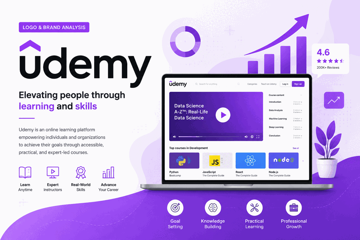
The 2021 Udemy identity distills a broad promise into a remarkably small gesture. The Uptick — an inverted angular shape above the first letter — represents growth, progress, and the upward trajectory of learning. It is not decoration; it is the thesis of the platform.
That reduction marked a clear evolution from the 2017 handwritten U and formal Zeitung wordmark. VSA Partners replaced the split personality with a geometric system that can be reproduced from a favicon to a conference banner. The result feels confident without losing the openness of a community marketplace.
Logo idea
Upward motion
A directional mark for learners, instructors, and teams moving forward
Current identity
VSA Partners · 2021
A compact symbol plus a custom lowercase wordmark, designed as one coherent system.
Udemy Purple
#A435F0
Creativity, transformation, and forward motion
Ink Black
#000000
Confidence, clarity, and maximum contrast
Cloud White
#FFFFFF
Space for ideas and accessible learning
02 · Color Psychology
Why Purple Owns the Learning Space
Udemy Purple is hex #A435F0: bright, high-saturation, and energetic without the aggression of red. Purple traditionally carries associations of creativity, wisdom, and transformation — a fitting choice for a platform where a marketer can learn Python and an engineer can learn photography.
It also creates valuable category separation. Coursera’s blue signals institutional authority; Duolingo’s green signals playful progress. Udemy claims a vivid purple that feels imaginative and digital, making the brand recognizable before the wordmark is read.
The pairing with pure black is equally purposeful. Ink-black type delivers maximum contrast and lets the purple mark become the only expressive accent. Restraint gives the identity confidence and keeps accessibility at the center.
03 · Typography
Custom Geometry Over Off-the-Shelf Fonts
The lowercase “udemy” wordmark is custom-built rather than a stock font. Lowercase signals approachability and keeps the platform open to anyone, while circular counters and carefully tuned terminals echo the precision of the Uptick. The symbol and letters feel like members of the same geometric family.
2010–2014
Assembled Sans-Serif
A practical lowercase wordmark supported the beta-era icon and tagline. Hierarchy was functional but several elements competed for attention.
2017–2021
Zeitung by Underware
The bold newspaper-inspired face added authority, while the handwritten U introduced an intentionally creative counterpoint.
2021–Present
Custom Geometric Wordmark
Lowercase forms, circular counters, and carefully tuned terminals balance approachability with the precision of the Uptick.
04 · Historical Evolution
Five Logos, One Direction
Udemy’s visual history is a lesson in strategic subtraction. Each era removed noise or resolved a tonal conflict, moving the identity toward a flexible mark that could represent a global learning ecosystem.
2010–2011
The beta identity paired a green rounded-square U icon with a sans-serif wordmark, a handwritten beta stamp, and the tagline “academy of you.” It captured an ambitious product still finding its voice.
2011–2014
The beta label disappeared as Udemy matured. A quoted “Academy for you” tagline remained beneath the wordmark, while the green icon anchored the growing learning marketplace.
2014–2017
Pablo Stanley’s redesign removed the tagline and redrew the wordmark with softer terminals. A light green monochrome system made the identity feel friendlier and more intentional.
2017–2021
Duncan Channon introduced a dark gray-brown Zeitung wordmark and a coral handwritten U. The expressive symbol reflected a creative community, but created tension with the formal typography.
2021–Present
VSA Partners reduced the identity to a lowercase custom wordmark and the purple Uptick. The new system launched July 15, 2021, concentrating Udemy’s promise into one upward gesture.
05 · Design Highlights
Less Logo, More Meaning
Six decisions explain why the current identity works across consumer learning, creator education, and enterprise training.
One mark, multiple readings
The Uptick works as an upward arrow, a roof, and a typographic accent. Its abstraction lets learners, instructors, and enterprise buyers find their own meaning.
Purple owns a category
#A435F0 gives Udemy distinct visual territory among education brands dominated by blue, green, and teal. The single vivid hue is recognizable before the name is read.
Geometry creates trust
The custom lowercase wordmark aligns symbol and letters into one system. Precision makes the global platform feel dependable without becoming institutional.
Reduction concentrates meaning
Removing the tagline, icon, and multiple colors did not make the brand smaller. It made the upward-learning idea easier to remember and reproduce.
Built for every subject
A neutral platform identity leaves room for coding, photography, business, and thousands of other subjects. It empowers the content rather than competing with it.
A visible growth story
Five identity eras mirror the company’s journey from scrappy startup to public global learning marketplace — a narrative encoded in increasingly confident design decisions.