01 · Design Philosophy
A Signature That Became a Gateway
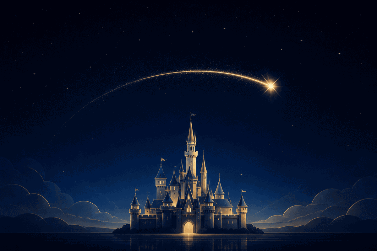
Few logos do what the Disney logo does. It does not merely identify a company — it opens a door. The wordmark, based on Walt Disney's signature, brings authorship and a human hand to the identity; the castle, introduced in 1985, turns that signature into a cinematic promise. Together they say that a storyteller built worlds worth entering.
Design takeaway
Make the promise visible
02 · Color Psychology
The Blue of a Story That Hasn't Started Yet
Deep blue creates the emotional dusk in which wishes become possible. It holds the reveal back for one suspenseful moment while also borrowing blue's associations with trust and safety. A white castle supplies purity and maximum contrast; a warm gold star arc adds wonder and reward. Every color advances the narrative rather than decorating it.
Design takeaway
Let color tell the story
03 · Typography
The Handwriting of a Founder, Refined Into a Mark
The famous script is a stylized, standardized interpretation of Walt Disney's autograph, not a literal reproduction of one signature. Its looping D and flowing lowercase forms imply creativity, warmth, and authorship. The unofficial Waltograph font is only a fan-created imitation; Disney uses proprietary lettering derived from the founder's signature.
Design takeaway
Give the brand a human hand
04 · Historical Evolution
From Title Card to CGI Spectacle
Disney's visual history is a lesson in continuity. The production technology changes, but each era keeps the same emotional sequence: anticipation, reveal, and an invitation into a story.
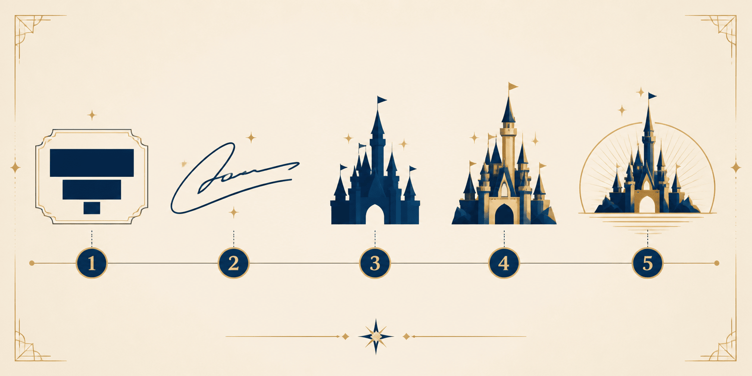
1923–1937
Early title cards identified the Disney Brothers Cartoon Studio with ordinary studio lettering; the brand was the name itself.
1937–1956
As feature animation grew, a stylized script based on Walt's handwriting emerged on title cards and merchandise.
1956–1985
The signature became the official corporate wordmark and carried the identity through a long static title-card era.
1985–2006
A white castle silhouette rose against blue in the first fantasy castle sequence, turning a label into a mini-movie.
2006–2011
A CGI rebuild added dimensional architecture, fireworks, film references, and a new orchestral arrangement.
2011–2022
The on-screen name simplified from Walt Disney Pictures to Disney, leaving the castle to carry more recognition.
2022–Present
The centennial sequence introduced a painterly sunrise treatment, proving a century-old symbol could still feel new.
Visual Application
One Emotional Language, Many Touchpoints
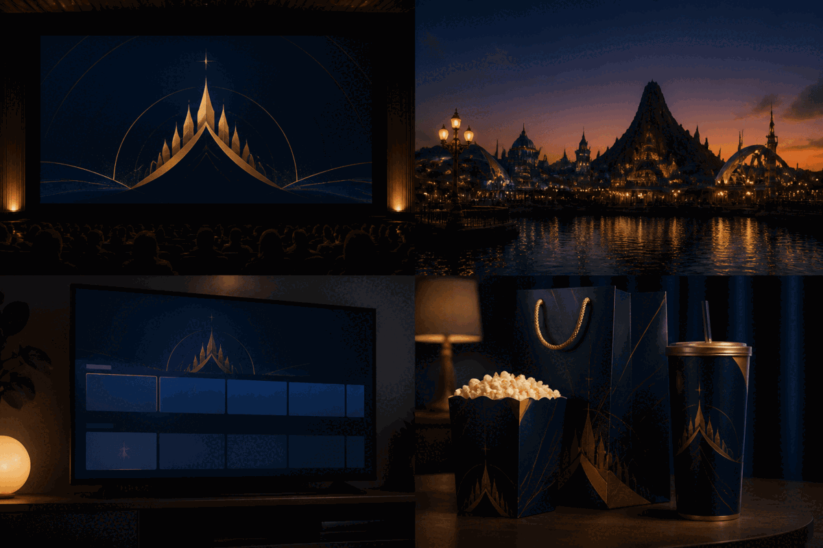
A strong entertainment identity travels beyond a title card. The same contrast between midnight blue, warm gold, and a story-led symbol can create recognition across cinema, streaming, park environments, and physical merchandise.
05 · Design Highlights
Why the Logo Still Works
The castle functions as both trademark and emotional experience because every component earns its place.
Two elements, one worldview
Heritage in the signature, imagination in the castle, and wonder in the star arc.
A logo with a soundtrack
Image and music reinforce one another until either cue can evoke the complete brand ritual.
Technology without identity drift
Each refresh upgrades craft while preserving the emotional structure audiences recognize.
A symbol beyond category
The castle never says movies or parks; it says story, covering every Disney touchpoint.