01 · Design Philosophy
A Sound Wave You Can See
Three curved white arcs sweep from the left edge of a green circle, like an equalizer caught mid-song. Spotify avoids the tired symbols of recording—headphones, notes, and cassettes—and draws what the service actually does: send audio from one place to another in a continuous stream. The mark suggests motion without animation, giving a digital product an instantly legible metaphor.
Design takeaway
Draw the action, not the object
02 · Color Psychology
Green That Says Go
Often cited as #1DB954, Spotify's vivid green is bright enough to glow in an app grid yet deep enough to feel premium against dark surfaces. It owns a hue that streaming competitors largely left open, connecting the brand to energy, discovery, growth, and the simple action of pressing play. Near-black surfaces, often represented by #191414, create the stage on which the green and album art can perform.
Design takeaway
Own a color with discipline
03 · Typography
Geometry That Keeps the Beat
The lowercase wordmark feels friendly and modular, echoing the rounded arcs of the icon. For years, Circular provided a soft geometric voice across the app and campaigns. In 2024, Spotify introduced Spotify Mix, a custom variable typeface made with Dinamo, replacing rented typography with a flexible system that can move from a smartwatch to a festival banner without losing recognition.
Design takeaway
Build a system that can flex
04 · Historical Evolution
From Web 2.0 Badge to Global Mark
Spotify's visual history is a lesson in continuity through subtraction. Each redesign removes noise while protecting the one gesture listeners remember: a signal leaving a circle.
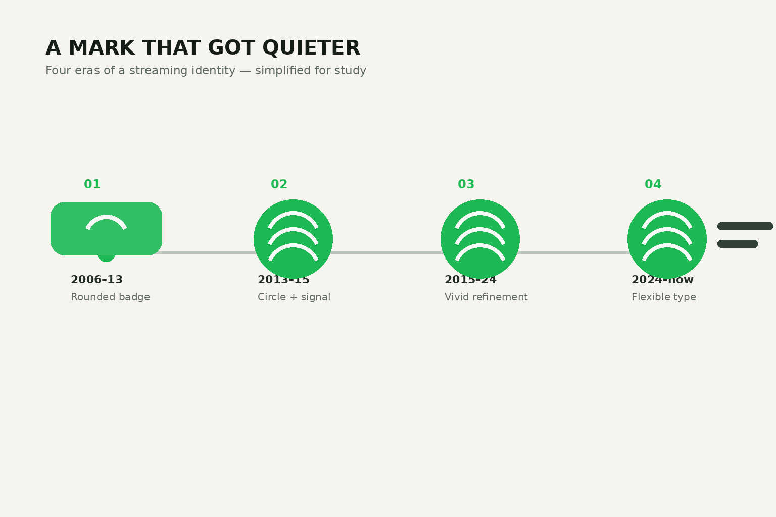
2006–2013
A friendly green rounded badge with uneven sound-wave bars and a casual lowercase wordmark.
2013–2015
The identity was stripped to a clean green circle, three white arcs, and an independent wordmark.
2015–2024
Collins refined the system, increasing vibrancy and tuning the type system for a global audio brand.
2024–Present
Spotify Mix introduced custom variable typography while the instantly recognizable icon held steady.
Visual Application
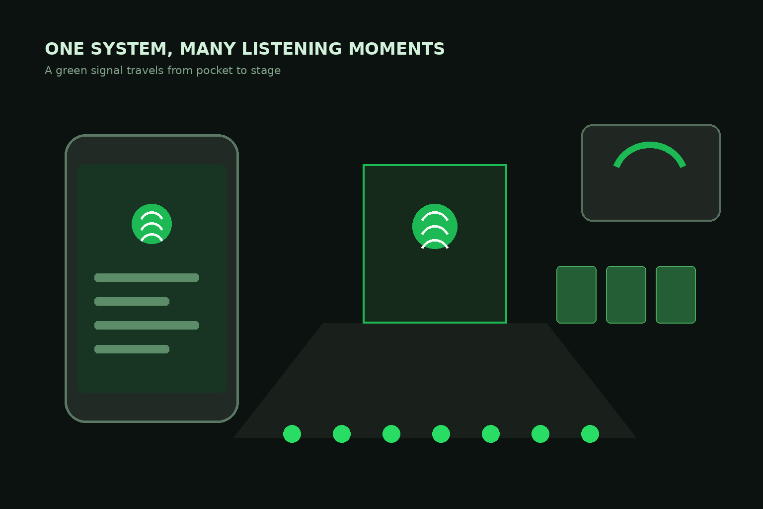
One Signal, Many Listening Moments
A streaming identity has to move from a phone screen to a car dashboard, podcast cover, speaker, and concert stage. Green provides the active cue; black creates the neutral venue that lets music and artist content stay central.
05 · Design Highlights
Why the Mark Keeps Its Rhythm
The icon works because every part earns its place and the system gives it room to breathe.
Motion without animation
Tilted, tapering arcs make a still mark feel like playback is already happening.
Color ownership
Green and black form a recognizable pair that users voluntarily share through Wrapped.
Modular by design
Icon and wordmark separate cleanly for app icons, billboards, playlists, and stages.
A generous host
The dark stage frames artists and album art instead of competing with the content.