01 · Design Philosophy
A mascot born from conversation
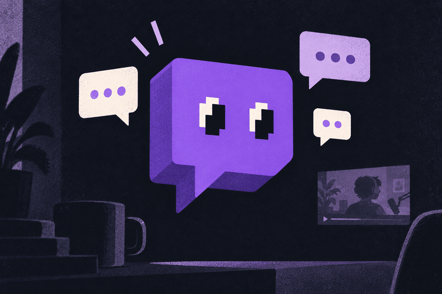
Most streaming brands picture a screen. Twitch pictures the thing viewers do while the screen is on: talk. Glitch, the blocky speech-bubble mascot, makes chat—not video—the platform's differentiator. Its pixelated silhouette nods to gaming, while the friendly eyes make a digital malfunction feel social and alive.
Design takeaway
Draw the behavior that makes your product different.
02 · Color Psychology
Purple as a community signal
Often cited as #9146FF, Twitch purple is bright, saturated, and instantly legible against dark surfaces. It sits between blue's trust and magenta's energy, claiming creative territory that tech brands traditionally left open. White acts as the pause: a high-contrast partner that gives the violet room to perform.
Design takeaway
Own one color, then use it as the frame around community expression.
03 · Typography
Roobert and the sound of a synthesizer
Roobert began as a tribute to synthesizer pioneer Robert Moog, then evolved into a geometric, slightly rounded sans-serif system. Its chunky, extruded character recalls arcade cabinets and a signal doubled by a glitch. Brand display type makes noise; highly legible interface type lets the stream take the spotlight.
Design takeaway
Let display typography carry heritage while UI type carries clarity.
04 · Historical Evolution
From a life-stream camera to a global stage
Twitch's identity evolved in measured steps: each refresh preserved the community's beloved Glitch while giving the system more range.
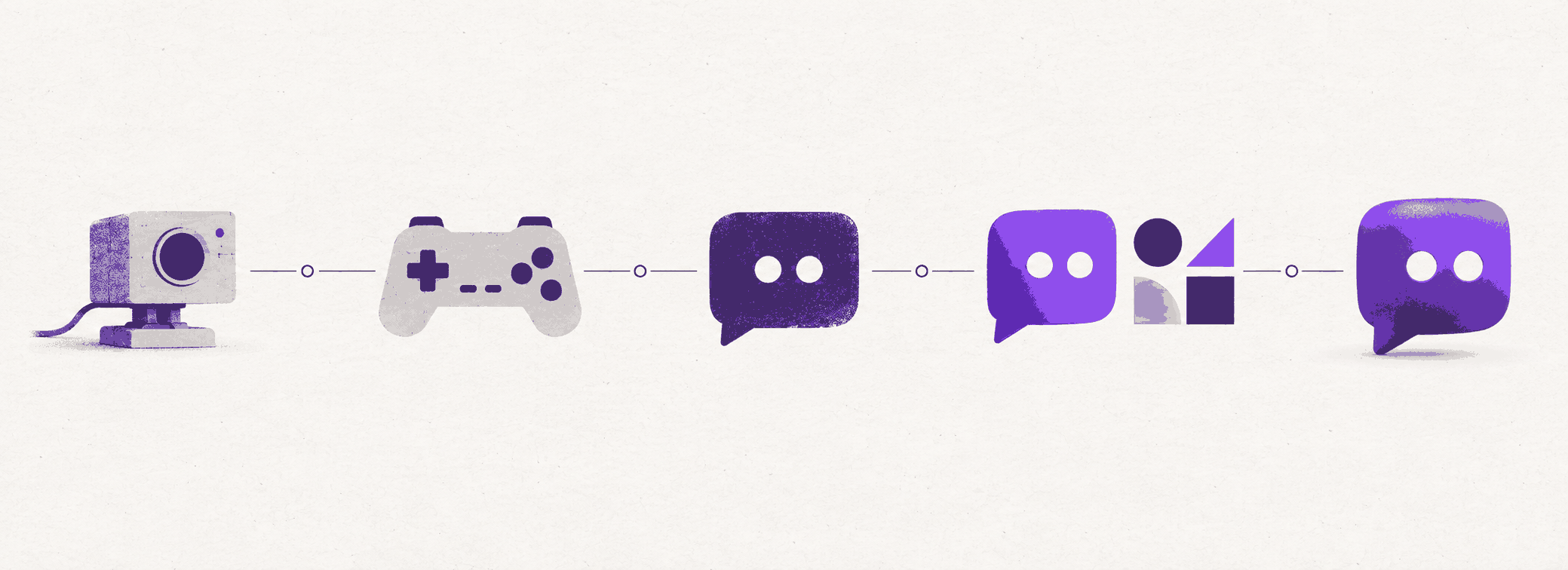
2006–11
Justin.tv begins as a lifecasting experiment.
2011–12
Gaming spins out as a standalone service.
2012–19
Glitch arrives as the face of the community.
2019
COLLINS brightens purple and systematizes the wordmark.
2023→
Porto Rocha gives the identity a dimensional, dynamic world.
Visual Application
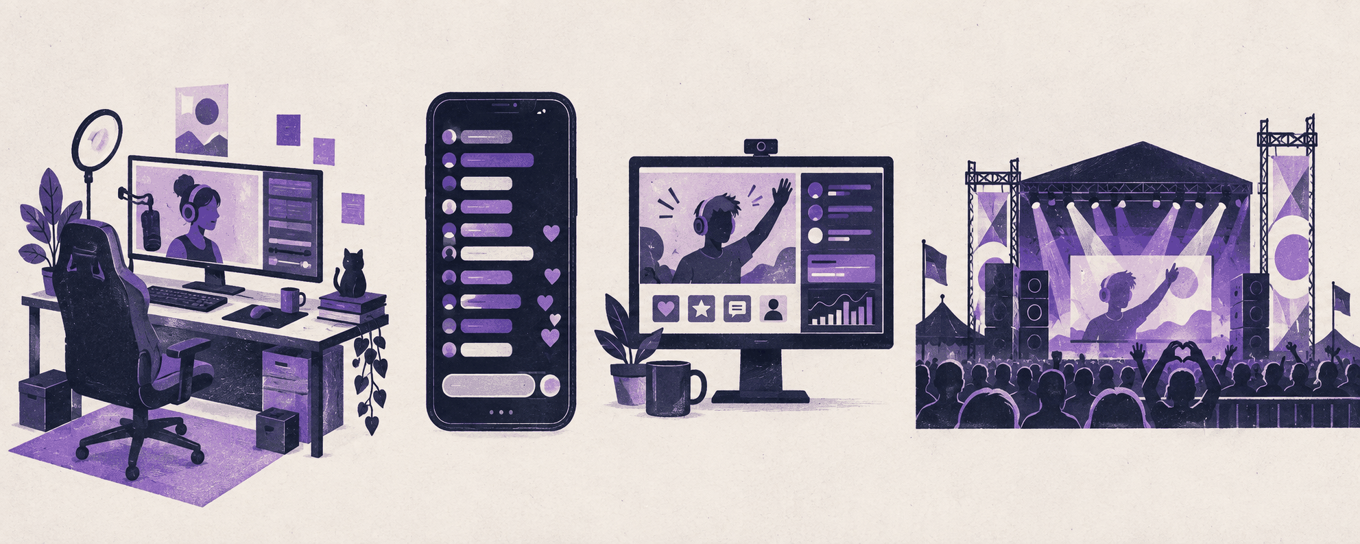
One community, many screens
The identity moves from a creator desk to a phone, chat column, and festival stage. Purple remains the anchor while creators supply the changing content and color.