01 · Design Philosophy
A Button, Not a Picture
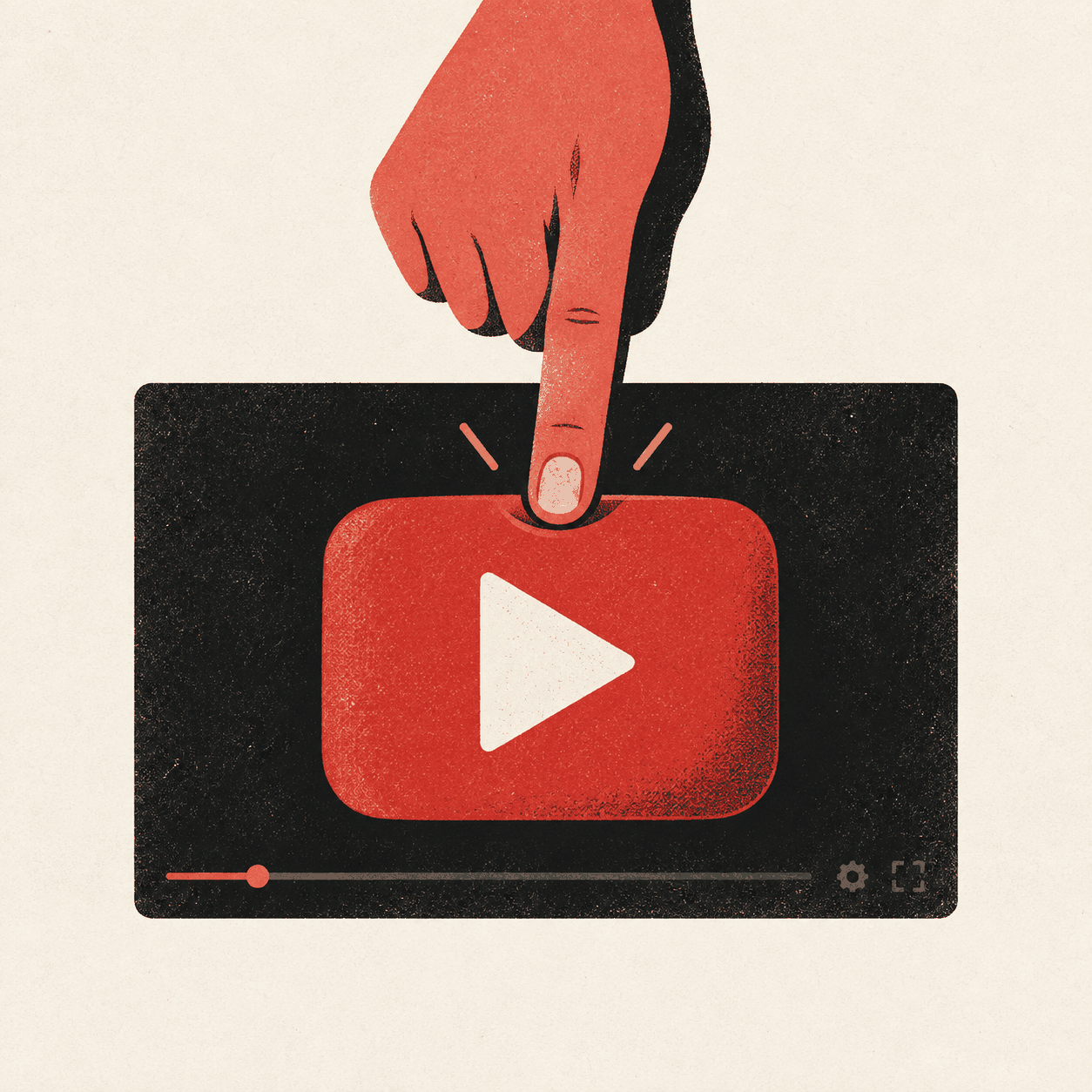
Most logos are pictures of what a company sells. The YouTube logo is rarer: a picture of what a company asks you to do. A red rounded rectangle, a white triangle, and a dark wordmark depict the instant before the video starts — the universal gesture of pressing play. The interface element became a brand ambassador, so the redesign promoted what users already loved.
Design takeaway
Draw the action, not the object
02 · Color Psychology
Red That Says Play
YouTube's red does not primarily say danger or passion. It says play. The 2017 system grounded the color in video itself: the recording light, a LIVE badge, the moment the camera is rolling. Beside a white triangle, pure red creates the highest-energy combination in the mark. The wordmark's near-black calm partner gives the eye somewhere to rest.
Design takeaway
Own a color with discipline
03 · Typography
From a 1903 Typeface to YouTube Sans
For most of its life, the wordmark used Alternate Gothic No. 2, a condensed grotesque first released in 1903. The 2017 redesign cleaned up years of manual tweaks while preserving that blunt, hard-working character. YouTube Sans, developed with Saffron, Letterjuice, URW++, and the UX team, extended the brand voice across the product with geometry drawn from the play button.
Design takeaway
Preserve history while building a system
04 · Historical Evolution
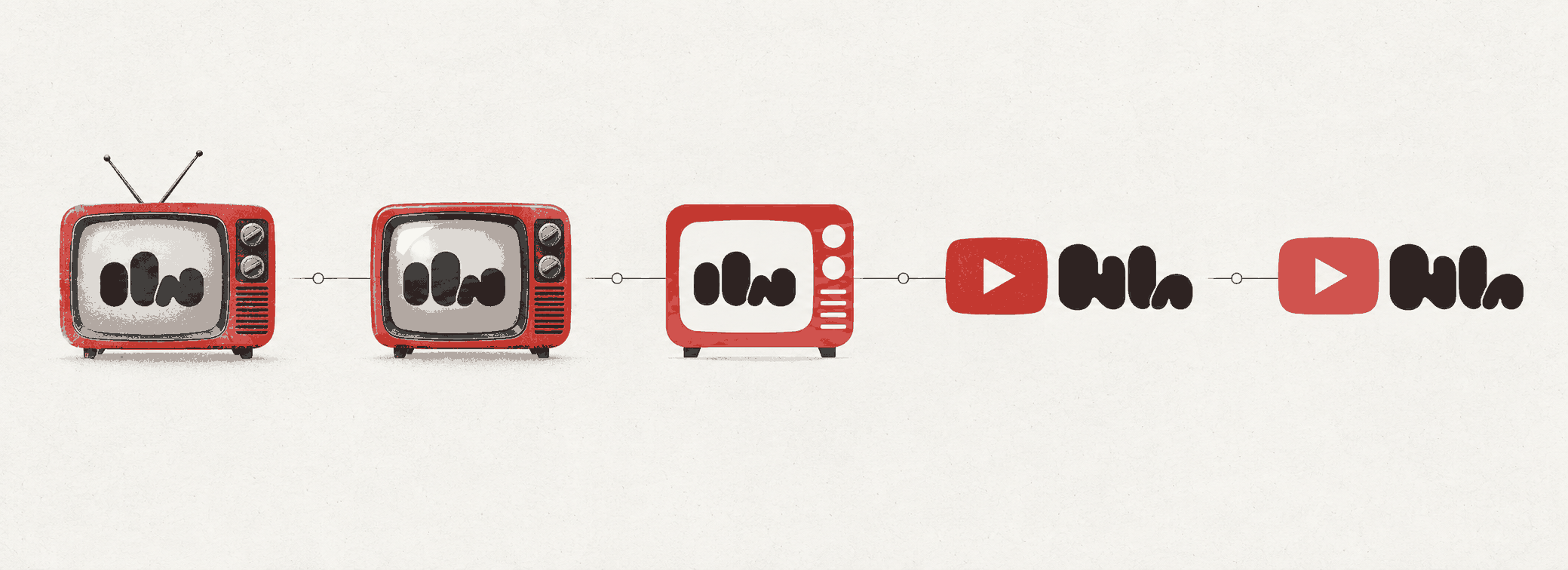
From Tube-in-a-Tube to the Play Icon
YouTube's visual history is a lesson in how slowly an iconic logo changes — and how decisive the changes are when they finally arrive.
2005–2011
The tube-in-a-tube: black You beside Tube framed in a red rounded television shape, paired with Broadcast Yourself.
2011–2015
A cosmetic refresh softened shading before the mark gradually lost its gloss and aligned with flatter digital language.
2015–2017
Gradients were stripped away entirely, producing a clean flat version as Material Design spread through Google products.
2017–Present
The red play button stepped out in front of a unified wordmark; the icon became a flexible standalone system.
2025 · Quiet refresh
A subtle palette shift toward a warmer, pinker red tuned a two-decade-old instrument without changing its melody.
Visual Application
One Action, Many Screens
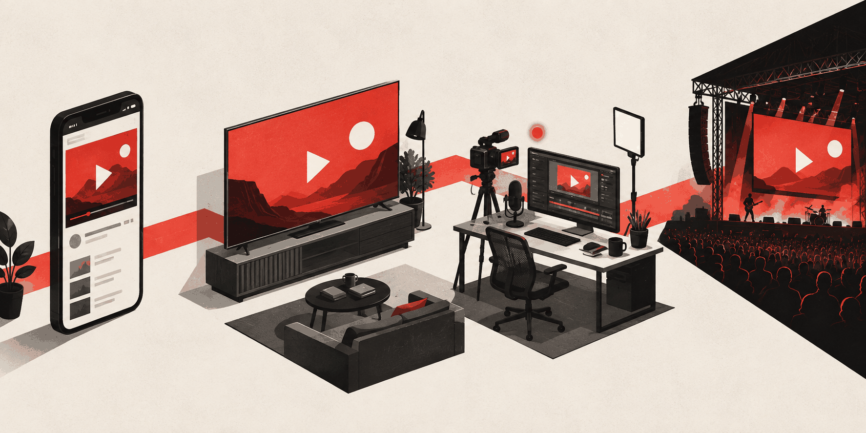
The identity travels from a phone to a smart TV, creator studio, and concert-stage screen. Red provides the active cue; dark surfaces let video and creator content remain the source of color.
05 · Design Highlights
Why the Mark Plays Everywhere
The system works because every part earns its place and the identity knows when to step aside.
The product is the symbol
You do not interpret the play button; you press it. Identity and interface become one gesture.
Color owns the action
Red marks the moment content begins while near-black type stays quiet beside the show.
Modular at every scale
Icon and wordmark separate cleanly for favicons, phones, billboards, and monochrome applications.
A generous host
A platform built on other people's creativity keeps its own identity reliable rather than loud.