01 · Design Philosophy
One small spark, everyday low prices
Most logos try to say everything at once. Walmart's logo says almost nothing—a blue word, a yellow burst—and still carries the promise that one of the world's largest companies rests on: save money, live better. The gap between how little the mark shows and how much it means is the whole lesson of this design.
Design takeaway
Reduce the promise to one memorable gesture.
02 · Color Psychology
True Blue trust meets Spark Yellow optimism
Walmart's blue signals reliability and access rather than luxury. The 2025 refresh deepened it into True Blue, a steadier tone for signage, apps, and video. Spark Yellow does the opposite job: it injects warmth, attention, and deal-day energy. Together, the two-color system says customers are safe—and something good is happening.
Design takeaway
Use contrast to make value feel human.
03 · Typography
Everyday Sans makes heritage usable
The refreshed wordmark is built around Everyday Sans, a rounded humanist face inspired by the Antique Olive used in Walmart advertising from the 1980s into the early 2000s. Its generous curves and heavy weight hold up at the sizes customers encounter on a receipt, app surface, or distant storefront. The trucker hat worn by founder Sam Walton supplied an unusually personal reference for the new letterforms.
Design takeaway
Typography is infrastructure, not decoration.
04 · Historical Evolution
From the Frontier Font to the standalone spark
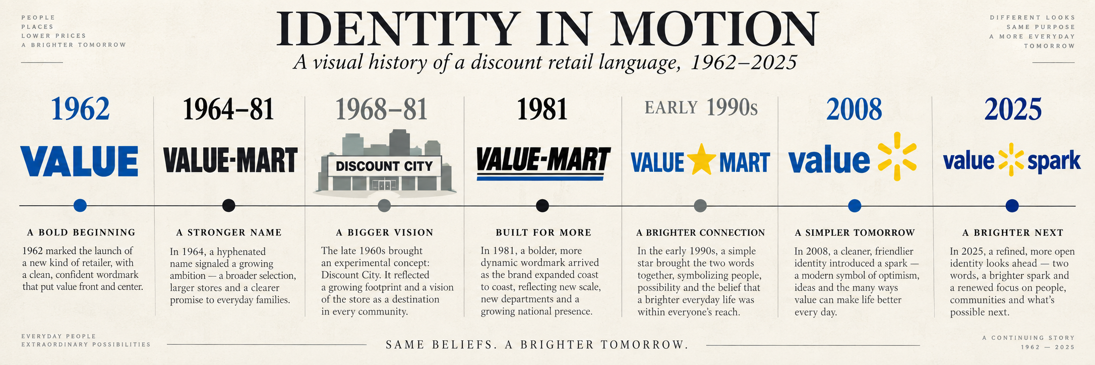
Walmart's visual history shows how a retailer can evolve without discarding recognition. Each era kept the name or color familiar while adding just enough structure for the next stage of growth.
1962
The first Rogers, Arkansas store used a plain straight-blue WALMART sign.
1964–81
The black, blocky Frontier Font introduced a consistent Wal-Mart wordmark.
1968–81
A separate Discount City lockup appeared in advertising and on uniforms.
Early 1990s
The hyphen became a star, creating the memorable Wal★Mart era.
2008
Lowercase Walmart arrived with the yellow spark beside the name.
2025
True Blue, Spark Yellow, Everyday Sans, and a more independent spark.
05 · Visual Application
One mark, ten thousand stores
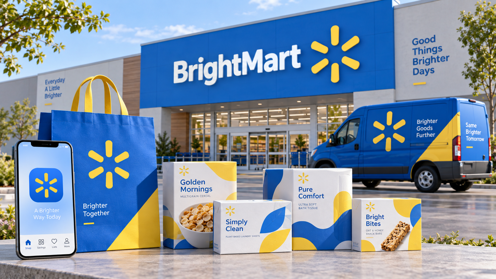
The logo must work on a supercenter sign, a $16 receipt, a mobile app icon, private-brand packaging, uniforms, and delivery vehicles. Flat colors, rounded forms, and the separated spark give the identity a dependable rhythm from aisle to app.
Brand Background
From a small Arkansas store to an omnichannel system
Sam Walton opened Walmart's first store in Rogers, Arkansas, on July 2, 1962. The idea was simple: sell goods at the lowest possible prices in towns larger chains ignored. That mission grew into a global, people-led, tech-powered retailer, but the visual promise stayed consistent—an accessible blue name and an optimistic spark.