Logo Review Guide
How to Critique a Logo: A Practical Review Framework
Learn how to critique a logo with a repeatable framework for clarity, relevance, distinctiveness, typography, scalability, and real-world use. Review your mark with evidence.
A practical framework for designers, founders, and clients
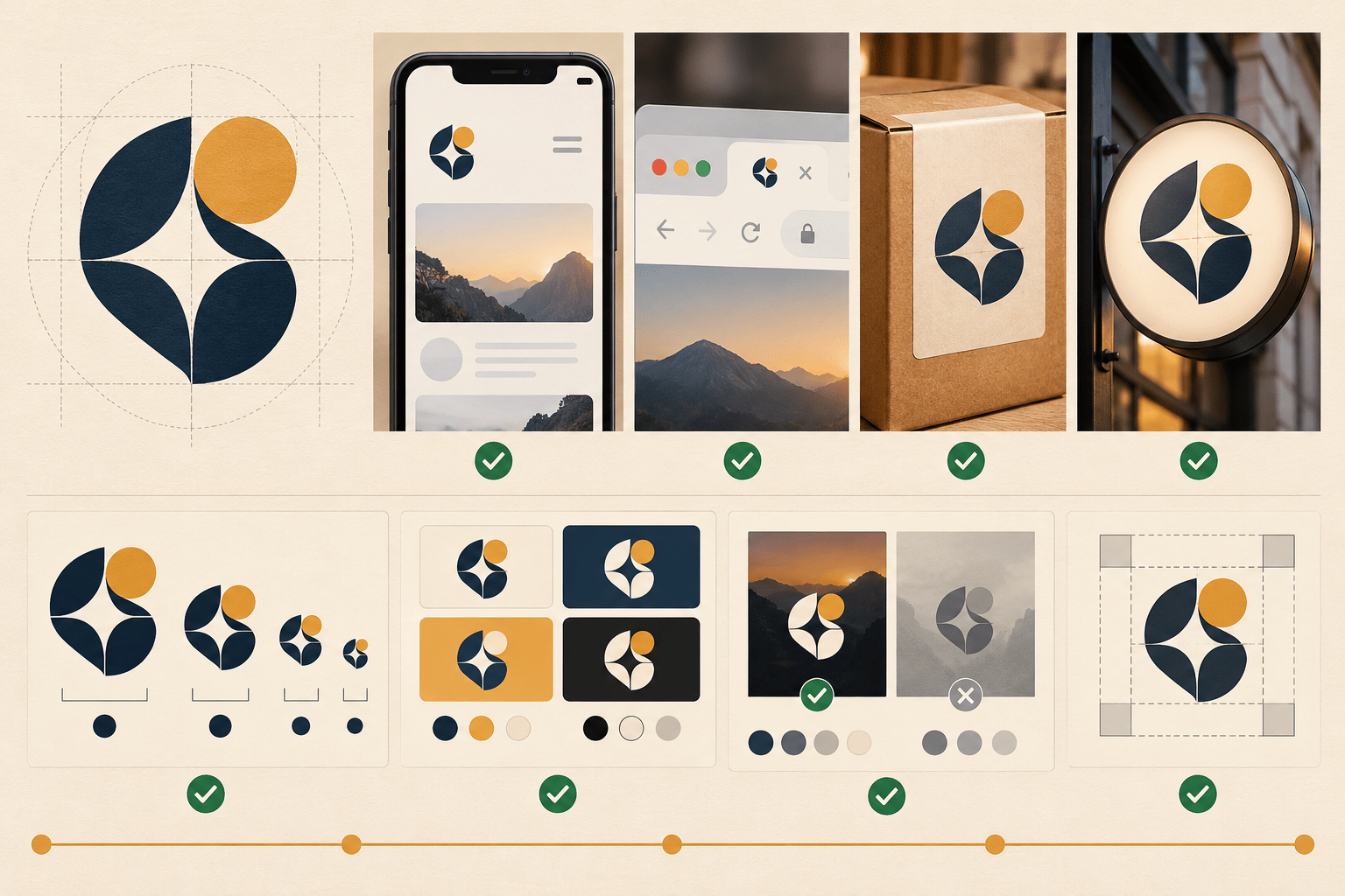
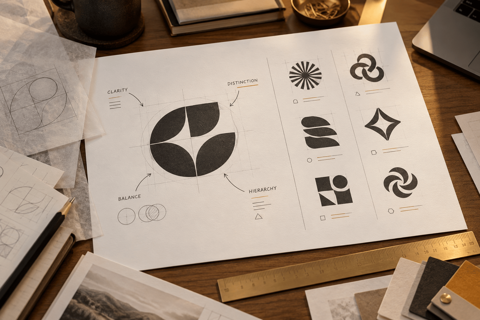
Logo critique is most useful when it turns an opinion into an observable decision. “I like it” may be a valid personal reaction, but it does not tell a designer what to change or a founder whether the mark is ready for customers. A useful critique asks what the logo needs to do, tests it in the situations where it will appear, and separates evidence from preference.
This framework is for reviewing an existing logo with a designer, client, or internal team. It does not replace trademark or legal advice. Its purpose is to make visual feedback clearer, more specific, and easier to act on.
Start with the job, audience, and context
Before judging the drawing, define the job. Who needs to recognise the brand? Where will the logo appear first: a product interface, packaging, storefront, pitch deck, social profile, or browser tab? What should the identity help customers expect—clarity, reliability, energy, expertise, or something else?
Write a one-sentence brief before the review. For example: “This mark should help a small-business software product look clear and dependable in a crowded navigation bar.” The sentence is not a branding slogan. It is a filter for feedback. A design can be attractive yet wrong for its audience or application.
Ask reviewers to describe the intended audience and context before showing the logo. This reduces the risk that a critique becomes a generic discussion of whether the mark feels modern or premium.
1. Check clarity and first-read hierarchy
Show the logo for a few seconds, then ask what the viewer noticed first. Do not expect them to guess the company or explain the concept perfectly. Look instead for a clean silhouette, a readable wordmark, and a sensible relationship between symbol and type.
Check whether the eye knows where to begin. If every detail has equal emphasis, the mark may feel busy. If the symbol and wordmark compete, decide which needs priority in the intended context. Review the logo in colour and in one colour. If the idea disappears in black and white, colour may be carrying too much of the recognition load. Use logo evaluation criteria as a companion reference when you need a broader checklist.
2. Test relevance without rewarding obvious symbolism
A logo does not need to illustrate the product literally. A finance company does not need a coin, and an AI company does not need a circuit or robot. Literal symbols can be appropriate, but they should earn their place through a clear connection to the brand and audience.
Ask three questions: Does the mark fit the category without blending into it? Does it support the brand’s intended character? Will it still make sense if the company expands its offer? Avoid feedback such as “make it more professional” unless you can explain which visual decision creates the mismatch—perhaps an overly playful type treatment, weak contrast, or an illustration that is too detailed for the product interface.
Relevance is about fit, not about forcing a story onto every shape. A simple mark can work well when its use, language, and surrounding identity make the positioning clear.
3. Compare distinctiveness with real competitors
Place the logo beside five to ten direct or adjacent competitors at the same size. Hide the names if possible and look at the row as a customer might. Which marks are easy to confuse? Which one can you recall after the names are removed?
Look for ownable features: a particular proportion, silhouette, letterform, colour relationship, or repeated shape. Do not confuse novelty with distinctiveness. A strange symbol that customers cannot read may be less useful than a restrained mark with one memorable feature.
If the logo feels generic, identify the highest-value opportunity rather than requesting a completely different concept. A concrete AI startup logo review can help illustrate how differentiation and usability interact.
4. Inspect typography, spacing, and balance
For a wordmark or lockup, review letter spacing, weight, alignment, case, and the space between symbol and type. Look for accidental tangencies, uneven counters, awkward joins, and a symbol that overwhelms the name. A logo can be mathematically aligned and still look visually off-balance, so inspect it at normal viewing distance as well as close up.
Ask whether the type supports the audience and context, not whether the font is fashionable. Test the logo in a line of navigation, a social avatar, and a document header. If the wordmark becomes unreadable at the smallest useful size, define a compact or icon-only version rather than shrinking it indefinitely.
Keep feedback concrete: “The gap between the symbol and first letter reads as a break” is more actionable than “the logo feels weird.”
5. Test scalability, contrast, and variants
Review the mark at 16px, 32px, 64px, and a larger display size. Thin strokes, small counters, and fine details often disappear before anyone notices in the original design file. Test light and dark backgrounds, monochrome, reversed colour, and a busy context if the brand will use photography.
Check that the team has an editable vector master and practical exports. A useful identity system may need a full lockup, a compact lockup, an icon, one-colour artwork, and clear-space guidance. These are not signs that the primary logo failed; they are responses to different applications.
For surrounding interface text and supporting information, use the W3C Web Content Accessibility Guidelines as the accessibility reference. Logos receive different treatment from ordinary text, but a brand experience still needs readable labels, controls, and content.
6. Turn observations into a decision
End the critique by sorting observations into three groups: Keep—strengths that should survive any refinement. Refine—production or system issues such as spacing, contrast, file formats, or small-size detail. Reconsider—strategic issues such as a strong resemblance to a competitor, a mismatch with the intended audience, or a category signal the business has outgrown.
Choose the smallest change that addresses the highest-impact problem. If the mark is clear and distinctive but lacks variants, build the system. If the symbol works but the wordmark is cramped, adjust the typography. If the logo consistently attracts the wrong audience or cannot be distinguished in context, a broader redesign conversation may be justified.
The Logo Review Tool can provide a structured first pass across clarity, contrast, colour, scalability, typography, uniqueness, versatility, application, and commercial fit. Use its output as evidence to discuss—not as a replacement for context, judgement, or a designer’s craft.
A strong logo critique does not produce the loudest opinion. It produces a shared understanding of what the logo must do, what currently gets in the way, and what to change next.
Frequently Asked Questions
What should I say first when critiquing a logo?
Start with the logo’s job, audience, and main context. Describe what the viewer notices first and where the mark must work before suggesting visual changes.
How can I make logo feedback more specific?
Tie each observation to something visible and actionable, such as a crowded silhouette, weak contrast, cramped spacing, or a wordmark that becomes unreadable at its smallest required size.
Should a logo critique include competitor comparisons?
Yes. Comparing five to ten relevant competitors at the same scale helps reveal category conventions, confusing similarities, and distinctive features worth protecting.
Does every logo problem require a redesign?
No. Missing variants, export quality, spacing, and contrast are often system or production fixes. A redesign conversation is more appropriate when the mark consistently misfits the audience or resembles a competitor.