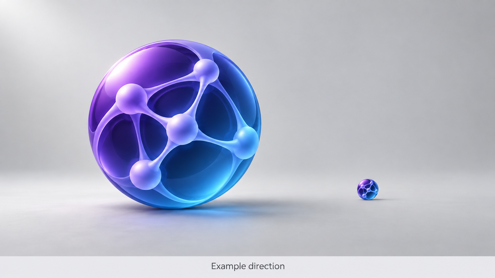
Demonstration Case — Sample Logo Review. The mark discussed here is a generic sample logo for a fictional generative AI brand, not a client project. All visuals are labelled Example direction. No scores, customer data, or delivered redesign outcomes are claimed; the page shows the kind of diagnostic feedback a Logo Review report produces.
Step 1
Before: The Sample Logo as Submitted
The sample mark is a single lockup: a circular icon filled with a purple-to-blue gradient, containing an abstract geometric motif that suggests a neural network or spark, set above a lowercase wordmark in a geometric sans-serif. The wordmark picks up the same gradient. Everything ships as one flat PNG — no icon-only file, no monochrome version, no dark-mode variant.
On a Product Hunt listing or a landing-page hero, the gradient orb reads as polished and contemporary. The problem appears when the same mark lands where an AI startup actually competes: a 16-pixel browser tab, a crowded AI tools directory, a GitHub README header, or a dark-mode Slack sidebar full of similar gradient circles. The question stops being “does it look modern” and becomes “can anyone tell it apart from the twenty other AI logos on the same page.”
Step 2
Context: What This AI Startup Builds, and Who It Must Convince
The sample brand sells a generative AI writing platform for content teams. Its buyers are marketing managers and product leads who encounter the brand inside a weekly flood of new AI tools on Product Hunt, Hacker News, and LinkedIn. That context sets three requirements.
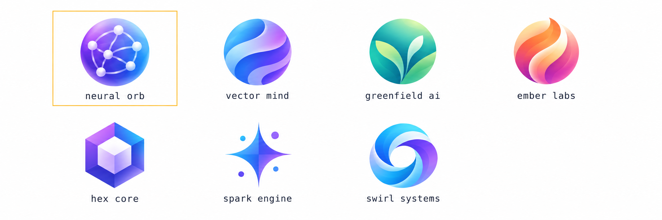
Uniqueness. The AI startup category has converged on a visual default: gradient orbs, hexagons, abstract neural motifs, and minimal sans-serif wordmarks. When every competitor uses the same language, no one stands out, and a mark that matches the default is easy to forget and confuse (Ebaq Design).
Brand personality.A logo should communicate something specific, not just signal “this is an AI company.” An abstract gradient orb says “AI” to everyone, which means it says nothing distinctive to anyone.
Distinctiveness. Research on distinctive brand assets is consistent: shape-based assets such as logos have the greatest potential for unique brand ownership, but only when the shape is genuinely ownable and repeated consistently (Ehrenberg-Bass Institute).
Those three pressures are exactly what the Logo Evaluation Criteria are built to measure.
Step 3
Review Snapshot: How the Sample Mark Reads Against Evaluation Criteria
Reviewed against the same ten dimensions a Logo Review report uses — Visual Clarity, Contrast & Accessibility, Color Harmony, Scalability, Shape & Balance, Typography, Uniqueness, Versatility, Application, and Commercial Value — the sample mark shows a familiar split. No numeric scores appear here; what follows is the qualitative read a reviewer would give.
What holds up. The colour palette is internally harmonious, the wordmark is legible at header size, and the overall composition feels contemporary.
What slips.Every weakness traces back to one root cause: a gradient-dependent mark that borrows the AI category’s default visual language instead of building its own.
| Dimension | Reviewer’s read |
|---|---|
| Visual Clarity | Gradient and internal detail blur below 48 px |
| Scalability | Orb becomes a muddy circle at 16 px |
| Uniqueness | Purple-blue gradient orb matches the AI category default |
| Versatility | No monochrome version; gradient fails on dark backgrounds |
| Commercial Value | Reads as AI-generated, not as a brand |
Step 4
Top 3 Problems
1. The mark is category-default, not brand-specific. A purple-to-blue gradient orb with an abstract internal motif is what many AI startups already use. The convergence is so pronounced that blog posts catalogue the pattern — hexagons, swirls, gradients, and minimal sans-serif wordmarks repeating across hundreds of unrelated companies (Ebaq Design). Nothing in the sample mark is ownable: no distinctive silhouette, no unusual colour, no idea only this product could claim.
2. The gradient breaks at small sizes and on dark backgrounds. Gradients require sufficient pixels and a light background to render cleanly. At 16 pixels in a browser tab, the gradient collapses into a muddy block. On a dark Slack sidebar or a dark-mode interface, the purple-to-blue range loses contrast and the orb disappears. A mark that only works on a white landing-page hero is not a system — it is a header decoration.
3. The abstract motif communicates “AI” but nothing about the brand.The neural-network suggestion inside the orb is a generic signal: it tells viewers “this is an AI company,” which every competitor’s logo also says. It does not communicate what kind of AI, who it serves, or what makes the product different. A logo that only signals its category is a badge, not a mark.
Step 5
Recommended Changes
Replace the gradient orb with a single bold, ownable shape. Strip the gradient and internal detail. Commit to one silhouette that reads as a solid form at 16 pixels — a shape a user could sketch from memory. Distinctive assets earn recognition through uniqueness and repetition, not colour complexity.
Choose one distinctive colour, not the category default.Purple-to-blue gradients are the AI category’s visual shorthand. A single, unexpected colour — or a high-contrast monochrome — immediately separates the mark from the gradient-orb crowd. Colour is the weakest distinctive asset class; shape is the strongest, so invest where ownership is achievable.
Build a small, documented system. Ship an icon-only lockup, a monochrome version, and a dark-mode variant. A one-page brand sheet prevents the inconsistency that makes a young AI brand look assembled from generator outputs rather than designed.
Step 6
After: The Same Mark Under the Recommended Direction (Example direction)
Example direction — not a delivered result. Under this direction, the mark would change in a focused way: the gradient and internal motif are removed; a single bold silhouette replaces the orb; one solid colour replaces the gradient; and monochrome and dark-mode variants are built from the same silhouette. The wordmark, typeface, and proportion stay, because they already work. The illustration shows the direction only — it is a demonstration, not a customer outcome.
Survives at 16 px
A single bold silhouette stays legible in a browser tab, where the gradient orb collapsed into a muddy block.
Icon-only lockup
A simplified mark for app icons, favicons, and avatars, freed from the wordmark.
Monochrome + dark mode
Two extra variants so the mark holds up on print, dark pages, and low-contrast surfaces.
One ownable shape
A single distinctive element replaces the category-default gradient orb — repeated across icon, site accent, and app mark.
Step 7
What Changed
What changes is the mark’s relationship to its category. The original logo signalled “AI” by borrowing the category’s default visual language; the recommended direction signals the brand by owning a shape no competitor uses. Uniqueness improves because one ownable silhouette replaces a gradient orb that matches dozens of competitors. Brand personality emerges because the mark stops being a generic AI badge. Versatility improves because a solid silhouette works at 16 pixels, in monochrome, and on dark backgrounds — contexts where a gradient always fails.
Uniqueness
Category-default gradient orb → one ownable silhouette
Brand personality
Generic AI badge → a mark that says something specific
Versatility
Gradient-only → solid, mono, and dark-mode variants
Step 8
Related Guide and Evaluation Criteria
To run this checklist against your own mark, start with the Logo Evaluation Criteria, which explains all ten dimensions. For a broader framework, read How to Know If Your Logo Is Good — a practical checklist covering clarity, scalability, and distinctiveness. Browse more breakdowns in the Examples library, and find background reading on the logo review blog.
Step 9
Review Your Own AI Startup Logo
Upload your logo to the Logo Review tool and get feedback across the same ten dimensions used in this sample — with the changes that matter most for an AI brand. It takes a minute, and it is the fastest way to find out whether your mark stands apart or blends into the gradient.