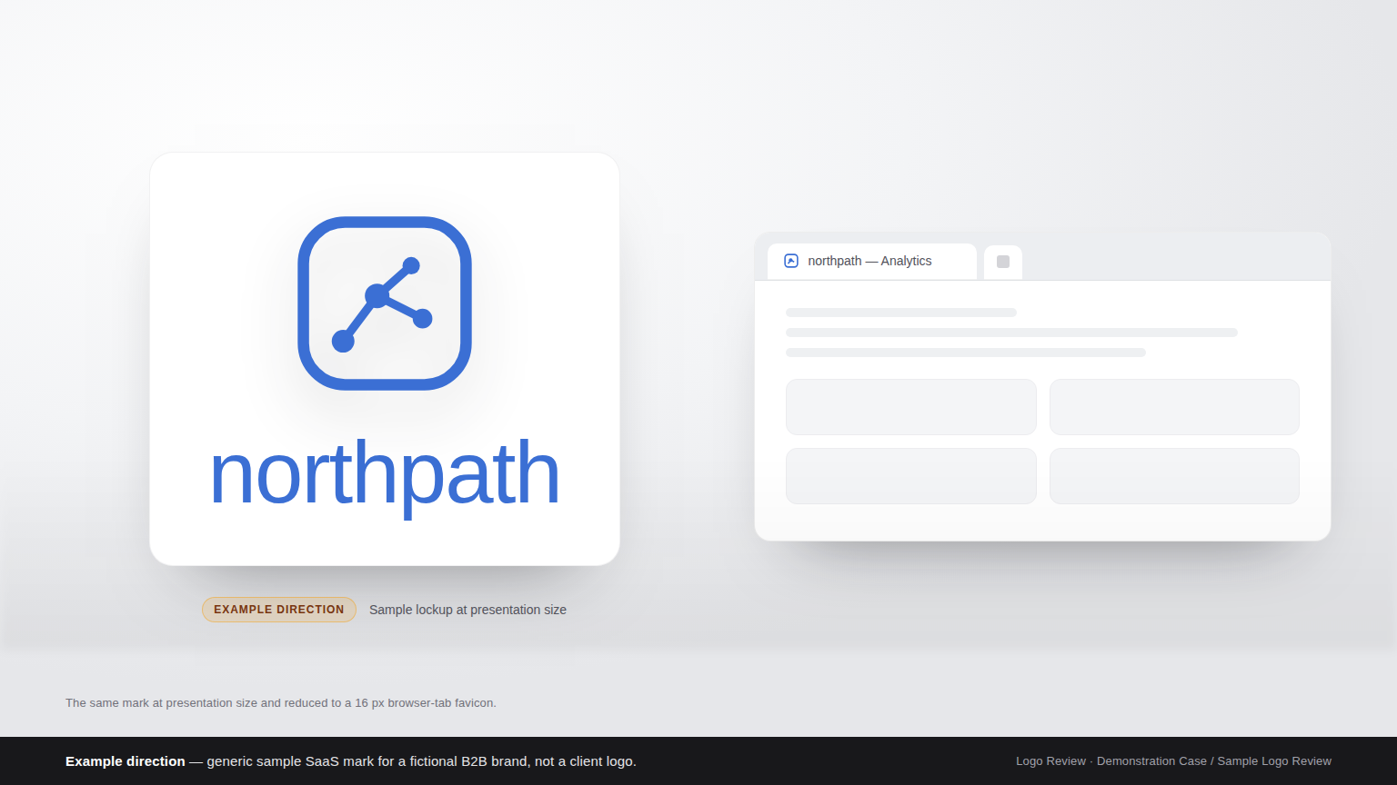
Demonstration Case — Sample Logo Review. The mark discussed here is a generic sample logo for a fictional B2B SaaS brand, not a client project. All visuals are labelled Example direction. No scores, customer data, or delivered redesign outcomes are claimed; the page shows the kind of diagnostic feedback a Logo Review report produces.
Step 1
Before: The Sample Logo as Submitted
The sample mark is a single lockup: a rounded-square icon holding an abstract node-and-line graph, set above a lowercase wordmark in a geometric sans-serif. Icon and wordmark are the same mid-blue on white, delivered as one flat PNG — no separate icon file, no monochrome version, no dark-mode variant.
On a wide laptop screen in a pitch deck, it looks tidy. The problem appears when the same file is dropped where a SaaS startup actually lives: a 16-pixel browser tab, an app-style square icon, a documentation header, and a dark-mode pricing page. The question stops being “does it look nice” and becomes “does it still work.”
Step 2
Context: What This SaaS Startup Sells, and Who It Must Convince
The sample brand sells B2B analytics software. Its buyers are operations and finance leads — not designers — and they meet the brand mid-way through a crowded vendor comparison, scrolling through near-identical product pages. That context sets three requirements.
Differentiation. In a category where most competitors use blue, a geometric sans, and an abstract data glyph, the mark has to stay memorable between meetings. Distinctiveness research is blunt here: a brand element becomes a real asset only when it is uniquely linked to one brand, and uniqueness matters more than raw difference (Ehrenberg-Bass Institute).
Trust. Enterprise buyers read visual craft as a proxy for product quality. A logo that breaks at small sizes or on dark backgrounds reads as unfinished, and unfinished reads as risky.
Scalability. One identity has to hold up as a favicon, an app icon, a documentation header, a conference banner, an invoice, and a browser tab in both light and dark mode.
Those three pressures are exactly what the Logo Evaluation Criteria are built to measure.
Step 3
Review Snapshot: How the Sample Mark Reads Against Evaluation Criteria
Reviewed against the same ten dimensions a Logo Review report uses — Visual Clarity, Contrast & Accessibility, Color Harmony, Scalability, Shape & Balance, Typography, Uniqueness, Versatility, Application, and Commercial Value — the sample mark splits into a few genuine strengths and one connected cluster of weaknesses. No numeric scores appear here, because the mark is illustrative; what follows is the qualitative read a reviewer would give.
What holds up. The proportion of icon to wordmark is balanced, one typeface keeps a consistent voice, and the mark is deliberately restrained.
What slips. Every weakness traces back to one decision: a single flat lockup, in a single colour, used in every context.
| Dimension | Reviewer’s read |
|---|---|
| Visual Clarity | Clear at header size, illegible in a browser tab |
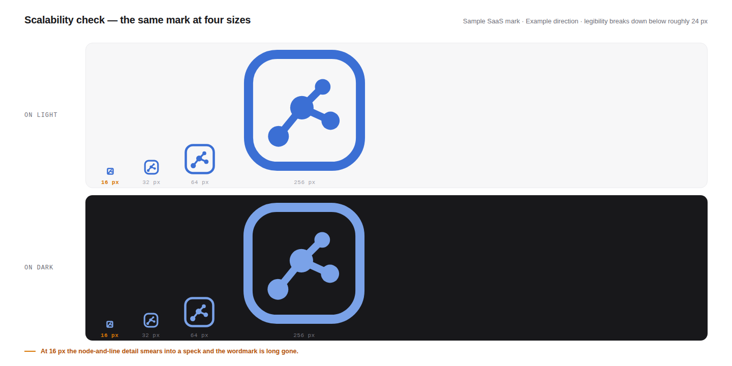
| Scalability | Loses definition below roughly 24 px |
| Contrast & Accessibility | Mid-blue on white falls short of AA at small sizes |
| Uniqueness | Blue plus an abstract graph matches the category default |
| Versatility | No monochrome or dark-mode variant supplied |
| Commercial Value | Reads as a template rather than a brand |
Step 4
Top 3 Problems
1. The icon collapses at favicon size. The graph uses thin strokes and small nodes. Scale it to 16 pixels and the lines smear into a speck; in a browser tab the mark becomes an unrecognisable block. This is the costliest failure, because the favicon is the one place a returning user sees the logo dozens of times a day.
2. The mark is category-default, not brand-specific. Mid-blue plus an abstract data motif is what many analytics vendors already use. Nothing in the icon is ownable — no distinctive shape, no unusual silhouette, no idea only this product could own. A mark that looks like its category is easy to forget and easy to confuse with a competitor.
3. There is no system behind the single file. One colour, one background, one lockup, no icon-only version. The moment the brand needs a small square, a dark background, or a one-colour print application, someone has to improvise — and improvisation is what makes a young brand look inconsistent.
Step 5
Recommended Changes
Give the icon a scalable silhouette. Rebuild the mark so it reads as one bold shape before any internal detail: thicker strokes, fewer and larger nodes, and a simplified icon-only file for small contexts. Designing at 16 px first is more reliable than shrinking detail down. Because modern browsers accept SVG icons, one vector source can carry a simplified small-size version and a richer large-size version (web.dev).
Build one distinctive element and repeat it. Instead of a generic graph, commit to a single ownable shape or letterform and use it everywhere — as the icon, a site accent, and the app mark. Distinctive assets earn recognition through repetition, not variety.
Define a small, documented system. Ship an icon-only lockup, a monochrome version, and a dark-mode version, plus a rule for minimum size and clear space. A one-page brand sheet prevents the inconsistency that quietly damages trust.
Step 6
After: The Same Mark Under the Recommended Direction (Example direction)
Example direction — not a delivered result. Under this direction, the mark would change in a limited way rather than being redesigned from scratch: a bolder, higher-contrast icon that survives at 16 px; an icon-only file for tabs and app icons; a one-colour and a dark-mode variant; and a single distinctive shape reused across the brand. The wordmark, typeface, and proportion stay, because they already work. The illustration shows the direction only — it is a demonstration, not a customer outcome.
Survives at 16 px
A bolder silhouette with fewer, larger nodes keeps the icon legible in a browser tab.
Icon-only lockup
A simplified square file for app icons and avatars, freed from the wordmark.
Monochrome + dark mode
Two extra variants so the mark holds up on print, dark pages, and low-contrast surfaces.
One ownable shape
A single distinctive element, repeated across icon, site accent, and app mark.
Step 7
What Changed
What changes is less the look than the range. The original mark was built for one context and borrowed into every other; the recommended direction is built for the smallest context first and expanded upward. Differentiation improves because one ownable shape replaces a category-default motif. Trust improves because the mark stays sharp wherever a buyer meets it. Scalability improves because small, monochrome, and dark-mode versions now exist as part of the system rather than as emergencies.
Differentiation
Category-default motif → one ownable shape
Trust
Sharp everywhere a buyer meets the brand
Scalability
Small, mono and dark-mode variants by default
Step 8
Related Guide and Evaluation Criteria
To run this checklist against your own mark, start with the Logo Evaluation Criteria, which explains all ten dimensions and what each one measures. For visual reference, browse tech logo design inspiration to see how established software brands handle small sizes and dark backgrounds, and read more breakdowns in the Examples library. Additional background reading is collected on the logo review blog.
Step 9
Review Your Own SaaS Logo
Upload your logo to the Logo Review tool and get feedback across the same ten dimensions used in this sample — visual clarity, contrast, scalability, typography, uniqueness, versatility, and more — with the changes that matter most for a startup. It takes a minute, and it is the fastest way to find out whether your mark still works at 16 pixels.