Logo Review Guide
How to Know If Your Logo Is Good Checklist
How to know if your logo is good: a practical checklist for clarity, scalability, contrast, distinctiveness, and real-world use. Try the Logo Review Tool today.
A practical guide for founders, brand owners, and marketing teams
A logo can look polished in a presentation and still fail in the places your brand is actually seen: a browser tab, a mobile header, a dark-mode interface, or a crowded comparison page. If you already have a logo and are deciding whether to keep it, refine it, or replace it, start with performance rather than personal taste.
A good logo is not simply attractive. It is clear, distinctive, usable, and appropriate for the brand it represents. The checklist below helps you make that judgment with less guesswork.
1. Check whether the logo is clear at a glance
Show the logo to someone who did not help create it. Give them a few seconds, then ask what they noticed. You are not testing whether they can guess the company perfectly; you are checking whether the mark has a clean visual read.
Look for a clear silhouette, understandable spacing, and a hierarchy between symbol and wordmark. Details that compete for attention make a logo harder to recognise. If the mark contains an abstract idea, it does not need to explain the entire business. It does need to be easy to see and remember.
Review it in black and white as well as colour. If the shape loses its identity when colour is removed, colour may be doing too much of the work. This is a useful first pass before applying the more complete logo evaluation criteria.
2. Test it at the sizes your business actually needs
Do not judge an existing logo only at the size in the original design file. Export or preview it at 16px, 32px, 64px, and a larger display size. Check a browser favicon, app icon, social avatar, website header, presentation slide, and printed document.
At small sizes, thin strokes disappear, tight counters close up, and separate elements merge into noise. A good logo does not have to look identical at every size, but its essential shape should remain recognisable. If it needs a simplified icon or a compact lockup for small applications, that is a normal part of a useful identity system—not evidence that the original logo is automatically bad.
Pay attention to file formats too. A logo that only exists as a compressed raster image will be difficult to resize cleanly. Keep an editable vector master and export versions suitable for light backgrounds, dark backgrounds, and one-colour use.
3. Verify contrast and colour behaviour
A strong colour palette supports recognition without making the logo unusable. Place the mark on the backgrounds where your customers will see it: white, near-black, a brand-colour panel, and a busy image if that is part of your product or marketing workflow.
The wordmark should remain legible, and the symbol should not disappear into its surroundings. For text and interface content, use the W3C Web Content Accessibility Guidelines as the reference for accessible contrast rather than relying on what looks acceptable on one screen. Logos are treated differently from ordinary text in accessibility standards, but the surrounding brand system still needs readable text, controls, and supporting information.
Also check colour vision simulations and a monochrome version. A logo does not need to avoid every colour combination, but it should not depend on a single subtle contrast relationship to be identifiable.
4. Ask whether it is distinctive enough to own
Many logos are competent but interchangeable. Generic gradients, familiar abstract swooshes, standard monograms, and category-default icons can make a brand look finished without making it memorable.
Compare your mark with five to ten direct competitors at the same scale. Put them in a row without names if possible. Does your logo have a shape, proportion, letterform, or visual idea that you could recognise later? Distinctiveness is not the same as being unusual for its own sake. A strange logo that customers cannot read is not stronger than a simple one with a recognisable, consistently used feature.
If the mark feels generic, first identify the one element worth developing. You may be able to improve it by simplifying the silhouette, adjusting the relationship between symbol and wordmark, or giving one shape a more consistent role across the brand.
5. Review typography and balance
For a wordmark, inspect letter spacing, weight, alignment, and the relationship between the type and symbol. The typeface should support the brand’s context without making unsupported claims about who the company is. A B2B product may need to feel dependable and contemporary; a consumer brand may need a different emphasis. The right question is whether the typography fits the audience and job, not whether the font is currently fashionable.
Look at the logo from a distance and flip it horizontally or view it upside down for a moment. These quick checks can reveal uneven visual weight, awkward tangencies, or a symbol that feels too large for its wordmark. Optical balance matters more than whether every measurement is mathematically equal.
6. Test the logo in real brand situations
A logo is an identity component, not an isolated poster. Place it in a product navigation bar, sign-up screen, invoice, pitch deck, social profile, favicon, and a page next to competitor logos. Review both the full lockup and the icon-only version.
Ask practical questions: Can a designer use it without inventing rules? Is there enough clear space? Are the minimum size and background rules documented? Does it still fit when the company adds a product line or enters a new market? A logo that looks good but creates friction in everyday use may need a system around it rather than a total redesign. For a concrete example, see the SaaS startup logo review.
7. Separate fixable problems from strategic problems
Not every weakness deserves a new logo. File quality, spacing, contrast, and missing variants are usually fixable production or system issues. A symbol that is too detailed can often be simplified. A wordmark that feels cramped may need optical adjustment.
Strategic problems require a bigger conversation: the mark may attract the wrong audience, resemble a competitor too closely, or communicate a category the business no longer serves. Before changing it, write down what the logo must help customers understand and where it must work. This keeps a redesign from becoming an expensive reaction to a temporary preference.
Make the next decision with evidence
You do not need a subjective score to start improving a logo. Collect the same mark at real sizes, on real backgrounds, beside competitors, and in the contexts where customers meet it. Note what fails first, then fix the highest-impact issue before polishing details.
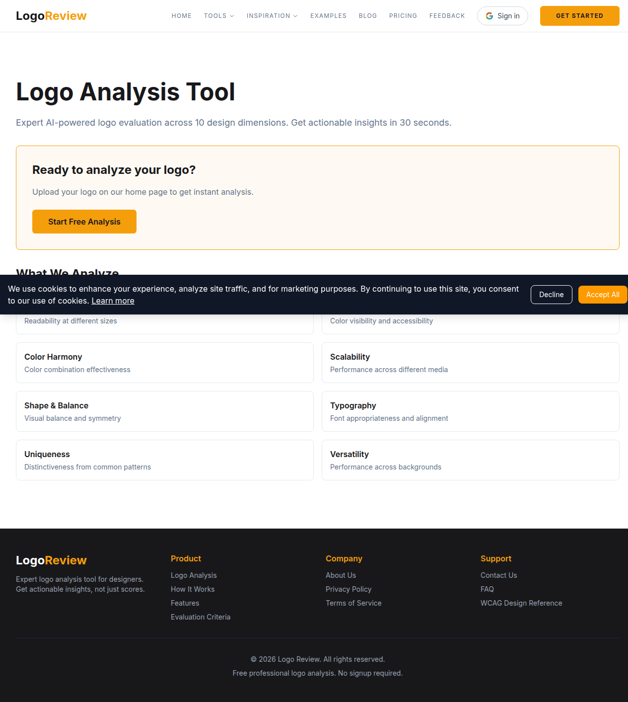
The Logo Review Tool can help you organise that first pass across visual clarity, contrast and accessibility, colour harmony, scalability, shape and balance, typography, uniqueness, versatility, application, and commercial value. Try the Logo Review Tool with your existing logo, then use the findings to decide whether you need a small refinement, a clearer usage system, or a broader identity review.
For more practical reading, continue with logo evaluation criteria, logo inspiration examples, and how Logo Review works.
Frequently Asked Questions
What makes a logo "good"?
A good logo is clear at a glance, recognisable at small sizes, distinctive from competitors, and usable across all the backgrounds and contexts where your brand appears. Personal taste matters less than performance in real-world conditions.
How do I test if my logo is scalable?
Export it at 16px (favicon size), 32px (app icon), 64px (social avatar), and a large display size. If thin strokes disappear or elements merge at small sizes, you may need a simplified variant — not necessarily a full redesign.
Should my logo work in black and white?
Yes. If the shape loses its identity when colour is removed, colour is doing too much of the work. A strong logo should be recognisable in monochrome, on light and dark backgrounds, and in colour-blindness simulations.
How is this different from the Logo Review Tool?
This checklist is a manual guide for evaluating your own logo. The Logo Review Tool automates the process across ten dimensions — visual clarity, contrast, colour harmony, scalability, typography, uniqueness, and more — and gives you a structured report in about 30 seconds.
Do I need a new logo if mine has issues?
Not always. File quality, spacing, contrast, and missing variants are fixable production problems. Strategic issues — resembling a competitor, attracting the wrong audience, or no longer fitting your category — may require a broader redesign conversation.