Logo Review Guide
How to Test a Logo Before Launch: A Practical Guide
A launch checklist for finding the problems that only appear when a new identity leaves the presentation board and enters real screens, print, signage, and social profiles.
Begin with the launch brief
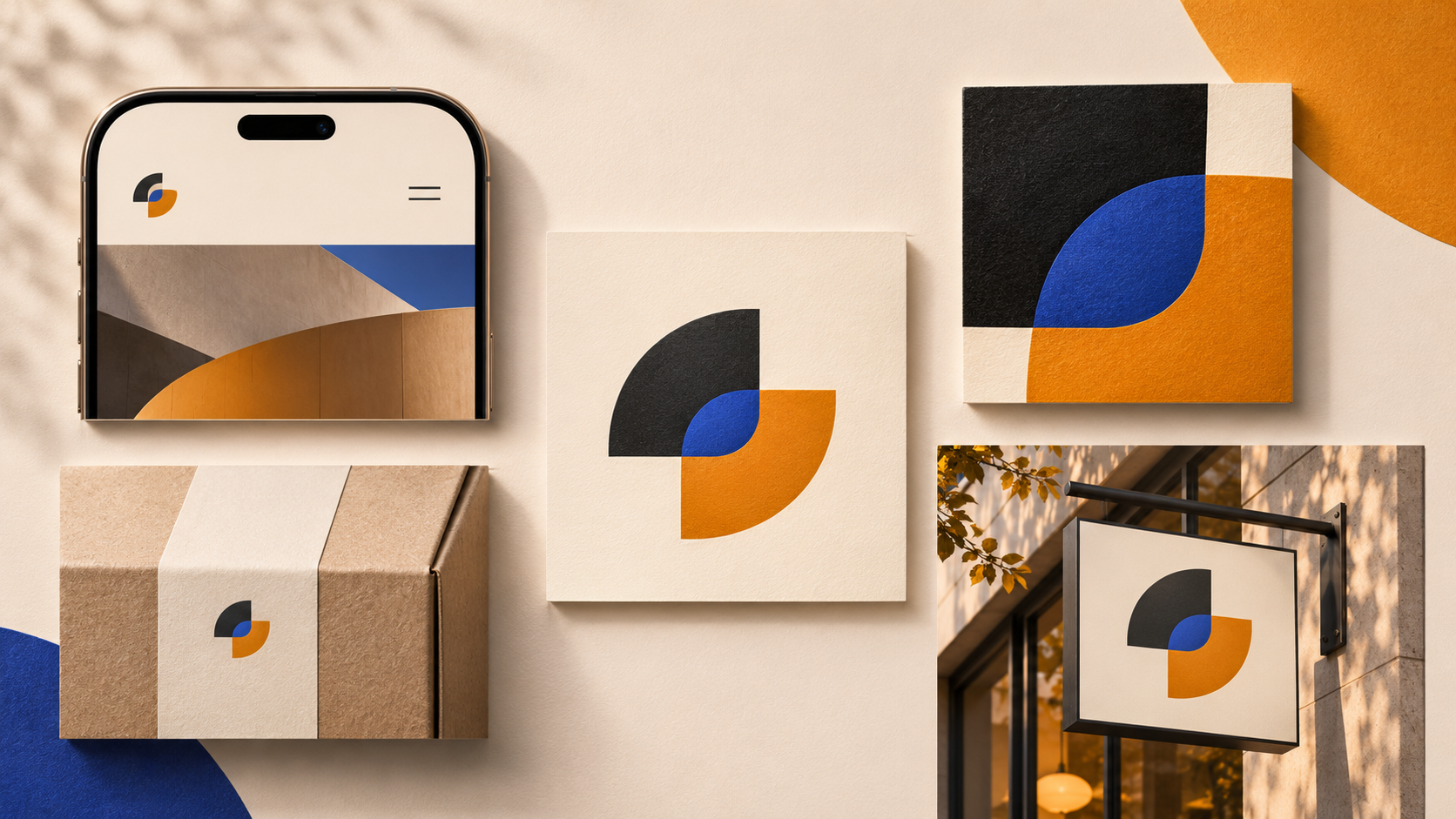
Before opening a design file, list the first five places the logo must work. A product website, mobile header, social avatar, printed invoice, and storefront sign create different constraints. Write the minimum size, background, production method, and viewing distance for each. This turns “does it look good?” into a set of observable questions.
Also define what success means. The mark may need to be recognisable, readable, technically reproducible, or simply consistent with an existing system. Those are related but not identical goals. The Logo Evaluation Criteria can provide a shared vocabulary for the review.
Run the first-read and distance tests
Show the logo for two or three seconds, hide it, and ask what the viewer noticed. Do not explain the concept before collecting the answer. Then test the mark at the smallest important size and at the distance of the primary sign or screen. Check whether the silhouette, name, and intended emphasis survive without a verbal tour.
Repeat with someone who has not been part of the project. Familiarity makes designers and founders unconsciously fill in missing information. If new viewers consistently describe the wrong focal point, record the observation rather than defending the intention.
Test size, colour, and contrast
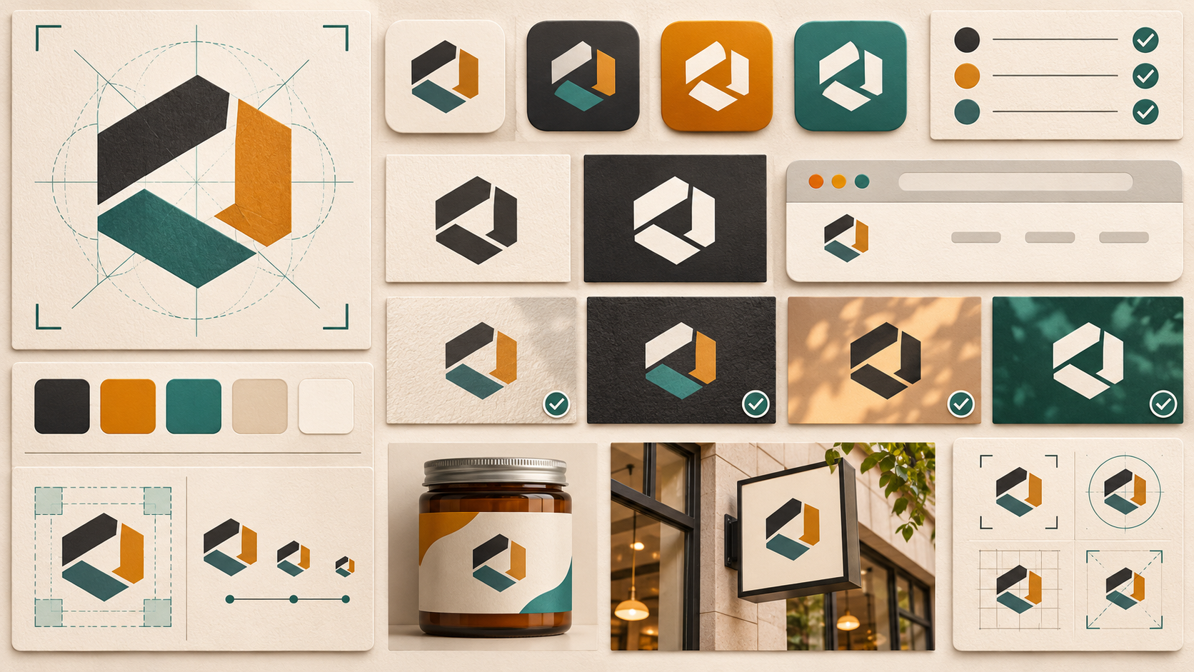
Prepare a grid at 16, 24, 32, 64, and display sizes. Inspect closed counters, thin strokes, tiny type, spacing, and the boundary between symbol and wordmark. Then remove colour: solid black, solid white, and grayscale often reveal details that were only legible because adjacent colours separated them.
Place the artwork on the actual light and dark surfaces it will use. A contrast checker can help, but context still matters: texture, glare, compression, distance, and surrounding content change perception. If a version fails, create a documented alternative rather than asking production teams to improvise.
Review the identity system, not just the master file
Confirm that the handoff includes vector artwork, web-ready exports, a full lockup, a compact lockup or symbol, one-colour versions, and practical clear-space guidance. Check that variants share the same proportions and visual gesture. A responsive identity is not a collection of unrelated redraws; it is a controlled set of assets for known constraints.
Test the files as a production teammate would use them. Open the exports, check transparent edges, inspect colour mode, place them on a real layout, and make sure filenames and dimensions are understandable. Many launch failures are handoff failures rather than design failures.
Turn findings into a launch decision
Sort observations into launch blockers, refinements, and future improvements. A blocker is a failure in a critical use case, such as unreadable navigation text or a symbol that disappears on the required avatar. A refinement might be spacing or export cleanup. Future work can include secondary applications that are not part of launch.
Retest the weakest application after every meaningful change. For a structured second opinion, use the Logo Review tool, and compare the process with the pre-launch evaluation guide. The aim is a defensible decision, not a perfect score.
Frequently asked questions
What is the most important logo test before launch?
Start with the smallest important application and the first-read test. If the mark loses its identity at the size or distance customers will actually see, polish and colour will not solve the underlying problem.
Should I test my logo in colour only?
No. Test full colour, grayscale, solid black, and reversed white. One-colour tests reveal reliance on gradients or colour separation, while reversed tests expose weak counters and contrast.
How many people should review a logo before launch?
A small, relevant group is more useful than a large popularity vote. Include someone close to the brief, someone unfamiliar with the project, and people who understand the primary applications. Record observations separately before discussing them.
Does a logo need to pass every test to launch?
No design is context-free. Define launch-critical conditions, document known limitations, and prepare variants when the primary artwork cannot cover every use. A clear exception is safer than silently shrinking or recolouring the mark.