Logo Review Guide
Why Does My Logo Look Unprofessional?
Why does your logo look unprofessional? Diagnose weak typography, spacing, consistency, exports, and real-world fit before deciding whether a redesign is needed.
A practical diagnosis for founders, marketers, and designers
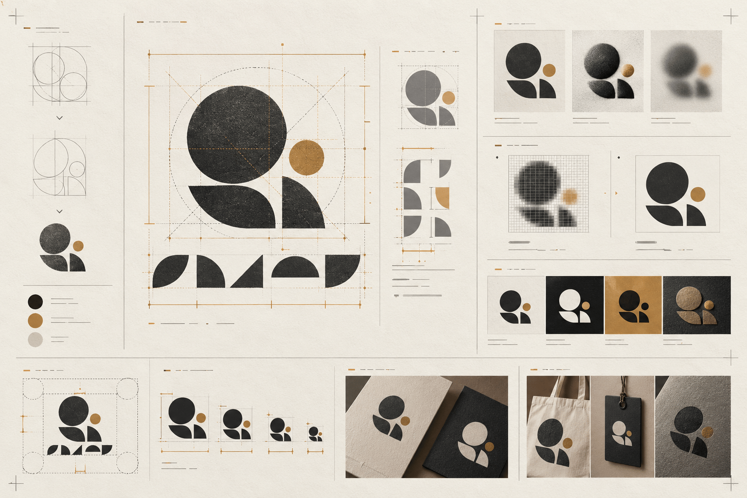
A logo can look unprofessional without having one obvious flaw. The impression often comes from several small signals: weak hierarchy, uncontrolled spacing, generic typography, poor contrast, incomplete file versions, or a visual style that does not fit the brand. Diagnose the visible cause before replacing the whole identity.
“Unprofessional” is a reaction, not a diagnosis
Treat the reaction as a useful starting signal. Ask what a viewer can actually see: Does the name disappear at small size? Does the icon overpower the wordmark? Does the file look blurry? Does the style promise a level of formality the product does not deliver? A specific observation gives you a testable next step.
Seven common reasons a logo looks amateur
1. The hierarchy is unclear
A logo should give the eye a sensible first read. If the symbol, name, tagline, and decorative details all compete, the mark can feel improvised. Test the primary lockup at its normal viewing distance and decide what should be noticed first. Reduce secondary detail or establish a clearer scale relationship before adding effects.
2. The typography looks like untouched text
A familiar typeface is not automatically a problem. The warning sign is a wordmark that looks typed rather than designed: default tracking, awkward kerning, inconsistent weight, or letterforms that conflict with the intended character. Inspect specific letter pairs and the relationship between the type and symbol. Small spacing or weight adjustments may be enough.
3. Spacing and alignment are accidental
A symbol can sit too high beside the name, a tagline can use a different visual axis, or clear space can change between exports. These details are easy to miss on an artboard and obvious in actual use. Check optical balance, not only bounding-box alignment, and define repeatable distances for each approved lockup.
4. Colour and effects hide a weak core
Shadows, outlines, gradients, and textures can make a presentation look finished while making the identity harder to reproduce. Remove the effects and test the mark in one colour, reversed use, and grayscale. If the silhouette or wordmark collapses, strengthen the underlying form before treating the effect as the solution.
5. The files are not production-ready
A good drawing can still look unprofessional when the only available asset is a blurry screenshot, a badly cropped raster, or a file with the wrong background. Keep an editable vector master and practical light, dark, one-colour, horizontal, stacked, and icon-only versions where the applications require them. Inspect exports at their real dimensions, not only zoomed in.
6. The mark uses a familiar shortcut without a point of view
A leaf, globe, shield, crown, swoosh, or abstract initial can signal a broad category while still looking interchangeable. Compare five to ten relevant competitors at the same size and hide the names if possible. Distinctiveness does not require making the logo strange; look for one ownable relationship—a silhouette, proportion, letterform, or construction rule—that survives in real use.
7. The visual language does not fit the brand
A playful display treatment may be wrong for a service that needs to communicate precision. A luxury-coded mark may feel disconnected from an accessible product. A highly detailed symbol may work on a poster but fail in a mobile header. Review the logo against the audience, offer, category, and priority applications rather than applying a universal idea of “professional.”
A practical diagnostic sequence
- Define the logo’s job, audience, priority applications, and intended character.
- Show the mark briefly without explaining the concept. Record what is noticed first and what disappears.
- Test the primary lockup at small, medium, and large sizes, plus light, dark, and one-colour backgrounds.
- Inspect typography, spacing, visual weight, contrast, and the relationship between icon and name.
- Compare the mark beside relevant competitors at the same size. Look for interchangeable category cues.
- Check the actual source files, exports, transparency, padding, and colour versions.
- Sort findings into Keep, Refine, and Reconsider. Choose the smallest change that addresses the highest-impact issue.
- Retest the revision in the same applications and conditions.
When a redesign is—and is not—needed
Fix the assets when the mark is sound but blurry, badly cropped, or missing useful variants. Refine the system when the main issue is typography, spacing, contrast, hierarchy, or application rules. Consider a broader identity change when the logo repeatedly mismatches the audience, cannot be distinguished in its category, or no longer represents the business it serves.
The Logo Evaluation Criteria page offers a broader framework for clarity, distinctiveness, scalability, and application fit. For a structured second opinion, try the Logo Review Tool; treat its output as review prompts, not a guarantee of business performance.
If the mark feels interchangeable, compare the diagnosis with why a logo looks generic. For a category-specific exercise, see the restaurant logo review example.
Factual basis
This guide uses observable design-review practices: first-read testing, size and one-colour checks, typography and spacing inspection, competitor comparison, application review, and production-file checks. The right decision still depends on the intended audience, brand requirements, and reproduction process.
Frequently asked questions
Why does my logo look unprofessional?
The impression often comes from a combination of unclear hierarchy, uncontrolled typography or spacing, weak contrast, poor exports, or a mismatch between the visual language and the brand context.
What should I check first?
Start with the logo’s job and first read, then test hierarchy, typography, spacing, contrast, and the smallest important application.
Do I need to redesign the logo completely?
Not necessarily. Separate asset and production problems from system and identity problems, choose the smallest useful change, and retest it in context.