Logo Review Guide
Why Your Logo Looks Generic (and How to Make It More Distinctive)
Why does your logo look generic? Learn how to diagnose weak distinction, vague meaning, and poor application fit—and choose focused improvements with a practical Logo Review process.
A practical diagnosis for founders, brand leads, and designers
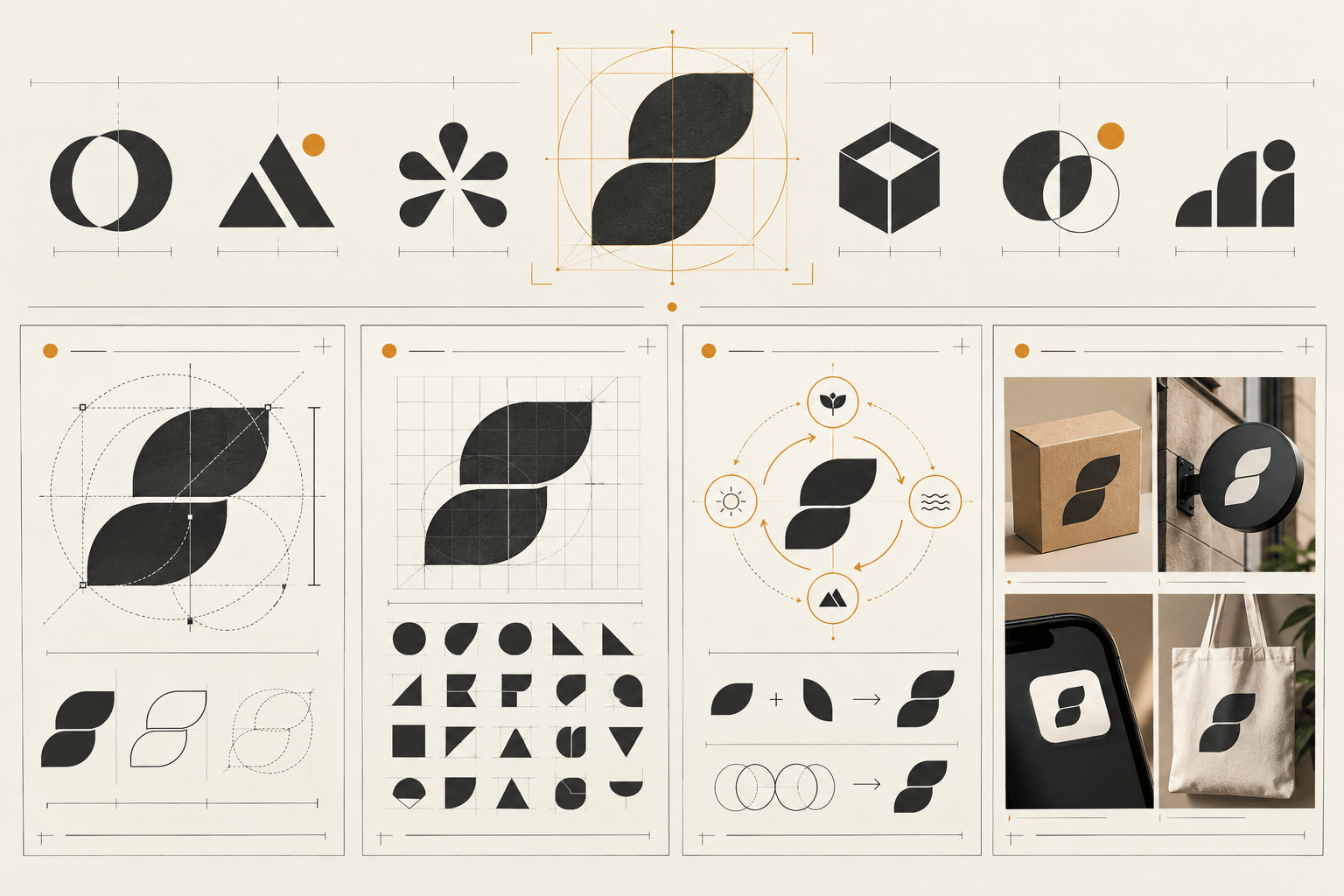
A logo can be polished, balanced, and professionally produced while still looking generic. The problem is not that it resembles one other logo in isolation. It is that, in the category where people encounter it, the mark does not give them a reliable reason to recognise it again.
This often happens after a sensible design process. A team chooses a familiar symbol, a clean sans serif, a safe colour palette, and a style that feels appropriate for the market. Together, those decisions may communicate the category but not the brand. The useful question is not “How do we make it more unusual?” It is “Which observable feature could make this logo more identifiable without making it less clear or usable?”
What “generic” actually means in a logo review
“Generic” is often used as a vague reaction. For a useful diagnosis, define it more narrowly: the logo shares so many visible cues with nearby alternatives that a viewer has difficulty identifying it without the brand name or category context. Those cues can include the same symbol family, similar proportions, familiar geometric construction, interchangeable typography, repeated colour combinations, or an identical relationship between icon and wordmark.
A leaf is not automatically generic. Neither is a circle, monogram, shield, gradient, or lowercase wordmark. The concern is the pattern of similarity and the absence of a feature that remains recognisable. This distinction prevents an overcorrection: a logo does not become stronger merely because it is strange or difficult to understand. Distinctiveness must work with clarity, legibility, meaning, and real applications.
Four reasons an existing logo may blend in
1. It uses a category shortcut without a brand-specific treatment
Many industries have visual shorthand: a leaf for sustainability, a spark for technology, a shield for security, or a speech bubble for communication. Such symbols can help a viewer understand the broad category quickly. They become weak when the treatment is interchangeable with dozens of competitors. Place five to ten direct competitors in a row at the same size, hide the names if possible, and record repeated shapes, type styles, colour relationships, and icon-to-wordmark arrangements. If the only answer is the colour, develop the structure, silhouette, letterform detail, or relationship between elements before adding decoration.
2. The logo says what the category is, but not what this brand is like
A literal symbol can explain an offer while leaving no room for personality. A generic cloud may suggest software; it does not necessarily suggest a careful workflow, a bold challenger, or a calm expert. Write down three to five qualities the brand needs to communicate in its priority context. Review type, proportion, colour, spacing, and symbolism as a system. Do they support those qualities, or merely confirm the category? A logo should create a coherent cue that the wider brand experience can reinforce, not illustrate every service.
3. The distinctive detail disappears in actual use
Sometimes a logo has a promising feature at large size, but that feature vanishes in a website header, social avatar, browser tab, invoice, or product interface. Thin strokes merge, counters close, and a small internal shape becomes noise. Test the logo at the smallest important size and on the backgrounds where people will encounter it. Check the icon, wordmark, and full lockup separately, including one-colour use. The answer may be a compact lockup, simplified symbol, or clearer wordmark—not a complete redesign.
4. Every element is familiar, but the combination has no hierarchy
A logo can accumulate safe decisions: a common icon, a popular typeface, a standard gradient, a rounded container, and a tagline. None is automatically wrong. When all elements compete equally, the viewer has no clear first read and the mark becomes a dense bundle of familiar parts. Remove or quieten one element at a time. Distinctiveness often comes from a deliberate relationship—an unusual proportion, a memorable cut in a letter, a specific overlap, or a consistent spacing rule—rather than another object.
A practical diagnosis before you redesign
- Define the job: name the audience, priority applications, viewing conditions, and whether the decision is keep, refine, or reconsider.
- Build a comparison row: collect direct competitors and adjacent alternatives at the same size and viewing conditions.
- Run a first-read test: show the mark briefly without explaining the concept and record what stands out first.
- Mark the repeatable feature: identify the silhouette, proportion, letterform, colour relationship, or construction detail that could carry recognition.
- Test meaning and fit: ask what expectation the logo creates before supporting copy is read.
- Test real applications: use the website header, social profile, mobile interface, documents, packaging, signage, or other priority contexts.
- Choose the smallest useful change: separate production fixes, hierarchy changes, system variants, and strategic changes.
- Retest the revision beside the same competitors and back in the same applications.
The Logo Evaluation Criteria page provides a broader framework for reviewing clarity, distinction, scalability, and application fit. Use it to keep the conversation specific rather than treating “generic” as a score or personal verdict.
How to make a logo more distinctive without making it worse
Start with one high-value change. A more ownable silhouette may help more than an extra colour; an edited wordmark may be more memorable than a new symbol. Preserve what already works. If the logo is legible, scalable, and appropriate but blends in, explore focused directions: refine the shape, alter a proportion, create a specific letterform detail, simplify competing elements, or develop a responsive system. Test every direction in context.
Avoid borrowing recognisability from another brand. Do not imitate a competitor’s signature shape, colour pairing, or construction and call the result differentiation. Distinction should come from the brand’s own positioning and a repeatable visual decision the team can apply consistently. For a labelled application example, compare the Restaurant Logo Review example, a fictional sample rather than a customer result.
Use a review tool as a second opinion
When your own comparison is complete, try the Logo Review Tool to organise a structured first pass. Treat its output as prompts for discussion, not proof that a mark will perform a particular way. Apply your audience, category, production constraints, and real applications before deciding what to change. For adjacent reading, see What Makes a Good Logo?, How to Critique a Logo, and Logo Design Checklist.
A generic-looking logo is not automatically a failed logo, and a distinctive logo is not automatically useful. The goal is a recognisable core, an appropriate signal, and enough flexibility for real use. Diagnose the source of similarity, make the smallest useful change, and test again.
Factual basis
This guide uses observable design-review practices: comparing competitors at the same scale, testing a mark in colour and one colour, checking applications, and separating visual observations from strategic judgement. For surrounding interface text and content, consult the W3C Web Content Accessibility Guidelines. Recommendations should be verified against the intended audience, brand requirements, and production process rather than treated as universal performance claims.
Frequently asked questions
Why does a logo look generic even when it is professionally designed?
A professionally produced logo can still look generic when its symbol, typography, colour relationship, and proportions repeat familiar category patterns without a recognisable brand-specific feature.
How can I tell whether my logo is actually too generic?
Place it beside five to ten direct competitors at the same size and hide the names. If the mark blends into the group and you cannot identify a repeatable silhouette, letterform, proportion, or colour relationship, it needs a stronger distinction.
Should I redesign a generic logo completely?
Not necessarily. First separate production problems from identity problems. A focused change to the silhouette, wordmark, hierarchy, or responsive variant may improve recognition while preserving parts that already work.
Can a logo be distinctive and still easy to understand?
Yes. Distinctiveness should work with clarity, legibility, meaning, and application fit. The goal is not unusual decoration; it is a memorable visual decision that survives real brand contexts.