Logo Review Guide
Why Your Logo Looks Cheap (and How to Fix It)
Why does your logo look cheap? Learn how to diagnose weak typography, spacing, effects, production quality, and brand fit before you redesign with confidence.
A practical diagnosis for founders, brand leads, and designers
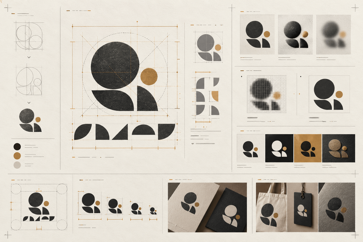
A logo can look cheap even when it was professionally drawn. The feeling usually comes from a group of small signals: awkward spacing, default-looking typography, effects that do not reproduce well, a low-quality export, or a presentation that makes the mark harder to judge.
“Cheap” is a subjective reaction, but it can still be reviewed objectively. Instead of asking whether a logo feels premium, identify the visible choice creating that impression. Is the wordmark difficult to read? Does the symbol rely on a stock visual shortcut? Does a gradient disappear in print? Does the logo look acceptable only in one carefully prepared mock-up?
This guide turns that reaction into a practical diagnosis. It is for reviewing an existing logo or draft before deciding whether to refine it, rebuild its assets, or start a broader identity project.
What people usually mean by “cheap-looking”
People rarely mean that a logo lacks expensive software or a large design budget. They usually notice a mismatch between the impression the brand wants to create and the cues the logo actually sends.
A professional-services firm may want to feel considered and dependable, but its logo may use cramped type, an unbalanced icon, and a bright effect that resembles a template. A consumer brand may want to feel approachable, but its wordmark may be so thin and decorative that it becomes difficult to use. In both cases, the problem is not a universal rule that one style is bad. It is a failure of fit, control, or application.
Review the logo in the context where people will meet it. A mark that feels polished on a large presentation slide may feel unfinished in a browser tab, social avatar, invoice, product header, storefront, or printed document. Quality is not only the drawing; it is the consistency of the system around it.
Six reasons a logo can look cheap
1. The typography looks untouched
A common typeface is not automatically a problem. Many strong wordmarks begin with an existing typeface. The warning sign is a wordmark that looks as if the type was typed, not designed: default tracking, unconsidered kerning, generic letter shapes, or a font choice that does not support the brand’s intended character.
Inspect the spaces between specific pairs of letters rather than judging the whole word at once. Check the relationship between the wordmark and symbol. Does the name feel too wide, too narrow, heavy, light, high, or low beside the icon? Are the capitals, terminals, and counters consistent with the brand’s tone?
A focused fix may include customising one or two letterforms, adjusting spacing, changing the weight, or choosing a more appropriate type treatment. It does not necessarily require an elaborate custom font. The aim is controlled typography that belongs to the mark and remains readable in real use.
2. The spacing and alignment feel accidental
Small alignment problems can make a logo feel unfinished faster than an unconventional style can. The symbol may sit slightly too high beside the name. The clear space may change from one export to another. A tagline may be centred against the wrong visual axis. Elements may be mathematically aligned but optically unbalanced.
Review the logo in its primary lockup and in the versions people actually need: horizontal, stacked, icon-only, light, dark, and one-colour. Look for a repeatable spacing rule between the symbol, wordmark, and supporting text. Check whether the visual weight—not only the bounding boxes—feels aligned.
Do not solve every imbalance by adding a container, shadow, or extra decoration. First test the distances, scale relationships, baseline, and hierarchy. A quiet correction to spacing often improves perceived quality more than a new visual effect.
3. Effects are doing work the design cannot support
Gloss, bevels, drop shadows, heavy outlines, metallic gradients, and intense colour transitions can make a logo feel polished in one context and dated or improvised in another. The issue is not that effects are always forbidden. It is that an effect can hide a weak silhouette, create reproduction problems, or become the most noticeable part of the mark.
Test the logo in full colour, grayscale, one colour, and reversed applications. Remove the effect temporarily. If the symbol or wordmark loses all structure when the gradient disappears, the core needs attention. If the outline changes the apparent weight of the letters, the underlying spacing may need to be corrected.
Keep expressive treatments as an optional presentation layer when appropriate. The primary identity should have a resilient version that remains recognisable without relying on lighting, texture, or a particular background.
4. The symbol is familiar but not specific
A generic swoosh, globe, lightbulb, crown, shield, leaf, or abstract initial may communicate a broad category while making the brand easy to confuse with alternatives. Familiarity is not the same as credibility. A symbol can look cheap when it appears selected from a template rather than developed from a clear brand idea.
Compare the mark with direct competitors and adjacent alternatives at the same size. Hide the names if possible. Record repeated silhouettes, proportions, colour pairings, and symbol-to-wordmark arrangements. Then identify what, if anything, would help someone recognise this mark a second time.
The answer does not have to be an unusual illustration. It might be a more ownable proportion, a specific cut in a letter, a coherent construction rule, or a distinctive relationship between the icon and name. Avoid copying a competitor’s signature feature in the attempt to look more premium.
5. The files and exports are visibly poor
Sometimes the logo itself is sound, but the available asset makes it look cheap. A blurry raster file, visible compression, jagged edges, accidental white background, incorrect colour profile, or inconsistent padding can damage the mark wherever it appears.
Check the source and delivery files. Keep an editable vector master, transparent raster exports at appropriate sizes, light and dark versions, a one-colour version, and clearly named files. Inspect the mark at the actual dimensions used in the website header, social profile, email signature, document, packaging, or print piece. Do not judge quality only from a zoomed-in artboard.
Production readiness is part of brand quality. A well-drawn logo cannot stay consistent if every team member has to crop a screenshot or recreate it from memory.
6. The logo promises the wrong kind of quality
A logo may look cheap because its visual language conflicts with the offer or audience. A playful display style can feel careless for a service that needs to communicate precision. A luxury-coded treatment can feel unconvincing when the product experience is practical and accessible. A highly detailed symbol may suggest craft while failing the digital contexts where the business actually operates.
Review typography, colour, proportion, symbolism, and application together. Ask what a reasonable viewer might expect before reading the supporting copy. Compare that expectation with the brand’s real offer, audience, price context, and intended character.
This is not an argument for making every logo restrained, minimalist, or expensive-looking. A bold or playful mark can be appropriate. The question is whether the choices are deliberate and coherent rather than borrowed from a visual trend.
A practical review before you redesign
Use this sequence to separate a correctable presentation issue from a deeper identity problem:
- Define the job. List the audience, priority applications, viewing conditions, and the impression the logo needs to support.
- Collect the real assets. Include the vector master, wordmark, icon, colour variants, exports, and any usage guidance. Note what is missing.
- Run a first-read test. Show the logo briefly without explaining the concept. Record what is noticed first and what disappears.
- Remove the effects. Compare the core mark in one colour, grayscale, and reversed use. Identify which features survive.
- Check typography and spacing. Review kerning, weight, alignment, clear space, hierarchy, and the relationship between icon and name.
- Compare the category. Place direct competitors and adjacent alternatives at the same size. Look for interchangeable cues and a repeatable point of distinction.
- Test the smallest important use. Check the favicon, social avatar, mobile header, document, or other compact context. Then test the largest relevant application.
- Check production quality. Inspect edges, transparency, colour, padding, export dimensions, and print or screen reproduction.
- Choose the smallest useful change. Separate asset fixes, spacing changes, system variants, visual refinements, and strategic concerns.
- Retest the revision. Put the change in the same contexts and beside the same alternatives. Confirm that the original problem is easier to describe and observe.
The Logo Evaluation Criteria page provides a broader framework for reviewing clarity, distinction, scalability, and application fit. Use it to keep feedback specific instead of treating “cheap” as a final verdict.
How to make a logo look more considered
Start with control rather than decoration. Correct the wordmark spacing, establish a clear hierarchy, simplify a crowded lockup, or prepare the missing production variants. These changes may be less dramatic than a new concept, but they often address the visible source of the problem directly.
Then check the idea behind the mark. If every element is familiar and no feature survives at small size, a focused identity refinement may be more useful than polishing the presentation. Preserve what already works—legibility, scalability, recognisable meaning, or a useful category signal—while developing one stronger point of distinction.
Finally, build consistency around the logo. Define clear space, minimum use conditions, colour versions, background rules, and approved lockups. A logo feels more credible when the system makes correct use easy and prevents improvised substitutes.
For an example of how application context changes a review, compare the Restaurant Logo Review example. It is a fictional sample, not a customer result. For the broader question of whether a mark is working, read What Makes a Good Logo?. If the main concern is category similarity, see Why Your Logo Looks Generic.
Use a review tool as a second opinion
When your own review is complete, try the Logo Review Tool to organise a structured first pass. Treat its output as prompts for discussion, not proof that a logo will produce a particular business result. Apply your audience, category, production constraints, and actual applications before deciding what to change.
A logo does not need to look expensive to be effective. It needs to look deliberate, appropriate, recognisable, and usable wherever the brand appears. Find the visible source of the cheap-looking impression, fix the highest-impact issue first, and retest before commissioning a full redesign.
Factual basis
This guide uses observable design-review practices: comparing category alternatives at the same scale, testing a mark with and without effects, checking typography and spacing, reviewing real applications, and inspecting production files. Recommendations should be verified against the intended audience, brand requirements, and reproduction process rather than treated as universal rules or performance claims. For surrounding interface text and content, consult the W3C Web Content Accessibility Guidelines.
Frequently asked questions
Why does a logo look cheap even when it was professionally designed?
The impression often comes from a combination of uncontrolled typography, spacing, effects, weak exports, or a mismatch between the visual language and the brand context.
What should I check first when a logo looks cheap?
Start with typography, spacing, and alignment, then compare the mark without effects and inspect the actual files and applications where people will see it.
Do I need to redesign the logo completely?
Not necessarily. Separate production and presentation fixes from identity problems, then choose the smallest useful change and retest it in context.