Demonstration Case · Sample Logo Review
Logo Too Complicated Review: A Sample Analysis
A worked example of how a mark can become harder to recognize when every surface carries a border, texture, caption, and secondary symbol.
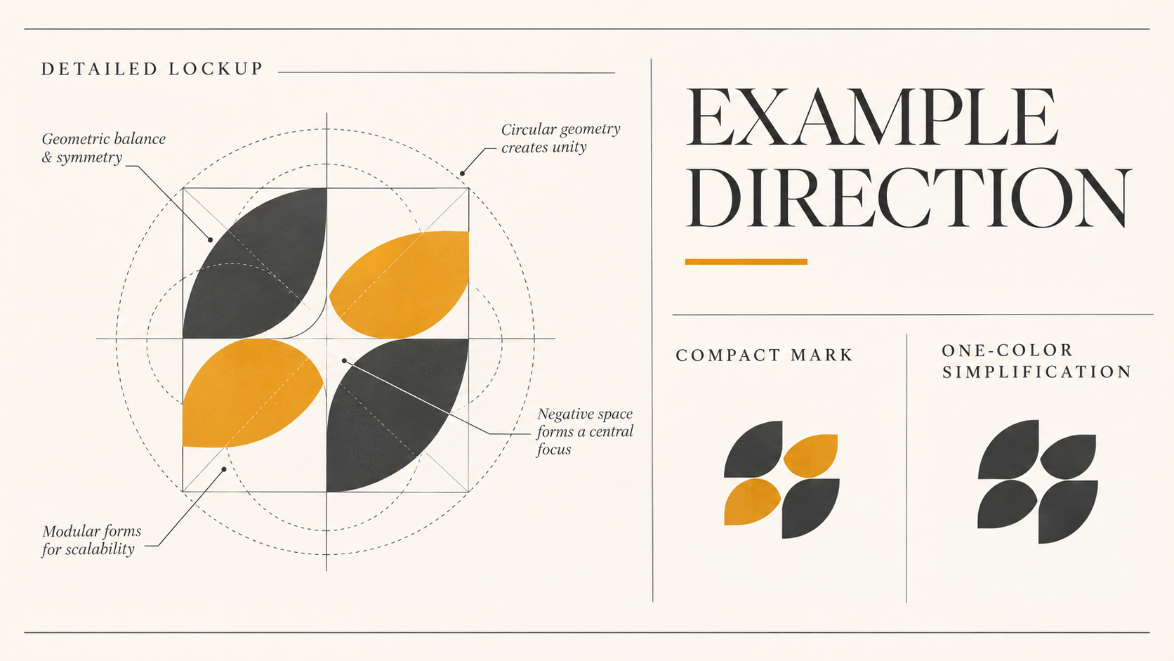
Before: when every detail asks for attention
This sample identity combines a circular badge, an outlined emblem, a three-part symbol, a curved name, a tagline, two accent colors, and several highlights. At poster size, the richness feels intentional. At the size where people actually encounter a brand, the parts merge into a busy outline. The viewer sees “a complicated badge” before seeing the brand name or remembering the symbol.
That distinction matters. Complexity is not automatically bad; detail can create character, heritage, or a premium cue. The problem begins when the logo has no hierarchy. If the most important idea is the same visual weight as a supporting flourish, the eye has no reliable first read.
Context: the applications expose the problem
The sample mark needs to work in a website header, social avatar, browser tab, presentation cover, printed label, and a single-color stamp. Each context removes some of the room that made the original composition feel comfortable. Small text becomes a line, thin gaps close, and the outer border competes with the silhouette.
For a fair review, compare the same artwork at 16, 32, 64, and display sizes. Repeat the test in black, white, and grayscale. Then place it beside relevant competitors at equal size. A logo that is technically legible but impossible to distinguish in a row may need a stronger ownable shape rather than additional decoration.
Review snapshot: three signals of excess complexity
Clarity. There are several plausible focal points, so the first read changes with scale. Scalability. Fine counters and the tagline disappear before the main silhouette becomes recognizable. Versatility. The full lockup has no prepared icon-only, compact, or one-color relationship, so every use is forced to carry every element.
This is a qualitative demonstration using the same kind of questions organised by the Logo Evaluation Criteria. It is not a numeric score and does not claim a customer outcome.
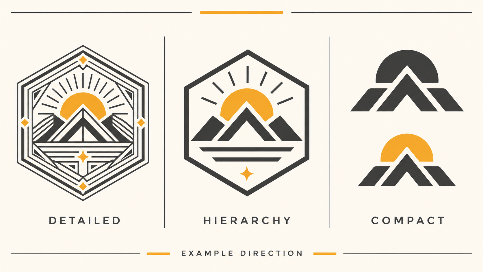
Top 3 problems and recommended changes
1. The symbol has too many nested parts. Remove the least ownable outlines first and preserve one gesture that can survive as a solid shape. 2. Supporting type is doing primary work. Separate the tagline from the logo asset and let the name carry recognition at small sizes. 3. The identity has one size. Build a responsive family: full lockup for spacious layouts, compact lockup for medium widths, and a symbol for avatars and favicons.
After each change, return to the weakest use case rather than judging only the large presentation. If simplification makes the mark generic, restore a single distinctive proportion, cut, or negative-space move. The goal is not minimalism for its own sake; it is a clear hierarchy with fewer elements competing at once.
After: a flexible direction, not a delivered redesign
In this sample direction, the outer badge is removed from the compact mark, the central symbol becomes a bold silhouette, and the wordmark receives enough space to read without the tagline. The full version still exists for editorial or packaging moments, while a one-color version handles stamps and constrained production. These are illustrative recommendations only, not a client result.
To continue, compare the direction with the guide to recognising a logo that is too complicated, then run your own file through the Logo Review tool. The tool can organise the questions; the final design decision still belongs to the brand team.
Frequently asked questions
How can I tell whether a logo is too complicated?
Test the mark at small size, in one color, and for a few seconds. If the silhouette disappears, the wordmark becomes a texture, or the viewer needs an explanation to identify the main idea, the logo is carrying more detail than the application can support.
Should I remove every detail from a complex logo?
No. Remove or reorganize details according to their job. Keep a distinctive gesture, preserve useful character, and create compact or one-color variants for constrained contexts instead of flattening the identity into a generic shape.
What should be simplified first?
Start with details that disappear first or compete with the main read: tiny text, thin outlines, nested borders, extra highlights, and decorative texture. Then retest the silhouette, spacing, and relationship between symbol and wordmark.
Can a logo review recommend simplification without redesigning it?
Yes. A review can separate production fixes from strategic changes. Clear-space, contrast, export, and responsive-variant issues may be solved without replacing the core mark; a redesign is only one possible direction.