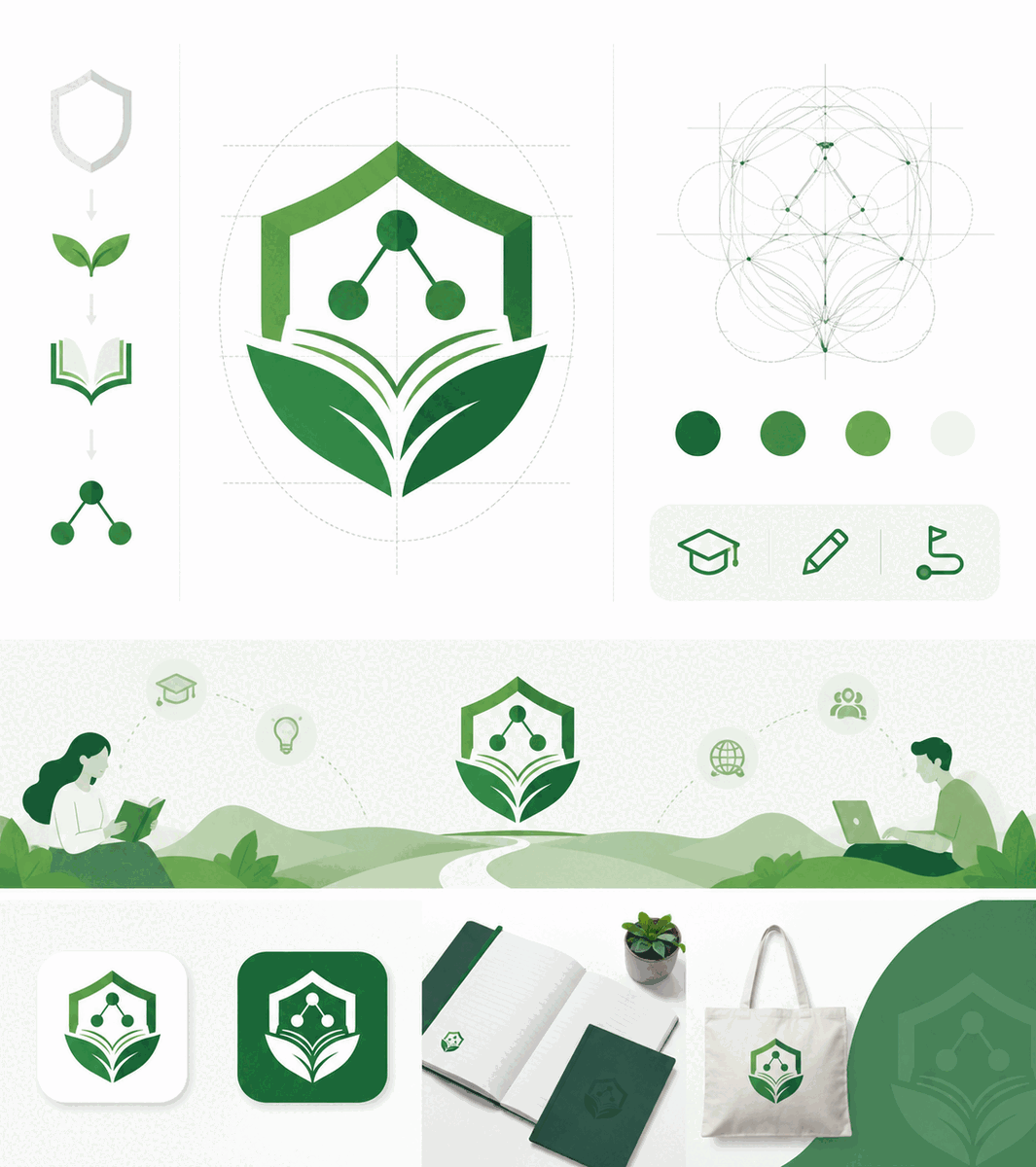
01 · Design Philosophy
One Leaf, A Universal Language
When Salman Khan began tutoring his cousin in mathematics over Yahoo Doodle in 2004, there was no logo — just a man, a screen, and a commitment to making knowledge accessible. The visual identity that would eventually represent that mission underwent three radical transformations, each stripping away complexity to arrive at a simpler, more universal statement. The current Khan Academy logo — a teal hexagon containing a white stylized symbol — is the culmination of that journey toward minimalism with meaning.
The symbol inside the hexagon is deliberately ambiguous. At first glance, it reads as two leaves sprouting from a seed, a direct descendant of the leaf motif Khan Academy has carried since 2012. Look again, and the circle at the top becomes a head, the leaves become arms, and the shape transforms into a student hunched over an open book. This dual interpretation is not accidental. It encodes the organization's two core values: growth and learning.
The decision to retain the leaf through every redesign reveals a brand that understands the power of consistency. While the container changed from a hand-tree to a standalone leaf to a hexagonal frame, the core metaphor never wavered. A leaf is universally understood across cultures and languages. It requires no translation. For an organization operating in over 50 languages across 190 countries, that universality is not an aesthetic preference — it is an operational necessity.
Logo Type
Dual-Interpretation Symbol
Hexagon containing a leaf-and-student motif in negative space
Core Metaphor
Growth + Learning
The leaf represents personal development; the student represents the human element. Both values encoded in a single shape.
Strategic Teal
#14BF96
Blue's credibility with green's growth — positioned between institutional authority and approachable warmth
Academic Navy
#1A2332
Typographic gravitas, grounding the playful symbol with institutional weight and seriousness of purpose
Negative Space White
#FFFFFF
Clarity and dual-interpretation canvas — the same shape reads as leaf, student, or both depending on the viewer
02 · Color Psychology
From Vibrant Green to Strategic Teal
The original Khan Academy leaf was a vibrant, saturated green — the color of fresh foliage, evoking immediate associations with growth, renewal, and vitality. Green carries deep psychological resonance in educational contexts: it signals permission to begin, the safety of a starting line, the promise that something small will become something substantial.
The 2018 redesign shifted the palette to teal — a specific blend of blue and green that occupies a strategic middle ground. Pure blue communicates trust, stability, and institutional authority. Pure green communicates growth, nature, and youth. Teal borrows from both. It carries enough blue to signal credibility and seriousness of purpose, distancing Khan Academy from the juvenile bright greens of children's apps. Yet it retains enough green to feel warm, organic, and approachable.
This color choice also differentiates Khan Academy from competitors. Coursera uses blue. Duolingo uses green. edX uses red. By claiming teal, Khan Academy occupies a distinctive position in the education brand landscape — neither purely academic nor purely playful, but something that bridges both worlds.
03 · Typography
Lato and the Architecture of Approachability
Khan Academy uses Lato, a humanist sans-serif typeface designed by Łukasz Dziedzic in 2010. Humanist sans-serifs derive their proportions from classical inscriptional lettering — the same tradition that produced Roman monumental capitals. This gives Lato a warmth and readability that geometric sans-serifs like Futura or Helvetica cannot match. The rounded letterforms feel open and inviting, reducing the intimidation factor for a struggling learner encountering algebra for the first time.
Pre-2010
Utilitarian Bold Caps
The earliest identity used bold uppercase lettering — "KHAN" stacked above "ACADEMY" with a horizontal divider. No typeface consideration beyond legibility. The design communicated exactly what the organization was: a no-frills educational resource built by a single tutor.
2010–2018
Transitional Wordmark
As Khan Academy gained institutional backing, the wordmark unified into a single horizontal line at consistent character height. The transition from stacked to inline layout signaled professionalization — a resource growing into a platform. The leaf symbol sat to the left, creating a balanced lockup.
2018–Present
Lato Humanist Sans-Serif
The current wordmark uses Lato, a humanist sans-serif by Łukasz Dziedzic. Title case signals accessibility over authority. Rounded letterforms feel open and inviting, reducing intimidation for a struggling learner. Lato extends throughout the platform interface, creating visual continuity between brand and experience.
04 · Historical Evolution
From Hand-Tree to Hexagon
The Khan Academy logo has undergone three radical transformations in fifteen years. Each redesign stripped away complexity — from an intricate hand-tree to a single leaf to an abstract geometric frame — and each time, what remained carried more meaning, not less. This is the story of a brand that discovered the power of subtraction.
2007–2010
The Text Era. The earliest Khan Academy identity was purely typographic. "KHAN" appeared in bold uppercase with "ACADEMY" beneath in lighter weight, separated by a horizontal line. A startup with no design budget, focused entirely on content. No symbol, no metaphor, no color beyond black and white.
2010–2012
The Hand-Tree. With philanthropic backing from the Gates Foundation and Google, Khan Academy acquired its first iconic symbol: a brown hand with green leaves blooming from the fingertips. Emotionally resonant but technically problematic — intricate curves were difficult to scale for mobile icons and favicons.
2012–2018
The Single Leaf. The brand simplified dramatically. The hand-tree was reduced to a single green leaf beside a unified "KHAN ACADEMY" wordmark. Flat design at its purest — one color, one shape, one idea. The leaf became synonymous with the badges and energy points students earned on the platform.
2018–Present
The Hexagonal Leaf. The current logo: a teal hexagon containing a white stylized symbol with dual interpretation — sprouting plant and studying student. The hexagon references a fundamental building block in mathematics, nature, and art. The palette shifted from vibrant green to strategic teal.
05 · Design Highlights
Minimalism as Mission
Six principles explain why the Khan Academy logo has grown more meaningful with each simplification — lessons that any education brand should study.
Strategic Simplification Amplifies Meaning
Each redesign removed elements — the hand, then the tree, then the literal leaf rendering — and what remained became more potent, not less. The current symbol carries more meaning in its negative space than the original hand-tree carried in its explicit imagery.
Hexagonal Frame Provides Context
The standalone leaf was contextually ambiguous — a green leaf could represent agriculture, sustainability, or a grocery store. The hexagon anchors the symbol in a specific domain: mathematics, structure, knowledge. It transforms an organic metaphor into an intellectual one without losing warmth.
Color Discipline Builds Recognition
Khan Academy committed to a single teal hue across every touchpoint rather than adopting the multicolor palette common in education platforms. When a learner sees that specific shade, they think of Khan Academy before reading the wordmark. Color consistency becomes visual capital no campaign can replicate.
Dual-Interpretation Symbol Rewards Attention
A child sees a leaf and feels encouraged. An adult sees a student hunched over a book and feels purpose. A designer sees negative space used with surgical precision. The logo works at every level of literacy — precisely what an education platform serving ages five to eighty-five needs.
Cultural Universality as Operational Strategy
A leaf requires no translation. For an organization operating in over 50 languages across 190 countries, that universality is not an aesthetic preference — it is an operational necessity. The core metaphor has never wavered through three redesigns.
Negative Space as Active Communication
The white symbol inside the hexagon actively encodes the organization's two core values: growth (the leaf) and learning (the student). What you leave out can carry as much meaning as what you put in — a masterclass in restraint that few education brands execute this successfully.
06 · Symbol Geometry
The Architecture of the Hexagon
The Khan Academy symbol is a study in layered meaning. A teal hexagon — referencing a fundamental building block in mathematics, nature, and art — contains a white shape that simultaneously reads as a sprouting leaf and a studying student. The dual interpretation is not a coincidence but a deliberate encoding of the organization's two core values: growth and learning.
Hexagonal Frame
The hexagon references a fundamental building block in mathematics, nature, and art — honeycomb structures, molecular geometry, crystalline patterns. It anchors an organic metaphor in an intellectual domain.
Dual-Interpretation Symbol
The white shape reads as a sprouting leaf (growth mindset) or a student hunched over a book (human learning). Two core values encoded in a single form through negative space.
Strategic Teal
The specific blend of blue and green signals credibility without coldness, growth without juvenility. It differentiates Khan Academy from Coursera (blue), Duolingo (green), and edX (red).
Universal Scalability
The geometric simplicity ensures the mark scales cleanly from a 16-pixel browser favicon to a billboard-sized conference banner, with no loss of recognition across any language or culture.