01 · Design Philosophy
A hand-written letter in a digital category
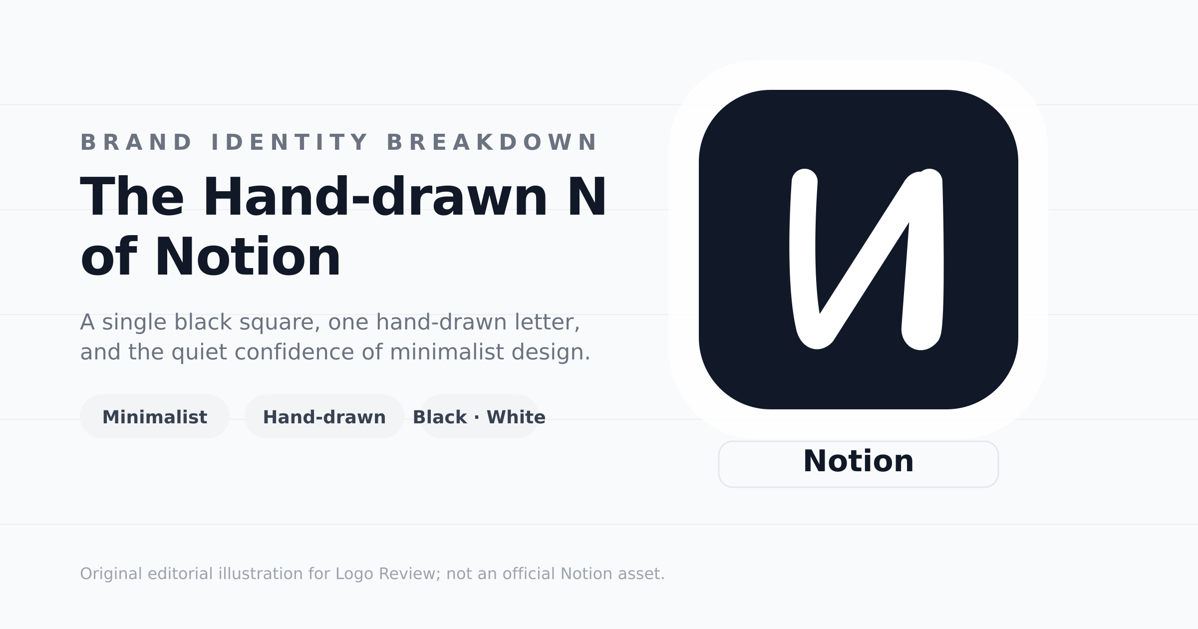
Notion's logo makes an unusual bet for a software company: it uses a letter that looks hand-drawn, not engineered. The black rounded tile holds a single white N whose strokes are deliberately imperfect — slightly uneven weight, a casual diagonal, a human touch. Where most productivity tools reach for geometric symbols or abstract glyphs, Notion reaches for something closer to a note you might jot in a margin.
That choice is the brand philosophy in miniature. Notion builds flexible workspaces — notes, wikis, databases, projects — and its mark behaves like one of its own documents: a plain canvas with one hand-made mark on it. The imperfection is not a flaw; it is the point. It signals that the tool is made for people, that structure can feel personal, and that a blank page is an invitation rather than a constraint.
The tile itself echoes the notebook aesthetic: a dark frame, a light mark, nothing else. In a category crowded with colorful, animated, gradient-rich branding, the logo's stillness becomes its most distinctive feature. It looks like something you could draw — which is precisely why it feels approachable.
A black tile, a white N, and nothing else — the whole identity fits in one hand.
Notion Black
#111827
Focus and authority
White
#FFFFFF
Space and clarity
Neutral Gray
#6B7280
Structure and support
02 · Color Psychology
Black and white as a statement of focus
Notion's palette is almost aggressively simple: black, white, and a few grays. In a SaaS landscape that treats color as a personality shortcut, that restraint reads as confidence. Black communicates authority and focus; white communicates space and clarity. Together they make the brand feel calm, professional, and — crucially — quiet.
The monochrome approach also solves a practical problem beautifully: Notion is a canvas for user content. If the brand were loud, it would compete with the notes, tables, and pages people create inside it. By withdrawing to black and white, the identity never fights the product. The user's own colors — highlighters, tags, cover images, charts — become the emotional layer, while the brand stays a neutral, dependable frame.
This is color psychology in reverse: instead of using color to persuade, Notion uses its absence to signal seriousness and trust. The mark works equally well on light backgrounds, dark mode, printed docs, and app icons because it never depends on a particular hue. That durability is a quiet superpower.
03 · Typography Choice
The imperfect letter that does the heavy lifting
The wordmark "Notion" is set in clean, geometric sans-serif lettering — tidy, legible, professional. But the logo's real typographic signature is the N: a hand-drawn letterform with uneven strokes, a relaxed diagonal, and slightly rounded terminals. It reads like handwriting captured mid-thought, not type rendered by a machine.
That contrast is the clever part. The disciplined wordmark establishes trust and precision, while the loose, human N adds warmth and personality. One system, two voices: the rational platform and the creative workspace. This pairing lets Notion feel simultaneously dependable and expressive — exactly the tone a flexible productivity tool needs.
The hand-drawn style also scales emotionally. Handwriting is universal, intimate, and unpretentious. It lowers the barrier between a piece of software and the person using it. In a world of perfect vector geometry, a slightly imperfect letter is a memorable act of rebellion.
Symbol character
Wordmark style
Notion
Geometric sans wordmark + hand-drawn symbol: precision on the surface, humanity at the core.
04 · Historical Evolution
From experiments to a single confident letter
Notion's visual history is a story of reduction. The product began as Maker Group in 2013 — an experiment in browser-based productivity — and relaunched as Notion in 2016. Since then, the identity has steadily shed decoration and converged on one idea: a hand-drawn N on a dark tile.
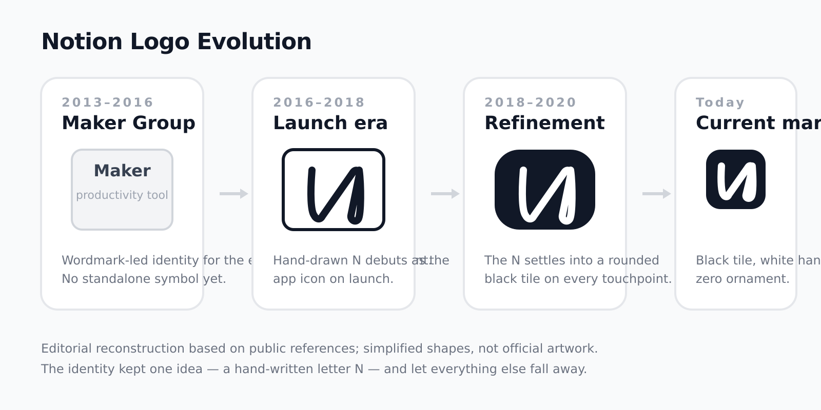
2013–2016
Maker Group experiments with browser-based productivity; identity is wordmark-led with no standalone symbol.
2016–2018
Notion launches to the public. The hand-drawn N debuts as the app icon and begins building recognition.
2018–2020
The N settles into a rounded black tile. The mark sheds the last traces of decoration and becomes the signature.
Today
A bold black tile and a single white hand-written N. One letter, maximum restraint, instant recognition.
05 · Design Highlights
Recognition without a single complex shape
The greatest design achievement of the Notion logo is that it needs no illustration, no mascot, and no elaborate geometry. One hand-drawn letter on a black tile is enough. That simplicity pays off in every environment where the brand lives.
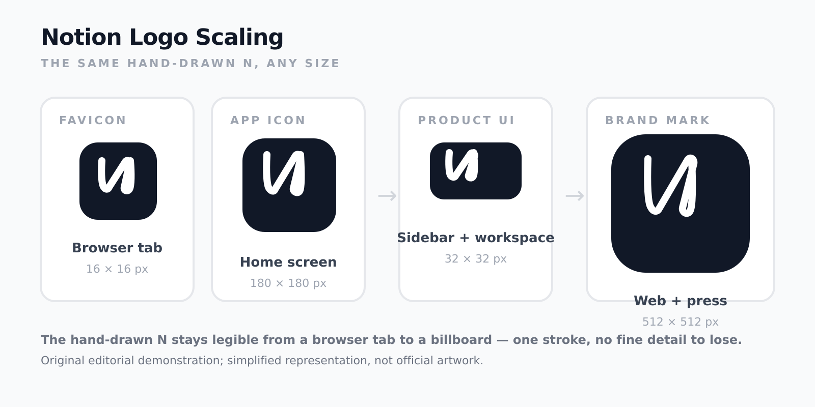
- One stroke survives favicon compression and tiny app grids
- Black-and-white works in light mode, dark mode, print, and signage
- The mark is easy to remember because it is easy to describe — an N on a black square
- It never competes with the user content it frames, so it stays fresh for decades
A letter, not a picture
The mark needs no illustration: one handwritten N carries the whole identity. What the logo refuses to show is as deliberate as what it shows.
Legible at any size
A single thick stroke survives favicon compression, browser tabs, sidebar tiles, and marketing banners without losing its character.
Built for the product it ships in
The monochrome tile sits naturally inside app icons, document chrome, dark mode, and mobile interfaces — never competing with user content.
Distinctive by restraint
While competitors layer gradients and glyph systems, Notion lets empty space and one imperfect letter become the memorable part.