Stripe Logo Design Analysis
Gradient stripes, fintech visual language, and a modern brand identity. How a single color transition — from purple to blue — came to represent financial innovation.
Industry
Tech / Financial Technology
Online payments, financial infrastructure, developer platform
Style
Clean wordmark plus an expressive gradient icon
Color
Signature purple → blue gradient
01 · Design Concept
Design concept: Gradient stripes represent the flow of money
Stripe's identity is built on one deceptively simple idea: money should move as smoothly as it looks in the logo. The wordmark is set in a clean, confident sans-serif, but the soul of the brand lives in the gradient “S” — a soft, flowing form that reads like fabric or a ribbon of light tracing the path of a payment.
The gradient from purple to blue does double duty. Purple signals innovation, creativity, and a willingness to challenge banking conventions; blue supplies trust, security, and the calm credibility financial infrastructure demands. Together they compress the entire brand promise into a single visual: cutting-edge, yet dependable; fluid, yet precise.
It is a logo about movement — about removing friction from commerce. Every curve of the mark whispers the brand's core pitch: payments that just work, invisibly and elegantly.
02 · Color Palette
Color palette: The psychology of purple to blue
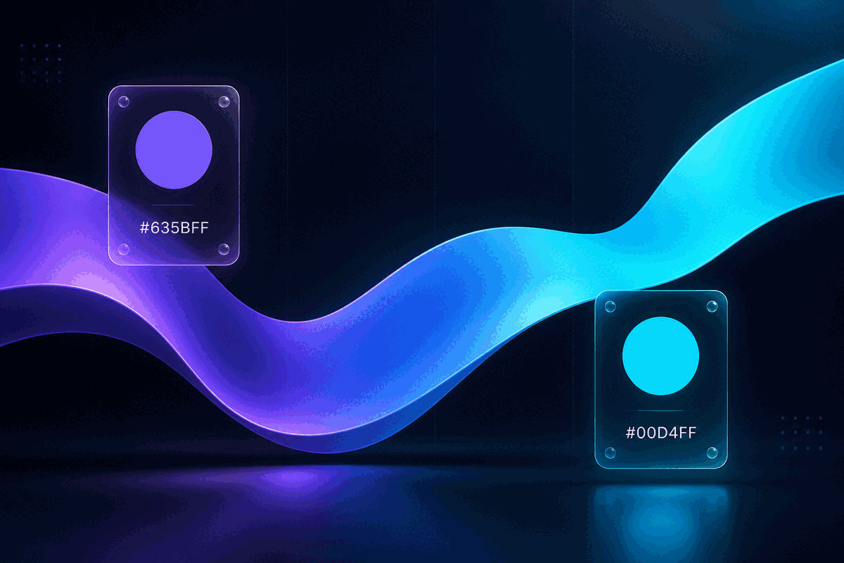
Stripe's palette is a masterclass in using color psychology to bridge a category contradiction. Traditional finance leans on navy blue, shields, and serifs to radiate stability. Stripe instead leads with vivid purple — #635BFF — a hue almost entirely absent from banking, chosen precisely because it signals something new.
As the eye travels, purple melts into #00AAFF blue, anchoring the mark in the trust spectrum. The transition mirrors the user journey: curiosity and delight at first contact, reliability once the transaction begins. Multi-stop gradients — purple through indigo to cyan — give the brand depth without muddying recognition.
The discipline is as important as the boldness: two hues, one consistent diagonal direction, repeated across every touchpoint until the gradient itself becomes the brand.
Stripe Purple
#635BFF
Innovation & creativity
Stripe Blue
#00AAFF
Trust & security
White
#FFFFFF
Clarity & space
03 · Typography
Typography: The confidence of a modern sans serif
Where the icon whispers, the wordmark speaks. Stripe uses FF Stripe, a custom geometric sans-serif built in-house. Its letterforms are engineered for the screen: open counters, balanced proportions, and a slightly rounded temperament that keeps a developer-facing brand approachable.
The type never competes with the gradient mark — it holds its own at small sizes, in dense API documentation, and in the checkout widgets developers embed across the web. That quiet reliability is exactly what a financial infrastructure brand needs its typography to express.
For teams borrowing Stripe's language, Inter is the closest open-source cousin — the same modern, neutral, highly legible temperament for digital-first products.
Primary Font
FF Stripe
Open-source Alternative
Inter
Sample · Light, Regular, Medium, Bold
Stripe
Aa Bb Cc 0123456789
04 · Evolution
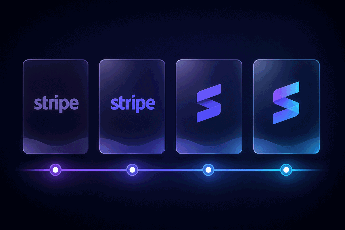
Evolution: From a wordmark to a gradient brand system
Stripe's identity matured the way the best tech brands do — by refining, not replacing. Unlike many contemporaries, Stripe never abandoned its wordmark for a standalone icon. The brand evolved from a plain functional wordmark into a complete gradient system around the same core name.
In its earliest years, the mark was a straightforward lowercase wordmark — clear and unadorned, exactly right for a developer-first payments API finding its footing in 2010. As the product matured, the gradient “S” emerged: first as a secondary motif, then as the signature used across app icons, favicons, and social avatars. Today the flowing form appears in product surfaces everywhere — always paired with, never replacing, the wordmark.
That evolution is a story of subtraction and consistency. Each redesign removed noise and tightened the palette, until the purple-to-blue transition itself became the brand. The final system pairs a restrained logotype with a flexible gradient mark — giving Stripe room to scale from a checkout button to a financial operating system without losing recognition.
05 · Design Highlights
Design highlights: Gradient as a fintech differentiator
Stripe didn't just use a gradient — it turned a gradient into a category-defining brand signal. These are the decisions that made it work.
Gradient as a fintech signature
Before Stripe, payment brands leaned on conservative navy and shields. A vivid purple-to-blue transition made infrastructure feel expressive — and launched a generation of gradient startups.
A mark that reads at any size
The flowing “S” keeps its silhouette from a 16px favicon to a stadium banner. Clean geometry and a single gradient direction survive every reduction.
Movement as a money metaphor
The soft, fabric-like curve of the icon implies flow, speed, and seamlessness — exactly the feeling Stripe wants when money moves through its rails.
Confidence without chaos
Two hues, one direction, consistent application. The palette feels bold yet disciplined — proof that expressive color can still read as professional.
Brand Background
Brand background: From developer tool to financial infrastructure
Founded in 2010 by brothers Patrick and John Collison, Stripe started with a developer-first insight: accepting payments online was needlessly painful. From its headquarters in San Francisco, the company built an API-first platform that now processes payments for businesses from two-person startups to Fortune 500 companies.
The logo's gradient is more than decoration — it maps directly onto the product's promise. Stripe's entire business is making money flow between systems, merchants, and consumers; the flowing, colorful mark makes that invisible infrastructure feel human and beautiful. For a company selling trust and movement, few identities could be more apt.
- Founded
- 2010
- Founders
- Patrick & John Collison
- Headquarters
- San Francisco, USA
- Business
- Online payment processing & financial infrastructure
Building a fintech brand? Let Stripe's gradient identity inspire your visual strategy!
Run your own logo through a professional design review, or keep exploring gradient and modern identities from the world's best tech brands.