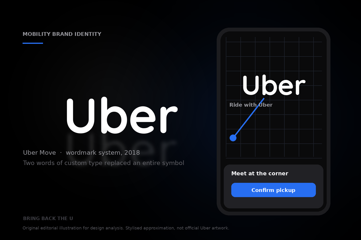
01 · Design Philosophy
The letter, the circle, and the word
Uber has redesigned its identity more often in its first fifteen years than most global brands manage in fifty. Three ideas run through three visual languages: an early red-and-black “U” monogram that signalled a private black-car service; a 2016 symbol — a small square “bit” held inside a simple circle — that tried to turn a company into an abstract system; and, in 2018, a plain black-and-white wordmark that treated the company's own name as its strongest asset.
That last decision runs against the instinct of every ambitious brand. When a company expands into food delivery, freight and public transit, the conventional move is to build an abstract symbol flexible enough to cover everything. Uber did the opposite, deleting the symbol and betting that “seeing Uber and knowing Uber” beats any clever icon.
The arc from the U to the simple circle and back to the word is not indecision. It is a company learning what it is.
The whole identity
Uber
Two words of custom type, two colours, no symbol — and a name set title case, because all-caps reads as a shout.
Uber Black
#000000
Authority, permanence, a neutral premium
White
#FFFFFF
Space, contrast, maximum legibility
Safety Blue
#276EF1
Support, assurance, delight — used sparingly
02 · Color Psychology
The confidence of black, the meaning of Safety Blue
The 2018 identity is built on a deliberate absence: no gradient, no pattern, and — for the first time since the app existed — no symbol above the name. What remains is contrast, white letterforms on black or black on white, at the highest possible ratio. The brief was summarised in three phrases: “let in the light, embrace the black; invest in a wordmark, not a symbol; bring back the U.”
Black is the most confident colour a brand can choose, and the most difficult to use well. It carries authority, permanence and a neutral premium that reads the same in a Manhattan crosswalk as in a São Paulo favela. It is also the safest choice for a company operating in more than 70 countries: black and white survive every print process and cultural context.
Where colour appears, it is rationed. Uber's brand guide calls Safety Blue (#276EF1) a shade “unique to Uber”, used sparingly for “moments of support, assurance, and delight” — contacting a driver, sharing a trip, reaching an emergency control: the moments when a stranger is trusting a stranger. The palette is signal architecture: black for the brand, blue for the promise that you are not alone in the car.
03 · Typography
Uber Move and the language of transit
The wordmark is set in Uber Move, a bespoke typeface drawn by Jeremy Mickel of the Los Angeles studio MCKL with branding consultancy Wolff Olins and Uber's internal brand team. It was not drawn to look fashionable; it was drawn to look like a place where people already know how to read quickly — airport signage, the New York subway, the London Underground.
That lineage shows in the letterforms: capitals that are geometric and slightly condensed, with subtly rounded corners that soften a mark which could otherwise read as severe. The family ships in four weights and two optical sizes — Display, tracked tightly for headlines and the wordmark, and Text, spaced more generously for body copy.
Its most distinctive detail is a lowercase “a” that looks as if it wandered in from a grotesque — a small human irregularity that keeps the system from feeling machine-made. The wordmark is set title case, not the all-caps “UBER” of the previous era: all-caps reads as a shout, title case reads as a name, and Uber had long been criticised for a brand that felt, in TechCrunch's words, “a bit hostile.”
Wordmark
Uber
- Typeface
- Uber Move (MCKL / Wolff Olins)
- Reference points
- Futura · Neuzeit Grotesk · transit signage
- Optical sizes
- Display (tight) · Text (generous)
- Case
- Title case — a name, not a shout
04 · Historical Evolution
Five marks in fifteen years
Uber's visual history is unusually restless — roughly one identity per era, each mapping onto a decisive moment in the company's self-image. Seen together, the logo changes stop looking like vanity and start looking like a public ledger of the company's confidence.
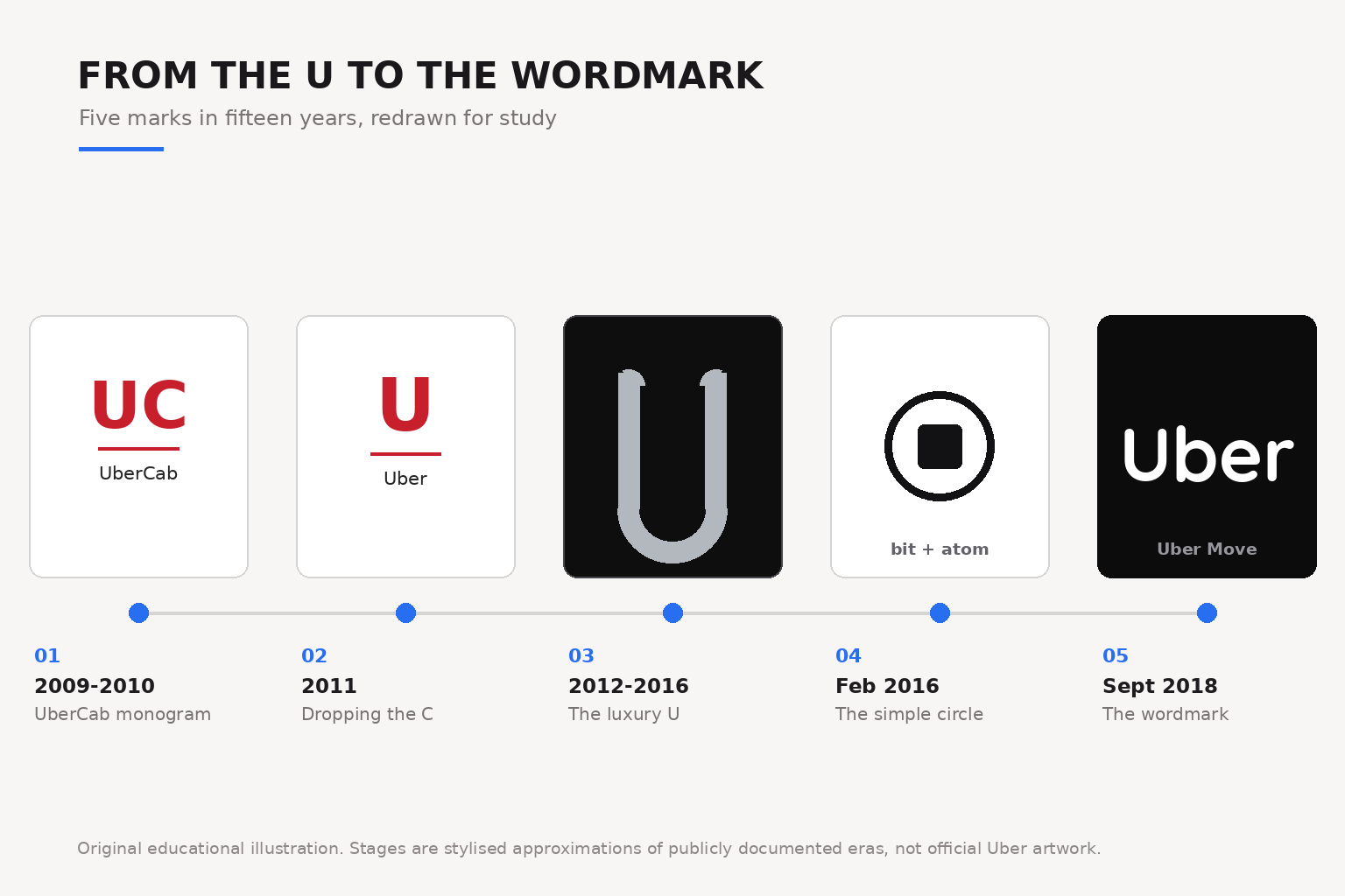
2009–2010
The UberCab monogram
A red “UC” monogram above the word “UberCab”. A functional first mark for a side project born in Paris and built in San Francisco — no agency, no brand system.
2011
Dropping the C
Regulators objected to a name that implied superiority over licensed cabs. UberCab became Uber, and the monogram lost its second letter.
2012–2016
The luxury U
A silver “U” with terminals curled gently inward, set in a black square with a fine silver outline, beside a wordmark whose strokes reached toward each other like a route.
February 2016
The simple circle
The bit-and-atom symbol: a small square held inside a circle, floating on locally inspired patterns with sixty-five country palettes. Users could not find the app icon, and critics compared the mark to other circles.
September 2018
The wordmark
Developed with Wolff Olins and MCKL over nine months. The symbol was deleted, not refined: “Uber” set in Uber Move, white on black. It read as the visual half of a trust rebuild under CEO Dara Khosrowshahi.
05 · Design Highlights
Why the name beat the symbol
The most consequential thing about the 2018 Uber logo is what it refuses to do: explain what Uber is. That is why “bring back the U” was more than nostalgia. It was a decision to stop spending brand equity teaching people to decode a shape, and start spending it on the word that appears in every headline, app store listing and car windshield.
- A single typographic mark reproduces identically at any size, from favicon to airport banner
- Pure black or pure white survives every medium, from screen to vinyl to metal
- The “U” became a composition system: campaign photography wraps inside the letter's silhouette
- Safety is treated as a design principle — high contrast and reserved blue read at a glance in a strange city at night
Design takeaway
The strongest asset most companies own is their own name.
The highest-value design work is often the discipline to get out of its way — to stop teaching people to decode a symbol and start spending recognition on the word they already know.
06 · Brand Application
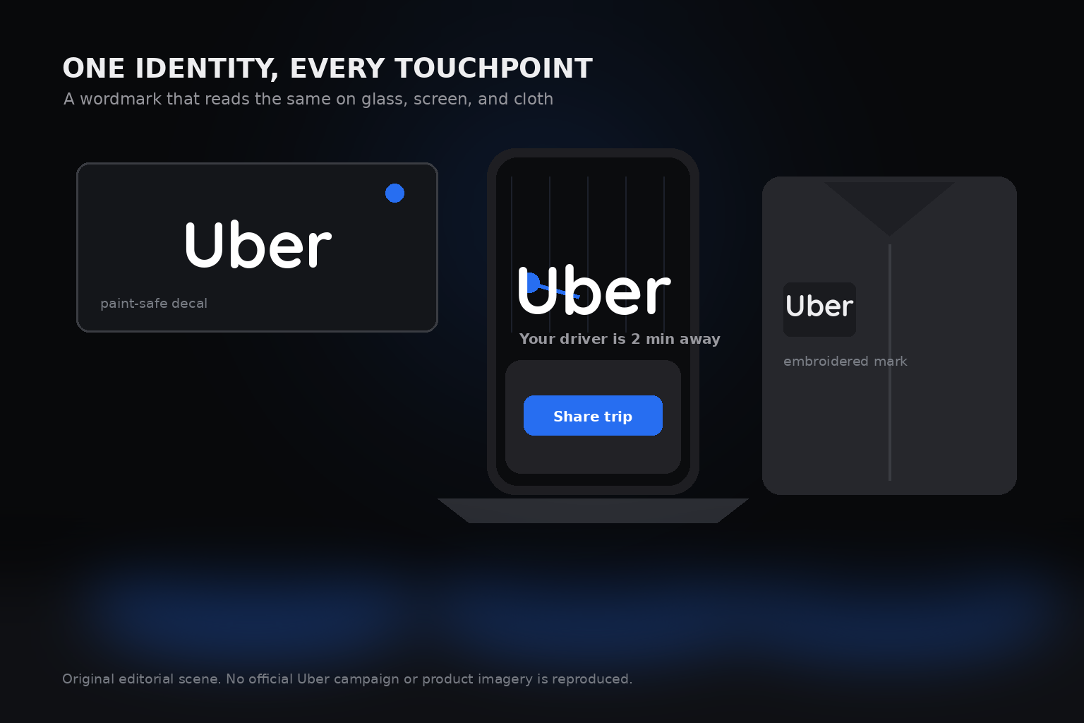
One identity, every touchpoint
A single typographic mark reproduces identically at any size — a 16-pixel favicon, an airport banner, an embroidered shirt — without the internal detail that made the bit-and-atom icon unreadable when small. Because it works in pure black or pure white, it survives every medium from screen to vinyl to metal.
The “U” became a composition system: Uber's advertising wraps photography inside a white U shape, or sets images against the letter's silhouette, so the mark structures campaigns without ever being redrawn. Treating safety as a design principle rather than a message, the high-contrast palette, transit-heritage type and reserved Safety Blue say one thing: this is a system you can read at a glance in a strange city at night.
Brand background
Two founders, one frustration
Uber's origin story is unusually literal: it started with two people who could not get a cab. Garrett Camp and Travis Kalanick met at the LeWeb conference in Paris in the winter of 2008, and Camp's idea — originally a shared limo service with a driver and a parking spot split between friends — hardened into a product over the following year. Camp began building in March 2009; Kalanick joined that summer as “chief incubator”, and engineers Oscar Salazar and Conrad Whelan built the first prototype.
The company launched as UberCab in San Francisco, with its first real ride on 31 May 2010. UberCab became Uber in 2011, the service expanded from black cars to UberX, UberPool and Uber Eats, and for a time Uber was the most valuable private company in the world. Scandal and lawsuits forced Kalanick to resign in June 2017; Dara Khosrowshahi took over that August with a mandate to clean up the company's culture and reputation. The 2018 rebrand was one of the first visible signs of that reset.
- Founded
- 2009 prototype · first ride 31 May 2010
- Founders
- Garrett Camp, Travis Kalanick
- Headquarters
- San Francisco, California, USA
- 2018 Rebrand
- Wolff Olins + MCKL, September 2018
- Typeface
- Uber Move (Jeremy Mickel / MCKL)
- Palette
- Black · White · Safety Blue #276EF1
Research
Authoritative sources
- TechCrunch — Uber is getting a new look (12 Sep 2018)
- Dezeen — Uber “brings back the U” in major rebrand
- Design Week — Uber rebrand looks to reflect how the taxi app is changing
- MCKL Type — Uber: logo and custom typeface
- Graphic Design USA — Uber reimagines how the world moves
- WIRED — The inside story of Uber's radical rebranding (2016)
- The Verge — Uber just completely changed its logo and branding (2016)
- Uber Newsroom — Uber's founding, by Travis Kalanick
- Uber brand system quick guide (PDF, October 2018)