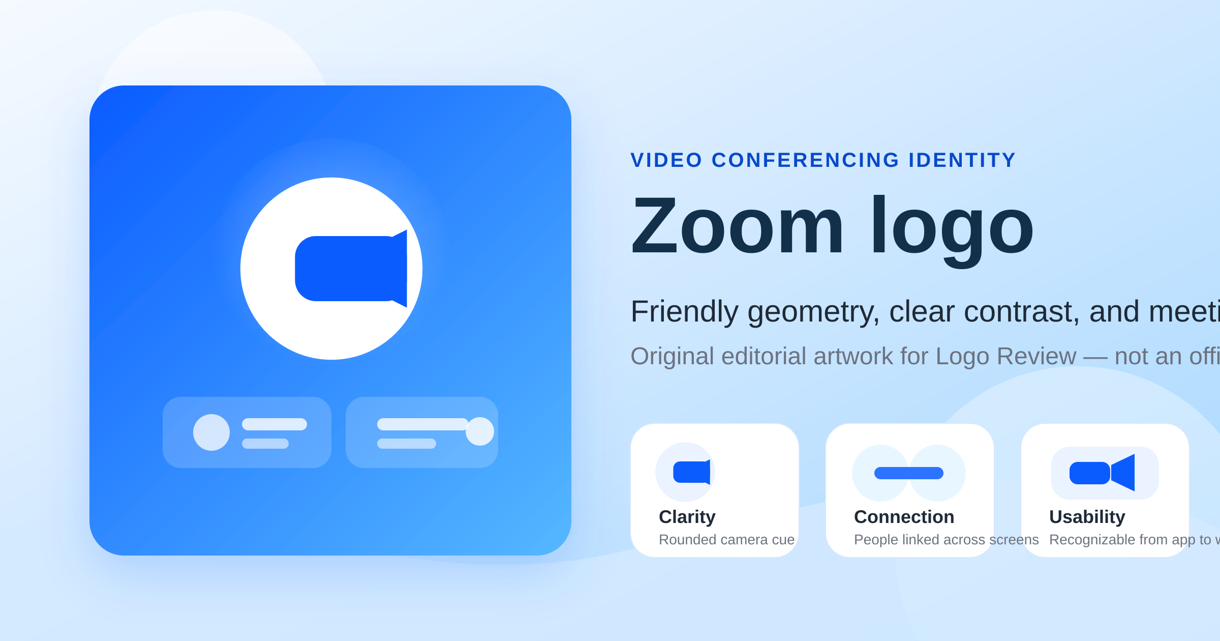
01 · Design Concept
A camera symbol made approachable
Zoom became recognizable by translating a product category into a shape people could read immediately. Its growth-era identity paired a lowercase wordmark with a simplified camera icon: a rounded rectangle and lens block rather than a realistic webcam. The result made video communication clear in one glance.
Rounded corners and balanced proportions kept the symbol from feeling mechanical. It communicated technology, but also ease — the right distinction for a service designed to remove friction from everyday meetings rather than sell professional AV hardware.
The current identity gives the wordmark greater priority. That reduction signals maturity: the name now carries enough recognition to stand on its own, while the familiar camera association continues to support product icons and collective brand memory.
Literal enough to explain the product. Soft enough to make the technology feel easy.
Zoom Blue
#2D8CFF
Clarity and connection
Deep Blue
#0B5CFF
Digital confidence
White
#FFFFFF
Space and simplicity
02 · Color Psychology
Why Zoom blue works
Blue is crowded territory in technology, yet Zoom chose a bright, optimistic register rather than a severe corporate navy. That shift changes the emotional tone: the palette communicates clarity, reliability, and openness without creating distance.
Video calls happen in classrooms, interviews, healthcare conversations, customer meetings, and family catch-ups. A lighter blue feels social enough for all of them. White adds breathing room and makes the system clean and legible across browser tabs, app icons, landing pages, and meeting interfaces.
The combination is intentionally quiet. It supports Zoom's role as dependable infrastructure without competing with the people and conversations inside the product.
03 · Typography
Rounded lowercase as a trust signal
Typography carries most of the identity's emotional weight. Lowercase forms reduce formality, while rounded terminals make the wordmark feel conversational. The repeating curves of the two “o” characters and the smooth construction of the “m” create rhythm without looking aggressively futuristic.
Zoom's wider digital system uses Almaden Sans to support readable interfaces across meetings, docs, phone, contact center, and AI workflows. The logo remains more disciplined than the marketing system around it, preserving a simple rounded wordmark as the product portfolio expands.
Wordmark character
zoom
Brand UI family
Almaden Sans
Rounded, open, digitally legible — a tone that lowers the barrier to joining a conversation.
04 · Historical Evolution
From product explanation to brand confidence
Zoom's visual evolution is not a story of dramatic reinvention. It is a steady process of strategic reduction: retaining familiar blue and rounded lettering while asking the symbol to explain less as the company becomes more recognizable.
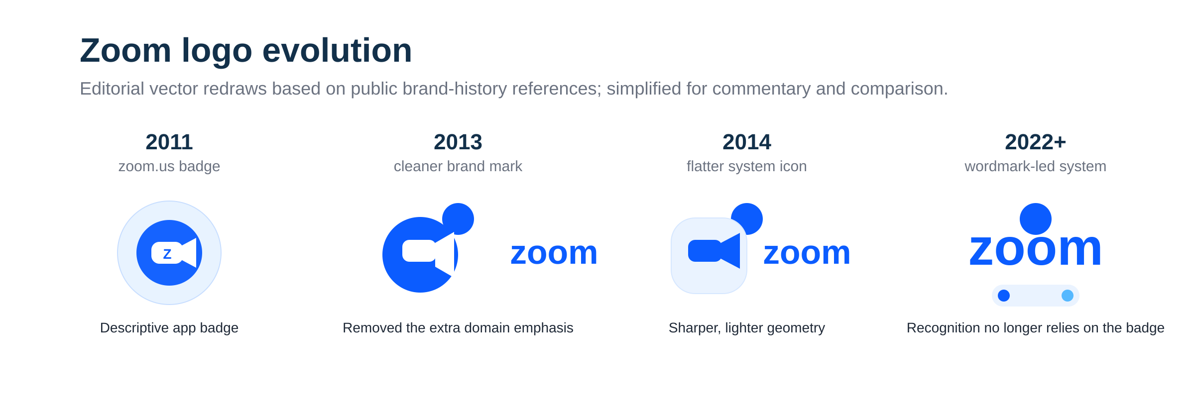
2011–2013
Early branding carried more explanatory weight while the product and name were unfamiliar.
2013–2014
The system moved toward the recognizable lowercase wordmark and camera-symbol combination.
2014–2022
The blue lockup became synonymous with remote work, education, and virtual events.
2022–present
A simplified primary wordmark signaled confidence and supported a broader platform.
2024 onward
A broader corporate name and AI-first story extended the identity beyond meetings.
05 · Responsive Identity
Recognition that survives scaling
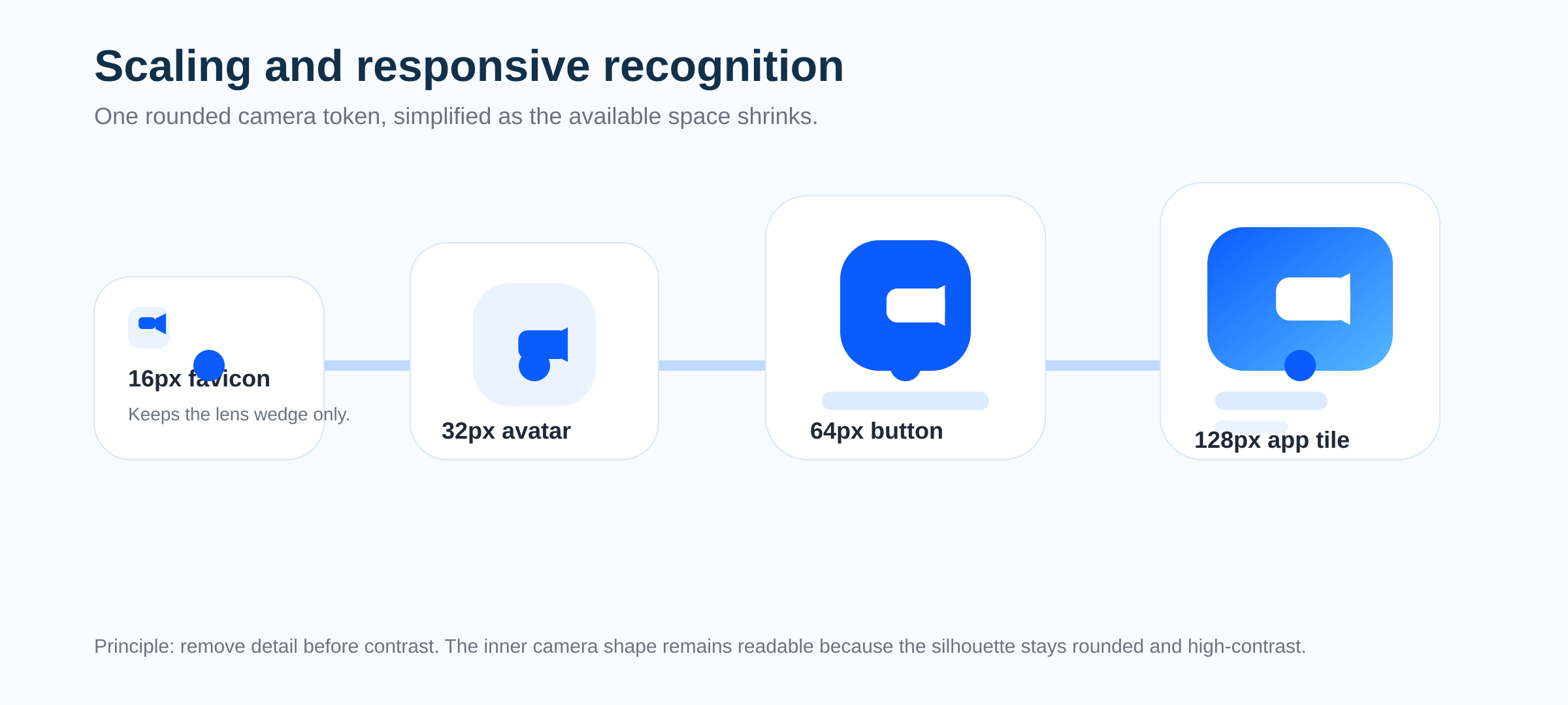
The logo performs in the environments where Zoom actually lives. Its rounded silhouette avoids fragile details, so recognition survives from a tiny favicon and browser tab to a meeting button, profile tile, or full app icon.
- Simple silhouette at favicon size
- Open shapes remain legible on dense interfaces
- Blue-and-white contrast works across light product surfaces
- Icon and wordmark can take separate roles without losing continuity
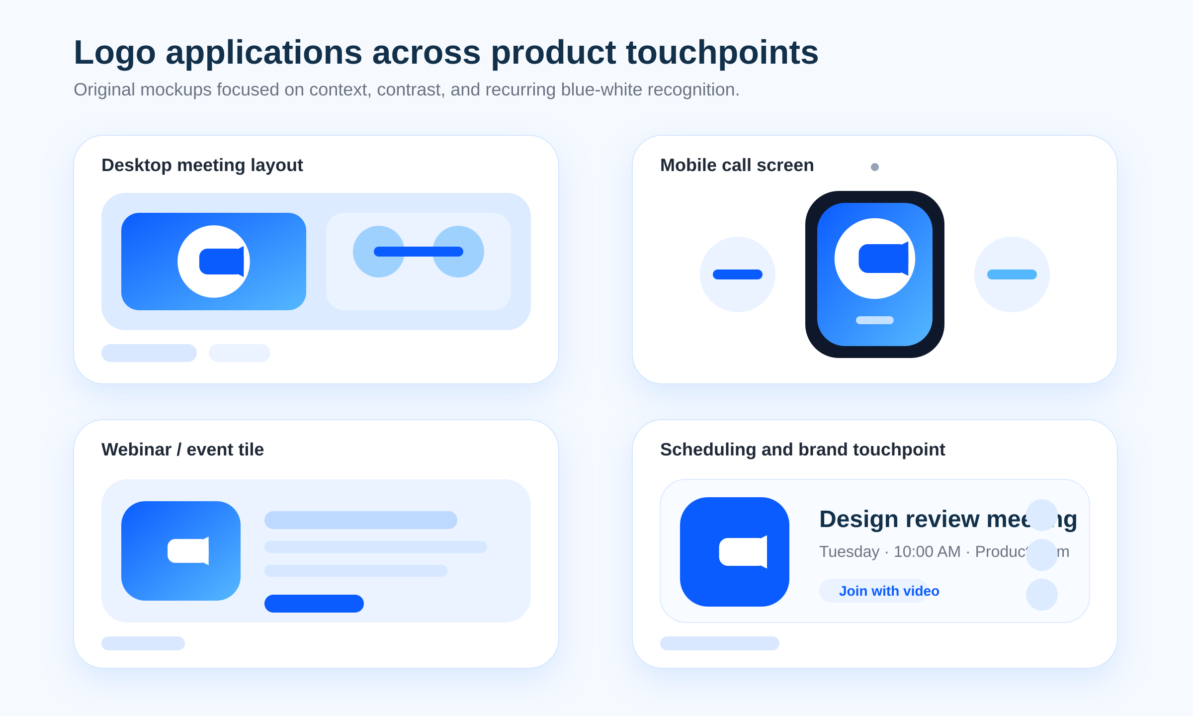
06 · Application System
One identity across every conversation touchpoint
The same visual language bridges product and marketing: restrained enough for desktop navigation and meeting invitations, yet friendly enough for mobile, webinars, education, healthcare, small business, and enterprise campaigns.
07 · Design Highlights
Why the identity feels dependable without feeling stiff
Zoom's real design win is balance: category recognition and brand maturity, enterprise trust and human warmth, product utility and cultural familiarity.
Readable at a glance
Rounded geometry and a clean silhouette stay recognizable in favicons, app grids, calendar invitations, and desktop docks.
Built for interface contexts
Blue and white sit naturally inside product UI while remaining clear across mobile, desktop, webinar, and scheduling touchpoints.
A familiar social cue
Repeated exposure during remote work turned the identity into visual shorthand for joining a call, not just a corporate signature.
Softness as strategy
Open counters, rounded forms, and vivid blue balance enterprise reliability with the warmth needed for everyday conversation.