Brand identity breakdown
Nike Logo Analysis: Why the Swoosh Still Wins
The Nike Swoosh is one of the clearest proofs that a logo does not need detail to carry meaning. One curved stroke communicates motion, confidence, and ambition across shoes, apparel, apps, retail, and culture.
Founded
1964 as Blue Ribbon Sports
Nike Name Adopted
1971
Designer
Carolyn Davidson
Headquarters
Beaverton, Oregon, USA
Design concept
A mark that behaves like motion
The Swoosh succeeds because it turns an abstract idea into an immediate physical feeling. Its curve is not static. It leans, narrows, and accelerates. Even when printed flat, it implies lift-off, speed, and directional intent.
That matters for Nike because the brand promise is not about one product category. It is about effort, competition, progress, and self-belief. A detailed emblem would have limited that range. The Swoosh stays open enough to work on running shoes, football kits, basketball campaigns, training apps, and lifestyle apparel without changing its underlying meaning.
Why designers keep studying the Swoosh
- It proves that a memorable silhouette can do more work than a complicated illustration.
- It scales from embroidery to billboards without relying on interior detail or gradients.
- It gained enough brand equity to eventually drop the wordmark, a rare milestone in identity design.
Key takeaways
Why the Nike logo remains effective
The Swoosh does not just identify Nike. It compresses the brand’s athletic worldview into one shape. That compression is why the mark performs so well in both commercial and cultural settings.
Motion in a Single Stroke
The Swoosh feels fast before any product or slogan appears. Its taper, angle, and forward pull make the mark read like movement frozen mid-action.
Recognizable Without the Name
Few brand symbols can drop the wordmark and still remain unmistakable. Nike earned that privilege by repeating one shape with near-total consistency over decades.
Color-Agnostic by Design
Because the mark is so simple, it works in black, white, tonal embroidery, metallic finishes, or campaign colors without losing recognition.
Built for Tiny and Huge Surfaces
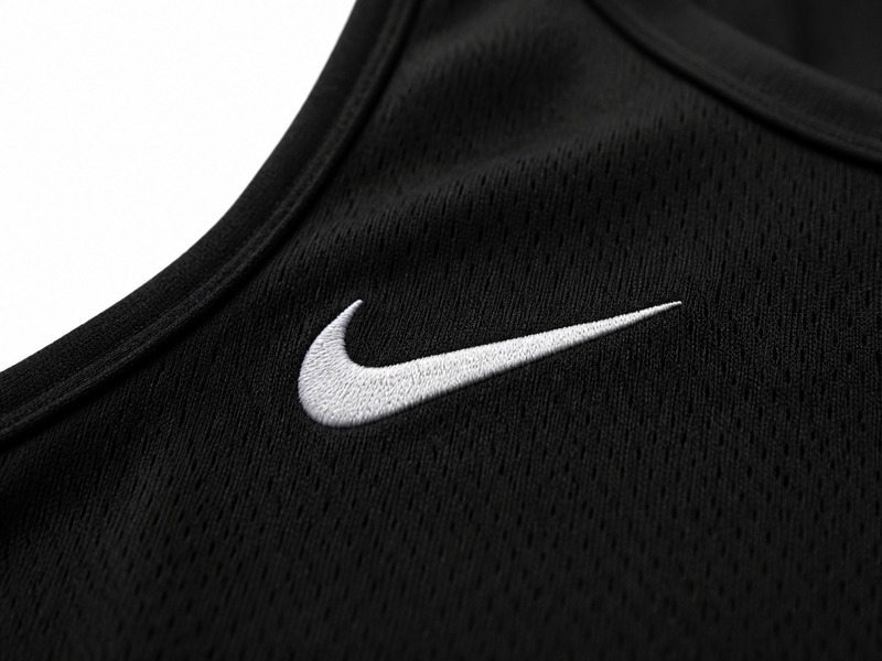
The Swoosh survives on app icons, shoe sidewalls, swing tags, stadium signage, and social thumbnails because it relies on silhouette rather than interior detail.
Athletic Meaning With Cultural Range
It started in running but now signals sport, streetwear, aspiration, and performance culture at once. That range comes from a shape broad enough to travel across categories.
Minimalism That Still Feels Emotional
The Swoosh is not a cold geometric icon. Its asymmetry and curve create a human, energetic quality that makes the mark feel alive rather than mechanical.
Color strategy
Mostly monochrome, always adaptable
Nike is unusual because the power of the symbol does not depend on a fixed color system. Black and white dominate because they maximize contrast and let products take center stage. The logo becomes a frame for performance, not a competing visual object.
Historically, orange-red lockups helped Nike feel bold and youthful in print and packaging, but the modern system is flexible by design. The Swoosh can absorb campaign colors, material finishes, and sport-specific treatments while staying unmistakably Nike.
Black
#000000
Authority, focus, and high contrast across footwear and apparel
White
#FFFFFF
Negative space, simplicity, and premium clarity
Nike Orange
#F15A22
Historic corporate accent used in some classic lockups and brand materials
Typography
When the wordmark appears, it supports the symbol
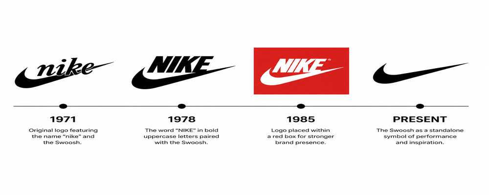
Nike’s wordmark history shows a steady simplification. Early versions used a hand-drawn script across the Swoosh. Later lockups moved to a bolder, cleaner uppercase wordmark that felt more industrial and scalable.
The important lesson is hierarchy. Even when the wordmark is present, the symbol carries the emotional load. Typography clarifies the name; the Swoosh carries the energy. That separation is one reason Nike could eventually remove the wordmark entirely in many contexts.
Evolution
Refinement instead of reinvention
Nike did not rebuild its logo every decade. It refined one strong idea, letting familiarity compound. That restraint protected recognition while giving the brand room to grow from running specialist to global sportswear giant.
1964-1971
Before Nike, Blue Ribbon Sports used text-based identities while building its running business. The company had momentum, but not yet a world-class proprietary symbol.
1971-1978
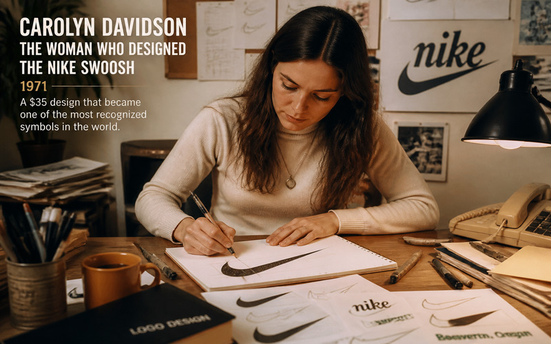
Carolyn Davidson created the original Swoosh for the new Nike name. Early lockups paired the symbol with a hand-drawn wordmark crossing the mark, emphasizing motion and immediacy.
1978-1985
The logo was refined with a cleaner uppercase wordmark above the Swoosh. This stage helped standardize the identity as Nike expanded from track roots into a larger sportswear business.
1985-1995
Nike often used the bold wordmark-plus-Swoosh lockup inside a red field across campaigns and packaging. The identity became louder, more confident, and globally scalable.
1995-Present
The standalone Swoosh became the primary hero. Dropping the wordmark signaled peak brand equity: the company no longer needed to spell out its own name to be recognized.
Brand context
Why the Swoosh became bigger than sportswear
The Nike logo reached icon status because the company repeated it at the intersection of product, performance, and storytelling. Elite athlete endorsements, signature product lines, and the “Just Do It” era all reinforced the same core message: achievement through action.
Crucially, the symbol is aspirational without being exclusive. It can appear on top-tier competition gear and still feel natural on everyday basics. That balance helped Nike move from sports brand to cultural shorthand for effort, ambition, and self-styled confidence.
Application system
A logo built for product-first branding
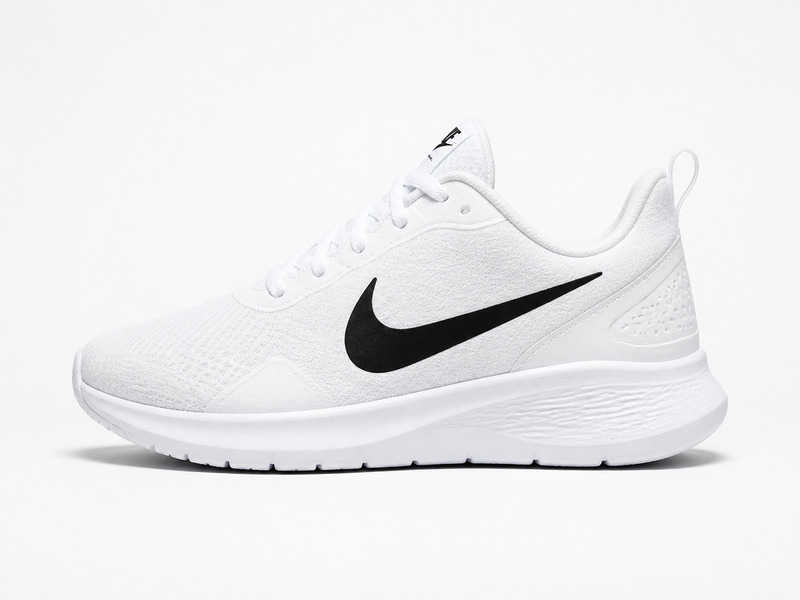
On many brands, the logo must sit next to the product. On Nike, the logo often becomes part of the product itself. The Swoosh can function as sidewall graphic, chest print, sole detail, lace tag, zipper pull, app icon, or storefront marker.
That versatility comes from three traits: a strong silhouette, a low-detail stroke, and flexible color treatment. The result is a system that feels equally natural in embroidery, rubber, leather, foil, digital UI, and large-scale environmental graphics.
Visual evidence
The Swoosh across time, people, and product
These visuals make the analysis tangible: a timeline shows disciplined refinement, while applications reveal how the mark behaves in real brand contexts.
Keep exploring
Related internal reads
Use these pages to compare Nike’s symbol-first strategy with other minimalist or category-specific logo systems.
Sources
Reference links used for factual grounding
These sources help anchor the timeline, founding facts, and public history around the Swoosh.
Need more logo inspiration?
Study more identities before you build your own brand system
Compare how different industries use symbols, typography, and color to create memorability. Nike is the benchmark for motion and minimalism, but the best design decisions always depend on category, audience, and use case.