01 · Brand history
From a 1951 red mark to the blue and yellow IKEA logo
IKEA was founded in 1943 by Ingvar Kamprad. The name combines his initials with Elmtaryd, the farm where he grew up, and Agunnaryd, his home parish. The first logo appeared in 1951 as a round red mark, reflecting the early promise of low prices. As the business expanded internationally, the identity retained its short name and oval structure while becoming more consistent across formats.
Design takeaway
Evolve the system without losing the cue people remember.
02 · Color psychology
Why blue and yellow work so well together
Blue provides structure, stability, and a strong field for the wordmark. Yellow adds warmth, visibility, and optimism. Together they reference the Swedish flag while serving a practical retail role: a large sign remains easy to spot in a parking area, and the same contrast stays legible on a digital surface. Meaning and wayfinding reinforce each other.
Design takeaway
Let color carry both cultural meaning and everyday function.
03 · Typography
Friendly strength in the IKEA wordmark
The uppercase wordmark uses broad, heavy geometric forms that feel sturdy rather than ornamental. IKEA explains that its early logo was influenced by extra-bold Futura; small serif details helped printed outlines stay clear during reproduction. The later IKEA Sans system, designed by Robin Nicholas, keeps the same robust character while making the identity distinctive across signage and screens.
Design takeaway
Typography is production knowledge made visible.
04 · Historical evolution
A compact badge built for a very large retail world
The oval enclosure turns a four-letter name into a complete, portable unit. It can sit on a store façade, catalogue, flat-pack label, paper bag, or app interface without requiring customers to decode a symbol. That restraint lets products, rooms, and offers remain the focus while the identity anchors the experience.
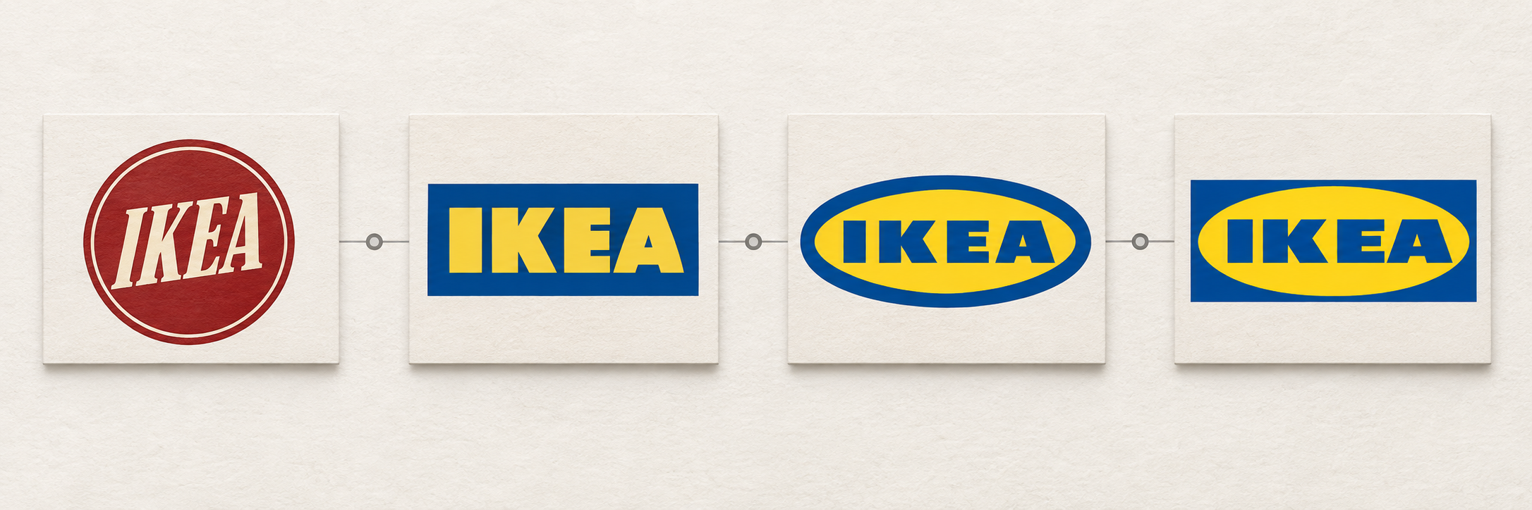
1943
Ingvar Kamprad founded IKEA in Älmhult, Sweden; the name combines his initials with Elmtaryd and Agunnaryd.
1951
The first IKEA logo appeared as a round red mark, connecting the identity to low prices.
1980s
Blue and yellow became the defining palette, referencing the Swedish flag and improving visibility.
1990s
Blue store buildings and yellow lettering turned the identity into a large-scale retail signpost.
Today
The oval wordmark remains a compact, high-contrast badge for stores, products, packaging, and digital surfaces.
05 · Everyday application
One mark, from store architecture to a phone screen
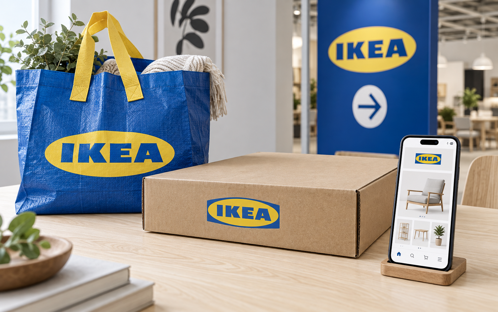
IKEA's identity operates as architecture on a building, a portable reminder on a shopping bag, and an orientation cue on a website. High contrast, limited colors, and a robust wordmark let the same visual language survive scale changes without becoming decorative noise.
Design lessons
What the IKEA logo teaches designers
- Build recognition around repeatable assets. A short wordmark, enclosure, and two colors can outperform a crowded symbol system.
- Design for scale. A retail mark must work on a building, label, catalogue, and screen.
- Treat evolution as stewardship. Refine consistency without discarding familiar visual cues.