Logo Review Guide
Logo Evaluation Criteria Explained: What to Check and Why
Learn logo evaluation criteria for clarity, contrast, typography, distinctiveness, scalability, and real-world brand use, with practical questions for each review.
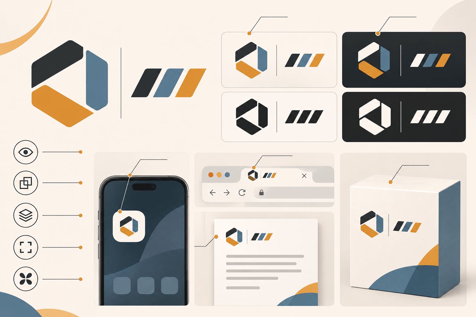
A logo review becomes useful when “I like it” turns into observable questions. Logo evaluation criteria give designers, founders, and stakeholders a shared way to discuss what a mark does well, where it breaks down, and which change is worth making first.
This guide is a practical framework, not a replacement for a brand brief or audience research. Use the full logo evaluation criteria reference alongside the real situations where your logo will appear.
The framework
The 10 criteria to check
Review these dimensions together. A polished presentation can hide a problem with size, context, or category distinction.
01
Clarity
Does the logo read quickly? Check the first impression, hierarchy, and whether the core idea survives without an explanation.
02
Contrast and accessibility
Test light, dark, mid-tone, and photographic backgrounds. Keep an effective one-color treatment for constrained uses.
03
Colour
Remove colour and inspect the structure. The silhouette and hierarchy should not depend entirely on gradients or saturation.
04
Typography
Review letterforms, spacing, weight, case, counters, and the relationship between the wordmark and symbol at realistic sizes.
05
Distinctiveness
Compare the mark with five to ten relevant competitors at the same size, hiding names where possible.
06
Balance and composition
Inspect optical weight, alignment, spacing, and whether the lockup feels settled in every orientation.
07
Scalability
Test the smallest digital use, a normal header, a large display, and a one-inch print use when relevant.
08
Versatility
Review light, dark, monochrome, image, and production-constrained versions so the identity remains recognisable.
09
Application fit
Place it in the browser header, mobile icon, social avatar, document, packaging, or other touchpoints customers actually see.
10
Commercial and brand fit
Return to the brief, audience, category, and future direction before recommending a strategic redesign.
How to use the criteria in a review
Start by writing the logo’s job and its three most important applications. Collect evidence rather than isolated opinions, then sort findings into:
- Keep: strengths that should survive refinement.
- Refine: focused issues such as spacing, contrast, exports, or small-size detail.
- Reconsider: strategic issues such as audience mismatch or competitor resemblance.
Prioritise the smallest change that addresses the highest-impact problem. After the change, retest the weakest application—not only the presentation mockup. For a structured first pass, try the Logo Review Tool, then compare your findings with the logo design checklist and logo review guide.
Evidence over opinion
A score is only useful when it explains what to do next.
Record the condition, the impact, and the smallest plausible fix. “The wordmark disappears below 24px on the mobile header” is more actionable than “the logo feels weak.”
Logo evaluation criteria FAQ
Should every logo receive a numerical score?
No. Scores can organise observations, but they should never replace evidence, context, or a clear description of what happens in a specific use case.
Which logo criterion matters most?
It depends on the brand and its applications. Clarity and legibility are foundational, but a strategically indistinct logo or one that fails its core application may deserve priority.
Do I need to redesign a logo that fails one test?
Not necessarily. A missing variant, spacing issue, export problem, or background treatment may need only a focused system fix.
How often should a logo be reviewed?
Review it when the brand changes, new applications are introduced, or repeated production problems reveal that the current system is incomplete.
Factual basis
This guide uses observable identity-review practices: comparing a mark at real sizes and backgrounds, inspecting letterforms and spacing, checking alternate artwork, and testing the applications that matter to the brand. For surrounding interface content, consult the W3C Web Content Accessibility Guidelines; logos can require separate treatment, so validate the final use with the relevant requirements.