Logo Review Guide
Serif vs Sans Serif for Logos: Which Should You Choose?
Compare serif and sans serif logos by brand fit, legibility, distinctiveness, spacing, and real-world use before choosing a type direction.
A practical guide for founders, designers, and brand teams
What the two styles actually change
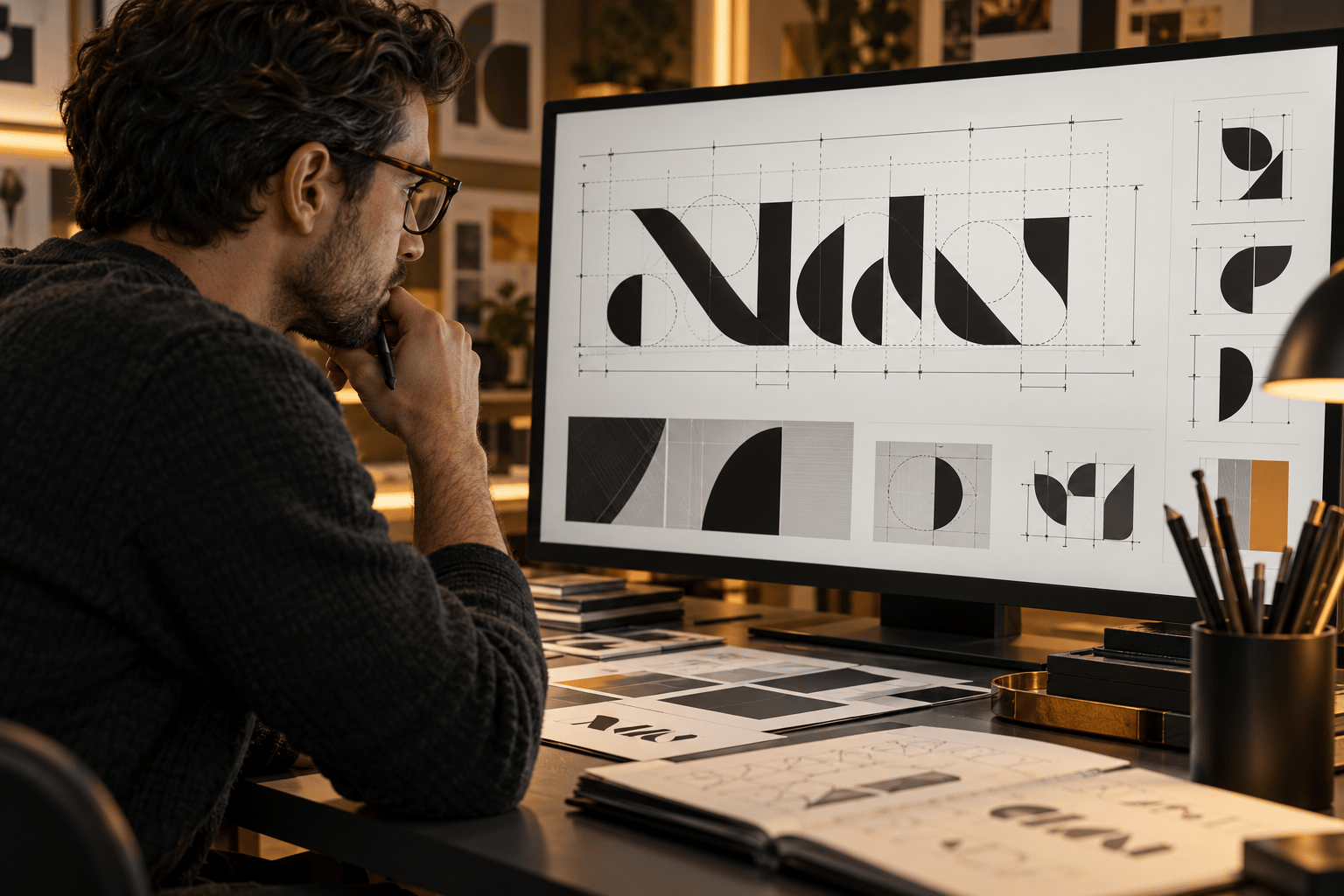
Serifs are the small finishing strokes attached to parts of a letter. They may be bracketed, unbracketed, wedge-shaped, or otherwise specific to a typeface. Sans-serif letters omit those finishing strokes, but they still vary widely in proportion, stroke contrast, terminals, and rhythm. That distinction changes the visual texture of a wordmark. A high-contrast serif can create a sharp, editorial rhythm; a slab serif can feel sturdy and direct. A geometric sans-serif can feel structured; a humanist sans-serif can have a warmer, more open rhythm. The category name is only a starting point. Inspect the actual letters in the actual brand name.
When a serif may be the better direction
A serif can support a brand that needs to signal history, craft, expertise, editorial character, or a considered pace. This is not an automatic claim that a serif makes a company premium or trustworthy. Consider a serif direction when the brand story depends on craft or archive, when the wordmark benefits from thick-and-thin contrast, when the category is crowded with neutral sans-serif marks, or when distinctive terminals give the name useful character.
Check the risks at the same time. Fine serifs and high stroke contrast can disappear in a small digital header or low-quality print. A familiar book-style serif can also make unrelated brands look alike. If the serif is doing all the work while the name is difficult to read, simplify before adding decoration.
When a sans serif may be the better direction
A sans serif often suits a brand that needs a direct, flexible, or interface-friendly wordmark. The style alone does not create accessibility, innovation, or approachability; those qualities come from the specific forms, spacing, hierarchy, colour, and application. Consider a sans-serif direction when the logo must remain clear in navigation or small profile images, when the brand needs an adaptable lockup, or when a long name benefits from simpler forms.
The risk is interchangeability. A default geometric sans can look generic in a crowded category, while tight tracking and uniform strokes can remove useful character. A sans-serif wordmark still needs a point of view: a proportion, terminal, letter modification, or spacing decision that belongs to the identity.
Compare the styles using your real name
Do not compare a random specimen word. Set the exact brand name in a limited selection of serif and sans-serif candidates at the same size. Include capital and lowercase forms, numerals, punctuation, and any descriptor that may appear in the approved lockup. Review the first read, letter distinction, rhythm, proportion, ownable detail, and the relationship between symbol and type.
A useful comparison is not “which one looks nicer?” It is “which direction solves the brand’s communication and production job with fewer compromises?”
Test readability without confusing it with body text
A logo does not need to behave exactly like paragraph typography. It does need to be recognisable and legible in the sizes and conditions that matter. Test the wordmark in black on white, white on black, brand colours, and one-colour artwork. Remove shadows, outlines, and gradients so you can see whether the underlying drawing works.
Use the actual contexts: a desktop header, mobile navigation, social avatar, document header, package or label, and signage if relevant. View each at its intended size rather than only zoomed in. Look for serifs, thin strokes, apertures, and counters that disappear; also look for sans-serif forms that merge because spacing is too tight or weight is too heavy. For surrounding interface text, the W3C Web Content Accessibility Guidelines are an authoritative reference.
Distinctive does not mean unusual
A serif and a sans serif can both be generic. Compare the shortlisted wordmarks beside five to ten direct or adjacent competitors at the same size, hiding names where possible. Note repeated proportions, familiar letter treatments, and the features that still stand apart when colour is removed.
If every sans-serif option resembles the category, look at proportion, spacing, or a carefully redrawn letter before switching automatically to a serif. If every serif option feels ornamental, test a quieter serif or a custom modification. The goal is not to be different at any cost; it is to be recognisable without sacrificing the brand’s job.
Review spacing, weight, and lockup behaviour
The serif-versus-sans decision is only one layer. Check kerning in difficult pairs, tracking across the full name, stroke weight at small sizes, cap height, x-height, baseline, and the gap between symbol and wordmark. A suitable typeface can still produce a weak logo when left at default settings.
Test responsive arrangements rather than shrinking one lockup indefinitely. You may need a full lockup, a compact lockup, and an icon-only version where the identity can support it. If a letterform or terminal is customised, save the vector master and document the source typeface, licence, and modifications.
A practical decision sequence
Write the audience, brand job, category context, and priority applications. Set the exact name in a small set of serif and sans-serif directions. Remove effects and test first read, letter distinction, rhythm, and proportion. Compare real sizes, monochrome, relevant backgrounds, and competitors. Adjust spacing or weight before discarding a promising direction. Confirm the licence and source files, then retest the weakest application and document the decision.
For a broader review sequence, read the Logo Evaluation Criteria, How to Choose a Font for Your Logo, and Why Your Logo Is Hard to Read, plus try the Logo Review Tool and treat its output as a discussion aid rather than a final design decision.
Frequently asked questions
Is a serif or sans serif better for a logo?
Neither is universally better. Choose the direction whose specific letterforms support the brand job, remain recognisable in important applications, and do not become interchangeable beside relevant competitors.
Do serif logos look more premium?
A serif can support a crafted or editorial tone, but it does not guarantee a premium impression. The result also depends on the drawing, spacing, colour, production quality, and context.
Are sans-serif logos easier to read?
A sans serif can be clear in compact digital contexts, but readability depends on the actual letters, weight, spacing, size, contrast, and reproduction. Test the exact wordmark instead of relying on the category label.
Can a logo combine serif and sans serif type?
Yes, a combination can create hierarchy between a wordmark and descriptor or between brand and supporting content. Keep the roles, spacing, and hierarchy deliberate so the lockup does not become visually divided.