Logo Review Guide
How to Choose a Font for Your Logo: Logo Review Guide
Learn how to choose a font for your logo by checking brand fit, readability, spacing, real-use sizes, licensing, and long-term flexibility for your brand.
A practical guide for founders, designers, and brand teams
Start with the brand position, not the font menu
Before comparing typefaces, write down what the wordmark needs to communicate: perhaps precise rather than playful, established rather than traditional, or direct rather than ornamental. Then define the audience, offer, category, and most important situations. A technical service, children’s product, local shop, and software company may each need a different balance of authority, warmth, and compact performance.
Use the existing logo as evidence. Which letterforms, proportions, or details already help people identify it? Which parts feel out of place? If the wordmark is recognisable but crowded, spacing or weight may be a better first fix than a new typeface.
Judge legibility at the sizes that matter
A logo does not need to behave like body text, but people should be able to distinguish its letters without a large screen or unlimited viewing time. Inspect counters and apertures, stroke weight, similar letter shapes, width, proportions, case, numerals, and punctuation in the actual brand name.
Test the wordmark in black on white, white on black, brand colours, and one-colour artwork. Remove shadows, gradients, outlines, and bevels. If the underlying letters become unclear without effects, styling is hiding a typography problem. For surrounding interface text, use the authoritative W3C Web Content Accessibility Guidelines reference.
Review weight, spacing, and the relationship between letters
A suitable font can still produce a weak wordmark when its defaults are left untouched. Inspect difficult kerning pairs, tracking across the full name, baseline, cap height, x-height, and the relationship between icon and wordmark. More space is not automatically more premium, and tighter space is not automatically more confident; the right spacing supports the intended tone and keeps the name together.
Compare a small set of weights at the same size. Ask whether the lightest option survives the smallest important use and whether the heaviest closes counters or overwhelms the symbol. If you modify a typeface, document the source font, licence, and changes alongside an editable vector master.
Test the font in real use before committing
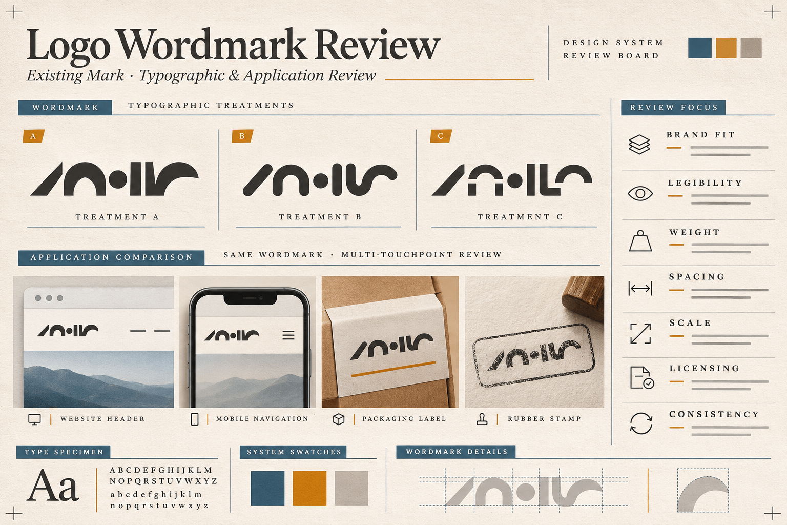
Build a small test sheet with the exact logo name in a desktop header, mobile header, social avatar or profile image, document or email signature, and one physical application such as packaging, signage, or a stamp. Include generous and restricted layouts, plus light, dark, coloured, and image backgrounds.
View every version at its intended size, then hide the explanation and ask a neutral viewer what they notice first and what they can read. Specific observations such as “the final letters merge at mobile size” are more useful than “it feels off.” Prepare responsive arrangements when the full name cannot work in a compact space: full lockup, simplified lockup, or icon-only version where the identity can support it.
Check licensing and long-term brand consistency
Confirm that the font licence covers the intended use. A font may be free for one purpose and restricted for another, and the licence for working files is separate from ownership of the final vector artwork. Read the licence from the foundry or distributor, save the version and terms, and identify who owns the approved artwork.
The Google Fonts FAQ is a useful official reference for Google Fonts questions, but it does not replace checking the specific licence. Also confirm that the team can access the source file, colour and one-colour versions, compact variants, and clear usage rules. A logo font may intentionally differ from the supporting interface family; consistency means the roles do not contradict the brand position.
Use a focused review and fix order
When several problems appear, change one layer at a time: confirm the audience, brand direction, priority applications, and smallest meaningful size; locate the vector master, font name, licence, and usage rules; test letterforms, counters, weight, case, kerning, tracking, and icon relationship; then correct export and colour issues before adjusting spacing or weight.
Only after focused fixes should you compare a limited set of alternatives using the same name and contexts. Retest the weakest application, record what changed, and update the approved asset set. This keeps a typography decision tied to observable evidence instead of fashion or personal preference.
For a broader framework, use the Logo Evaluation Criteria. For examples of structured review, read the Restaurant Logo Review, How to Critique a Logo, Logo Design Checklist, and Why Your Logo Is Hard to Read.
Frequently asked questions
Should a logo use the same font as the brand’s website?
Not necessarily. A logo typeface and supporting text family can work as a deliberate pair. Choose the relationship based on tone, legibility, hierarchy, and the applications the identity must support.
How many fonts should I compare for a logo?
Compare a focused shortlist. Start with the current wordmark, then test a small set of alternatives against the same name, sizes, backgrounds, and applications so the decision stays tied to the brief.
Is a free font safe to use in a logo?
“Free” does not describe every permitted use. Read the specific foundry or distributor licence, confirm it covers your intended work, and save the licence terms with the source files.
Should I change the font if the logo is hard to read when small?
First identify the cause. Weight, spacing, contrast, export quality, and a missing compact version can create small-size problems without requiring a new typeface. If focused adjustments still fail, compare alternatives using the same real-use sheet.
Make the decision with evidence
Choosing a font for a logo is a test of fit and use, not a hunt for a universally best typeface. Start with the brand position, inspect the letters, test the smallest important applications, confirm the licence, and document the decision. When you have gathered the logo files and real applications, try the Logo Review Tool to organise a structured first pass.