Logo Review Guide
What Makes a Bad Logo? A Practical Logo Review Guide
What makes a bad logo? Learn to spot weak distinction, poor legibility, scaling problems, brand mismatch, and application issues with Logo Review.
A practical guide for founders, brand leads, and designers
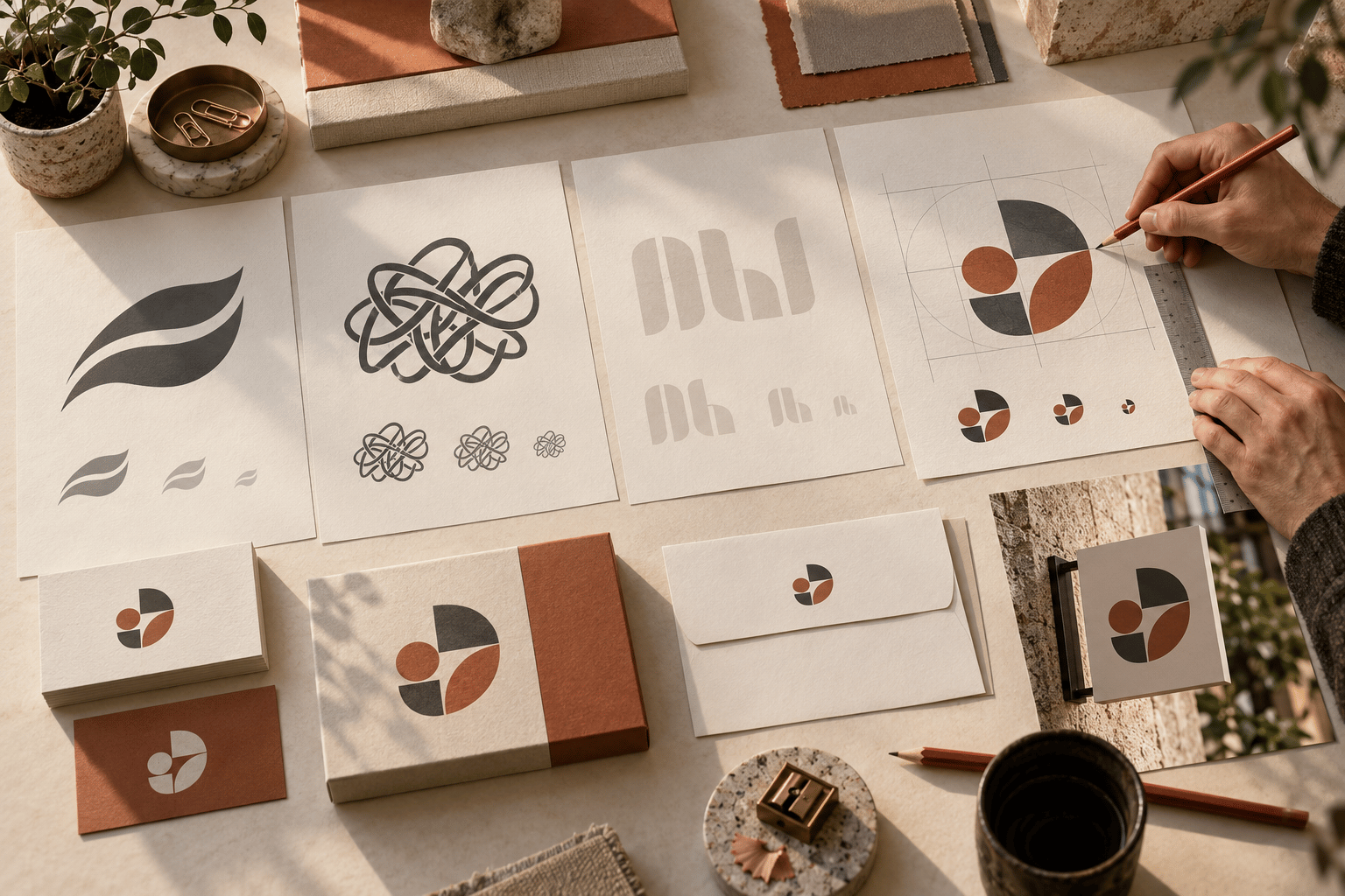
What makes a bad logo is rarely just an unpopular colour or a style someone finds dated. A logo becomes a problem when it repeatedly fails a job the brand needs it to do: help people recognise the business, distinguish it from nearby alternatives, communicate an appropriate expectation, and remain usable across real applications.
That distinction matters when you already have a logo and need to decide whether to keep it, refine it, or replace it. This guide is for founders, brand leads, and designers reviewing an existing mark. Use the patterns below to turn a vague reaction into a practical correction order.
The most common signs of a bad logo
1. It looks interchangeable
A logo can be clean, balanced, and professionally drawn while still looking like every other company in its category. Generic leaves, swooshes, shields, geometric initials, and familiar gradients are not automatically wrong. The problem appears when the mark offers no feature that a viewer could recognise after the brand name is removed.
Place the logo beside five to ten direct competitors at the same size. Hide the names if possible. Notice which marks merge into the same visual group and whether yours has a repeatable distinction in its silhouette, proportions, letterforms, or colour relationship. Distinctiveness does not mean being strange; it means being identifiable without relying on a category label.
2. The name is hard to read
Poor legibility is a practical failure, not a matter of taste. Tight counters, thin strokes, awkward letter spacing, low contrast, or an over-small tagline can turn a wordmark into a soft line at the exact moment a customer needs to read it.
Review the logo in a website header, social profile, invoice, presentation, mobile navigation, and other frequent placements. Inspect it at normal viewing distance, not only zoomed in on the original artboard. Test light and dark backgrounds. For supporting interface text and content, use the authoritative W3C Web Content Accessibility Guidelines reference for contrast and readable communication.
3. It collapses when reduced
A logo that only works large is not ready for a multi-channel identity. At small sizes, fine outlines vanish, separate shapes merge, counters close, and secondary text becomes noise. A detailed mark may look impressive on a presentation cover and fail as a favicon, app icon, social avatar, email signature, or product header.
Preview the logo at the smallest sizes the business actually needs, then inspect it large enough for signage or a presentation. The core idea does not need to look identical at every size. It does need a recognisable relationship across versions. If necessary, create a compact lockup, icon-only mark, or simplified one-colour asset rather than shrinking the full composition indefinitely. An editable vector master, transparent exports, light and dark versions, and one-colour artwork also prevent production problems.
4. It sends the wrong brand signal
A logo does not need to explain the whole business, but it should not create a persistent mismatch with the audience, offer, or intended character. A playful type treatment may feel wrong for a serious professional service. A highly technical symbol may conflict with a human, approachable offer. A narrow product reference may become misleading if the company plans to expand.
Review tone, typography, proportion, colour, and symbolism together. Ask what a reasonable viewer might expect from the business before reading the supporting copy. Avoid judging only by whether the style is fashionable. The useful question is whether the mark supports the expectations the brand needs to establish in its priority context. Literal symbolism can make an offer obvious but leave the brand indistinguishable.
5. It works only in one ideal mock-up
Inconsistent application often reveals a system problem rather than a single drawing problem. The logo may look fine on a white website but fail on a dark product screen, a printed receipt, packaging, signage, a one-colour document, or a busy photograph. Teams then add improvised outlines, drop shadows, containers, or distorted versions to make it fit.
Collect the actual applications that matter and test the logo in each one. Check contrast, clear space, cropping, alignment, background treatment, and the relationship between the full lockup and icon. If every context requires a new workaround, the identity needs clearer variants and usage rules. Compare the Restaurant Logo Review example for a labelled demonstration of how storefronts, menus, receipts, and compact profiles change a review.
6. It asks every detail to compete
Over-complexity is not the same as richness. A logo becomes difficult when too many shapes, colours, outlines, gradients, words, or decorative details compete for the first read. Viewers may notice an illustration, border, and tagline before they can identify the name. At small sizes, the whole mark becomes a dense block.
Test the logo in colour and in one colour. Remove optional details one at a time and note what improves. The goal is not to flatten every identity into a generic geometric mark. It is to establish hierarchy: the name or core symbol should be recognisable first, while supporting detail earns its place in the context where it can survive.
A practical review and fix sequence
Review in an order that separates urgent usability problems from deeper identity decisions. Write down observations instead of relying on a general feeling that the logo is “bad.”
- Define the job: audience, priority applications, viewing conditions, and whether the decision is keep, refine, or reconsider.
- Gather real assets: vector master, exports, wordmark, icon, colour variants, usage guidance, and a list of what is missing.
- Run a first-read test: show the mark briefly in colour and monochrome, then record what people notice first.
- Check distinction: compare direct competitors at the same scale and identify both category similarities and a feature worth developing.
- Test legibility and size: review wordmark, supporting text, icon, and full lockup from the smallest required use to a large display.
- Test backgrounds and production: check light, dark, busy, reversed, and one-colour applications and verify exports.
- Review brand fit: ask whether tone and visual signals match the audience, offer, and likely direction of the business.
- Sort findings by action: separate production fixes, system gaps, visual refinements, and strategic concerns.
- Retest the revision in the same contexts. A fix is useful only if it solves the original problem without creating a new one.
The Logo Evaluation Criteria page provides a broader reference for structured review. The Logo Review Tool can help organise a first pass on an existing mark; treat its output as a discussion aid and apply your own audience, category, and application context before deciding.
Continue your logo review
If you want a compact set of checks, read the logo design checklist. For a collaborative feedback process, see how to critique a logo. To assess strengths as well as weaknesses, read what makes a good logo. These related guides address review tasks rather than browsing inspiration or presenting a diagnosis of one specific logo.
When you are ready to examine your own mark, try the Logo Review Tool. Start with evidence from the places customers will actually meet the brand, then choose the smallest correction that addresses the highest-impact failure.
Factual basis
This guide uses practical design-review guidance: compare real category competitors, test actual sizes and backgrounds, inspect files and applications, and distinguish visual observations from strategic judgement. Its accessibility reference is the W3C Web Content Accessibility Guidelines. Recommendations should be verified against the logo’s intended audience, production process, and brand requirements rather than treated as universal performance claims.
Frequently asked questions
How can I tell whether a logo is genuinely bad or simply not my personal style?
Judge the logo against its job: recognition, distinction, legibility, brand fit, and reliable use across real applications. Personal preference is useful feedback, but repeated failures in those practical tests are stronger evidence.
What should I test first when reviewing a weak logo?
Start with the highest-impact use cases: website header, mobile view, social avatar, print, light and dark backgrounds, and the smallest required size. Then compare the mark with direct competitors at the same scale.
Does a bad logo always need to be replaced?
No. Some problems are fixed with better spacing, contrast, simplified variants, cleaner exports, or clearer usage rules. Replace the identity only when the core distinction, meaning, or system cannot support the brand after sensible refinement.
Can a detailed logo still work?
Yes, if the identity has a recognisable core and appropriate simplified versions. A detailed presentation mark should not be forced into a tiny icon; create compact, one-colour, and icon-only variants when the applications require them.
Ready to review your logo?
Get a structured first pass across clarity, contrast, scalability, and real-world use.
Try the Logo Review Tool