Demonstration Case · Sample Logo Review
Poor Logo Typography Review: A Sample Analysis
A worked example of how spacing, weight, alignment, and type selection can make an otherwise clear logo feel accidental or difficult to trust.
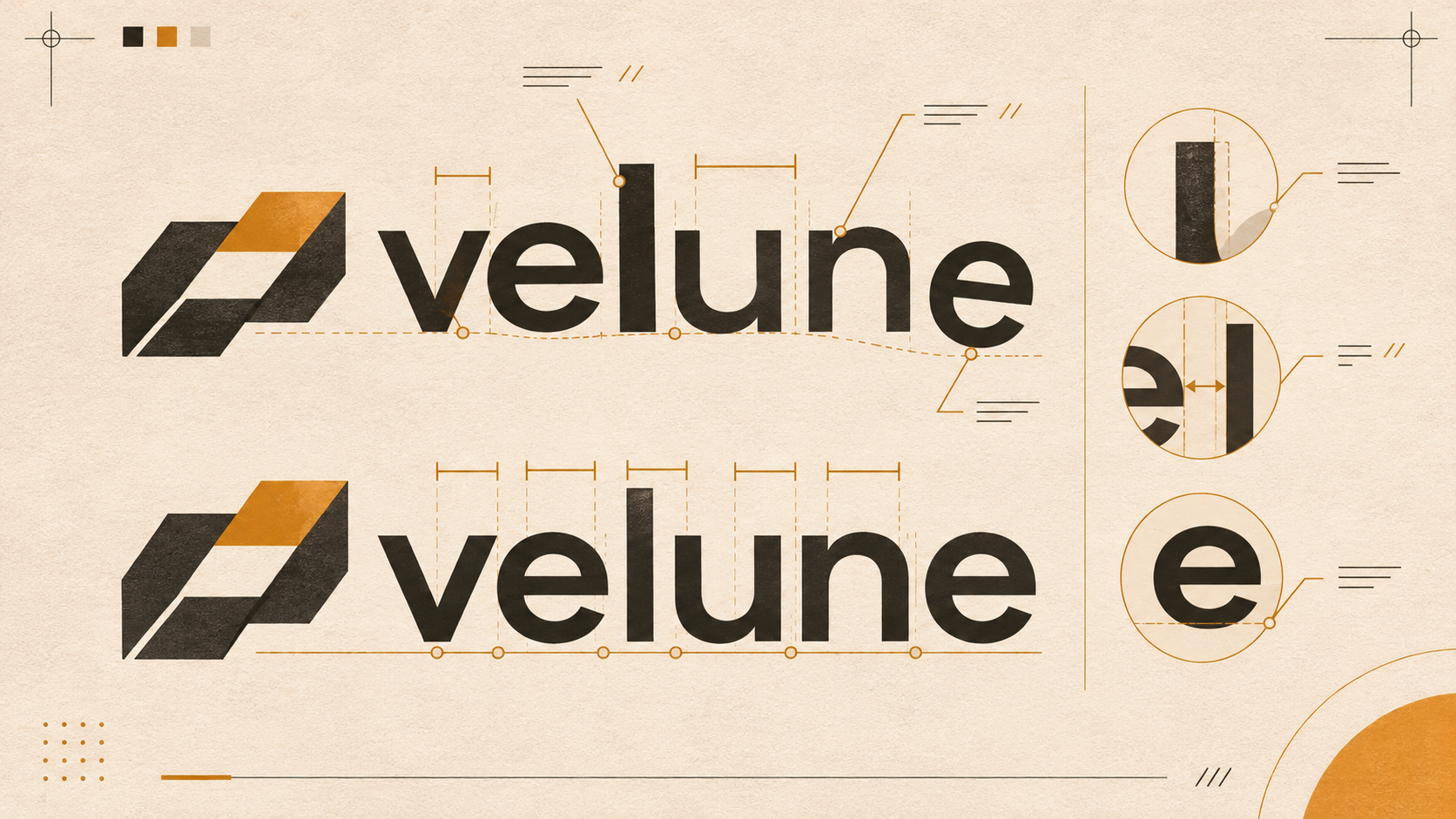
Before: the wordmark is doing too many jobs
The sample lockup pairs a geometric symbol with a lowercase wordmark in a high-contrast display face. The symbol is compact and reasonably memorable, but the type treatment feels disconnected: the letters are tightly packed in one area, loosely spaced in another, and set at a weight that competes with the icon. A secondary line is aligned to the full width of the name rather than to a meaningful visual edge.
None of these choices is automatically wrong. Typography becomes a problem when the viewer cannot tell whether a decision is intentional. A logo can be expressive and still need a more controlled relationship between symbol, name, tagline, and surrounding space.
Context: typography must survive real use
The wordmark appears in a navigation header, a square social profile, a pitch deck, a small invoice, and a printed label. In the header, the tight counters close when the logo is reduced. In the profile, the full lockup becomes a narrow unreadable strip. On the label, the thin strokes lose consistency because the reproduction process is less precise than a screen.
Test the wordmark by itself before adding the symbol. Read it at normal distance, in monochrome, and beside relevant competitors. Then test the full lockup and ask whether the symbol supports the name or simply adds another competing focal point. The Logo Evaluation Criteria gives typography, visual clarity, and versatility separate attention for this reason.
Review snapshot: spacing, weight, and positioning
Spacing. Default kerning creates visible holes around diagonal and rounded letters, while neighbouring pairs collide. Weight. The symbol is visually dense but the wordmark is fragile, so the lockup feels unbalanced. Positioning. The tagline is centred mathematically, yet optical alignment makes it appear to drift away from the main name.
These are observations, not a claim that a particular font is objectively poor. A different typeface can still fail if spacing, hierarchy, or application variants remain unresolved.
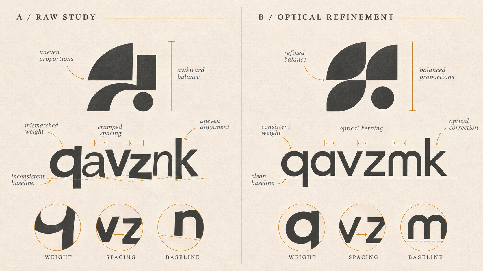
Top 3 problems and recommended changes
1. Refine the letter relationships. Adjust problematic pairs optically, open closed counters, and inspect the wordmark in the final lockup rather than in a font specimen. 2. Establish hierarchy. Decide whether the symbol or name leads, then size and weight the supporting element accordingly. 3. Create useful variants. Prepare a wordmark-only version, a symbol-only version, a compact lockup, and one-colour artwork with shared proportions.
Before redrawing letters, test the smallest change that solves the observed problem. A custom modification may be valuable, but it should be connected to recognition or production need, not added simply to make the type look more unusual.
After: a clearer typographic direction
In this sample direction, the wordmark receives optical spacing, a sturdier weight, and a consistent baseline. The symbol is reduced slightly so it supports rather than overwhelms the name. The tagline is removed from constrained variants and aligned only where it adds useful context. These recommendations are illustrative and do not describe a delivered client outcome.
For a broader typography workflow, read Why Logo Typography Matters and How to Choose a Font for Your Logo. You can also use the Logo Review tool to organise a second opinion across the complete identity.
Frequently asked questions
What makes typography look poor in a logo?
Common problems include uneven spacing, accidental tangencies, weak contrast between symbol and wordmark, unsuitable weight, awkward letterforms, and a typeface whose tone conflicts with the brand. The issue is usually the relationship between choices, not the font name alone.
Should I kern a logo by eye or use default spacing?
Use default spacing as a starting point, then adjust optically. Letter shapes create different amounts of visual space, so equal numeric gaps can still look uneven. Inspect the wordmark at its real display sizes as well as close up.
Is a popular font automatically wrong for a logo?
No. A familiar typeface can work when the wordmark has a deliberate voice, custom spacing, or meaningful modification. The risk is relying on an unedited default treatment that looks interchangeable with other brands.
When should typography lead a logo review?
Typography should lead when the name is the main recognition asset, when the mark is mostly a wordmark, or when the symbol and name do not share a clear hierarchy. Test the wordmark alone before judging the complete lockup.