Logo Review Guide
Why Logo Typography Matters: A Practical Review Guide
Learn why logo typography matters and how to review type choice, spacing, weight, legibility, and real-world use before revising a wordmark.
A practical guide for founders, brand leads, marketers, and designers
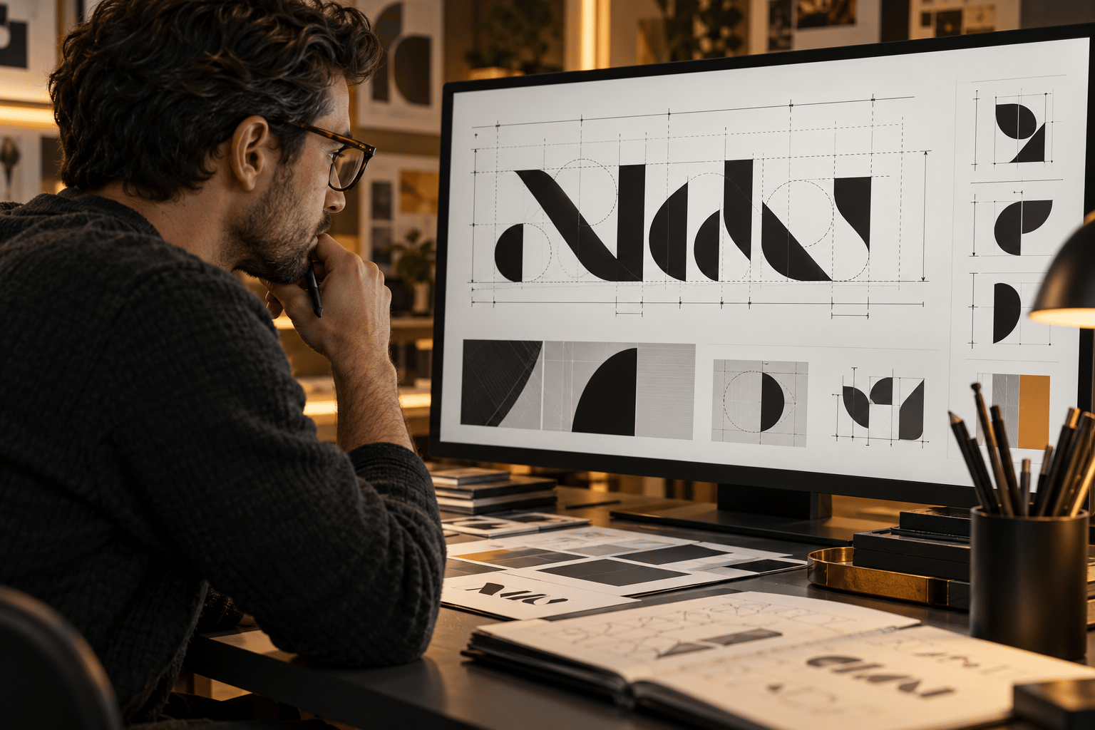
Logo typography is not decoration added after the symbol. In a wordmark or lockup, the letterforms carry the brand name, set the visual tone, and determine whether the identity remains clear when it is reduced, printed, or placed beside real content.
A typeface can look appropriate on a large artboard and fail in a mobile header. Tight spacing can make a familiar name feel cramped; a thin weight can disappear on a dark background; a generic choice can make a distinct symbol feel interchangeable. This guide shows how to review those issues before replacing the whole logo.
Typography gives a logo a voice
Type choices communicate through shape, proportion, rhythm, and contrast. Rounded forms may suggest a softer tone, while high-contrast or sharply angled forms can create a more formal or editorial impression. These are signals, not guarantees: the same typeface behaves differently depending on the name, spacing, colour, symbol, and application.
Start with the brand's actual job. Write down the audience, category, intended character, and three places where the logo must work. Compare the current wordmark with that brief rather than asking whether the font is fashionable. A useful review asks whether the letters support the identity's position and remain appropriate as the business grows.
Legibility is a design requirement
A logo does not need to read like body copy, but viewers should be able to distinguish its letters and forms in the situations that matter. Inspect:
- Counters and apertures: small openings can close when the wordmark is reduced or printed.
- Stroke weight: thin strokes may disappear, while heavy strokes can fill counters and merge letters.
- Letter shapes: similar forms, decorative alternates, and unusual joins deserve a closer look at normal viewing distance.
- Width and proportions: an extremely condensed or extended wordmark may fit one layout and fail in another.
- Case and punctuation: capitals, lowercase, numerals, and punctuation change the rhythm of the name.
Test the actual name in black on white, white on black, and the brand's common backgrounds. Compare it without shadows, gradients, outlines, or bevels. Effects can support a treatment, but they should not be doing the work of making unclear letters appear readable.
Spacing can change the meaning of a wordmark
Even a suitable typeface can produce a weak logo when its spacing is left at default settings. Inspect difficult letter pairs for collisions, unintended holes, and dark patches. Then review tracking across the full name. More space is not automatically more premium, and tighter space is not automatically more confident; spacing should keep the wordmark coherent and support its intended tone.
Also check the relationship between the symbol and the name. An icon with generous geometry can make a tightly set wordmark feel cramped. A small symbol beside a wide wordmark can make the lockup appear unbalanced. Compare optical alignment at normal viewing distance, not only mathematical guides at high zoom.
Weight and contrast must survive real use
Review at the smallest important size, such as a mobile navigation bar, social avatar, browser tab, or product interface. Then test a larger application such as packaging, signage, or a presentation. Thin strokes and small counters often fail first, but a heavy weight can be just as problematic when it closes internal spaces.
Test light, dark, coloured, and image backgrounds. Prepare approved light, dark, one-colour, and reversed treatments where the brand needs them. For surrounding interface text and controls, use the W3C Web Content Accessibility Guidelines as an authoritative reference; logo marks have different considerations, but nearby content still needs to remain usable.
Distinctive does not mean unusual
A logo font should help the identity be recognisable without forcing every letter to become a novelty. Compare the wordmark beside five to ten relevant competitors at the same size. Look for category conventions, confusing similarities, and one ownable feature: perhaps a proportion, terminal, counter, or relationship to the symbol.
If the wordmark feels generic, start by identifying what can be made specific without sacrificing clarity. A small, documented modification may be more useful than an exotic typeface that becomes difficult to read or reproduce. If letters are modified, record what changed and keep an editable vector master so the decision can be maintained consistently.
Test typography in context before changing it
Create a simple review sheet using the real logo name. Include a desktop header, mobile header, social profile image, document or email signature, and one physical application relevant to the business. Show each version at its intended size with the actual surrounding content.
Ask a neutral viewer what they noticed first and what they could read. Record observations such as “the final letters merge at mobile size” or “the wordmark loses contrast on the product image.” Specific observations point to a testable fix; “the font feels wrong” is only a starting signal.
- Confirm the audience, brand direction, priority applications, and smallest meaningful size.
- Check the source files, vector master, font information, licences, and existing usage rules.
- Test letterforms, counters, weight, case, kerning, tracking, and icon relationship.
- Correct production issues and background treatments before redrawing the wordmark.
- Adjust spacing or weight with the smallest change that addresses the observed failure.
- Compare a limited set of alternative typefaces only if the current choice still conflicts with the brief.
- Retest the same applications and document the approved version set.
Check the font licence and the handoff
Before committing to a typeface, confirm that its licence covers the intended use and save the licence information with the project files. A font may have different terms for design work, distribution, web use, or other applications. The Google Fonts FAQ is a useful official reference for Google Fonts questions, but the specific licence remains the source of truth.
Make the final system easy to use: name the full, compact, icon-only, light, dark, and one-colour versions clearly where they are needed. Keep the vector master and document any custom letterforms or spacing decisions.
For a broader framework, use the Logo Evaluation Criteria. To diagnose a specific readability issue, read Why Your Logo Is Hard to Read. You can also compare How to Choose a Font for Your Logo and How to Review a Logo Design.
When you have gathered the logo files and real applications, try the Logo Review Tool to organise a structured first pass. Treat the output as review prompts, then apply your audience, category, licensing, and production constraints before approving a change.
Factual basis
This guide is based on observable design-review practices: comparing letterforms and spacing, testing actual sizes and backgrounds, reviewing competitor context, checking font licences and source files, and separating production fixes from strategic changes. These are review prompts, not guarantees of recognition or business performance.
Frequently asked questions
Why does typography matter in a logo?
Typography carries the brand name, affects tone and distinctiveness, and determines whether the wordmark remains legible across sizes, backgrounds, and applications.
Should I change the font if my logo feels wrong?
Not necessarily. First test spacing, weight, counters, contrast, and the relationship between the symbol and wordmark. A focused adjustment may solve the observed problem.
How do I test logo typography?
Use the real name in actual priority contexts, including a desktop header, mobile header, social profile, document, and one physical application. Check intended sizes, backgrounds, one-colour use, and first-read clarity.
What should I check before choosing a logo font?
Check brand fit, legibility, spacing, scalability, distinctiveness, licence terms, source-file access, and whether the type choice can be maintained consistently.
Next step
Turn a typography concern into a focused logo review.
Upload the mark and its real-world context to organise a structured first pass, then apply your audience and production requirements before deciding what to change.
Try the Logo Review Tool