Brand identity breakdown
Gucci Logo Analysis: The Power of Interlocking Heritage
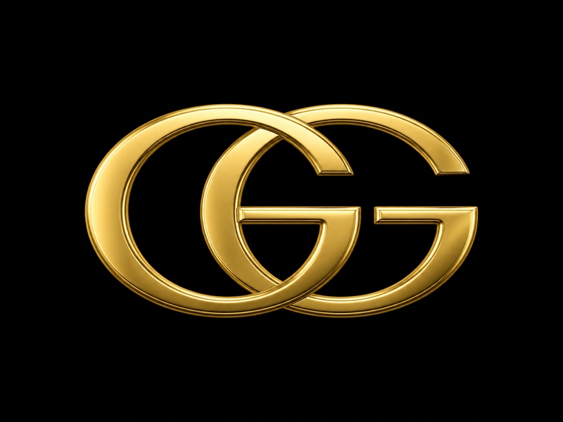
Two interlocking Gs honor a founder's name while creating one of the world's most recognizable luxury symbols. The Gucci monogram proves that personal legacy, designed with geometric precision, can become a global language of luxury.
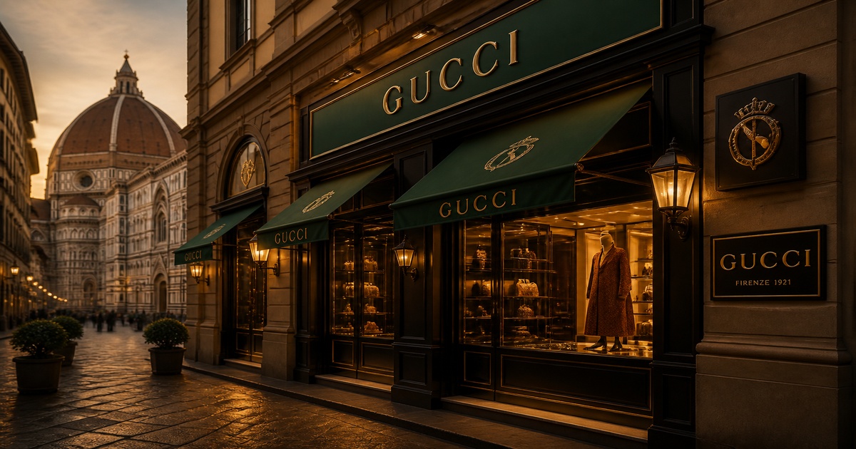
Founded
1921
Founder
Guccio Gucci
Headquarters
Florence, Italy
Business Scope
Luxury leather goods, fashion, accessories
Design concept
A founder's initials that became a luxury language
Guccio Gucci founded his eponymous brand in 1921 after working as a porter at London's Savoy Hotel, where he observed the luggage and leather goods of the international elite. That experience shaped his vision for Italian craftsmanship applied to travel accessories. But it was his son Aldo who transformed that legacy into a visual symbol.
In 1933, Aldo Gucci designed the interlocking double-G logo to honor his father's name. Two capital Gs facing each other create a chain-link visual that suggests connection, heritage, and enduring strength. The design is simultaneously personal (founder initials) and universal (geometric balance), which is why it scales from family business to global luxury empire.
Unlike logos that require abstract shapes to achieve recognition, the Gucci monogram builds authority through directness. It says: this is who we are, this is where we come from, and this is the quality you can expect. That clarity is what makes the GG one of the most counterfeited—and therefore most coveted—symbols in luxury fashion.
Why the interlocking GG works
- A founder-honoring design that encodes heritage into the mark itself, making the logo authentically tied to brand origin.
- A geometric structure that works as both standalone logo and repeating pattern, creating brand density across products.
- A design flexible enough to span black elegance, gold luxury, and green-red heritage accents without losing recognition.
Key takeaways
Design strengths of the Gucci identity
The Gucci logo system succeeds because it treats the GG monogram as both mark and material. The interlocking letters appear as embossed logos, repeated patterns, hardware details, and woven textiles. That versatility is rare in luxury branding.
Heritage Encoded in Form
The interlocking Gs represent Guccio Gucci's initials, binding founder legacy to visual identity. Every product carries the founder's name as a permanent stamp of authenticity and craftsmanship.
A Monogram Built for Pattern
The double-G design scales from a single embossed logo on leather to repeated monogram patterns on canvas. One shape works as both mark and textile design, creating brand density without complexity.
From Family Crest to Global Icon
Aldo Gucci designed the interlocking Gs in 1933 to honor his father. That family-first symbol became one of the most recognized luxury marks worldwide—proof that personal meaning can scale globally.
Instant Recognition at Any Scale
The interlocking design survives on tiny hardware engravings, large retail signage, and everything between. Its geometric simplicity guarantees recognition whether stamped in gold or woven into fabric.
Color Flexibility Across Eras
The GG monogram works in black leather elegance, gold hardware luxury, or green-red stripe accents. That versatility lets Gucci span classic heritage and bold contemporary without changing the core mark.
A Mark That Becomes Material
Unlike most logos that sit on products, the Gucci GG often becomes the product surface itself. Monogram canvas, embossed leather, and hardware patterns treat the logo as material, not just label.
Color strategy
Black, gold, and the Italian tricolor stripe
Gucci's color system operates on two levels. The core logo palette uses black and gold for premium leather applications—signaling timeless elegance and material luxury. Those choices let the GG monogram integrate seamlessly with leather goods, hardware, and formal packaging.
The green-red-green stripe, derived from the Italian flag, functions as a secondary brand element. Applied to webbing, accents, and heritage products, this tricolor pairing connects Gucci to its Florentine roots while creating instant visual recognition across the luxury market.
This layered approach—monochrome core plus heritage stripe—lets Gucci span classic luxury and bold fashion without diluting either. The GG works in gold on black leather for a timeless handbag, in tonal embossing for understated elegance, or alongside green-red accents for a heritage-forward statement.
Black
#000000
Timeless elegance and luxury authority across leather goods and formal applications
Gold
#C19A6B
Premium heritage and craftsmanship that signals exclusivity and Italian luxury lineage
Gucci Green
#006241
Connection to Italian heritage through the national flag, applied across webbing and accents
Gucci Red
#B6002D
Paired with green as a signature stripe, anchoring the brand's visual identity system
Typography
A serif wordmark that anchors heritage
The Gucci wordmark uses Granjon Roman, a classic serif typeface that signals tradition and craftsmanship. The rounded letterforms and balanced proportions give the typography a timeless quality that aligns with the brand's century-long heritage.
When the wordmark appears alongside the GG monogram, the hierarchy is clear: the interlocking letters carry the visual weight and recognition, while the wordmark provides brand name clarity. This separation lets Gucci use the standalone GG in high-recognition contexts (hardware, patterns, embossing) while reserving the full wordmark for formal communications and retail signage.
Evolution
From family signature to global icon
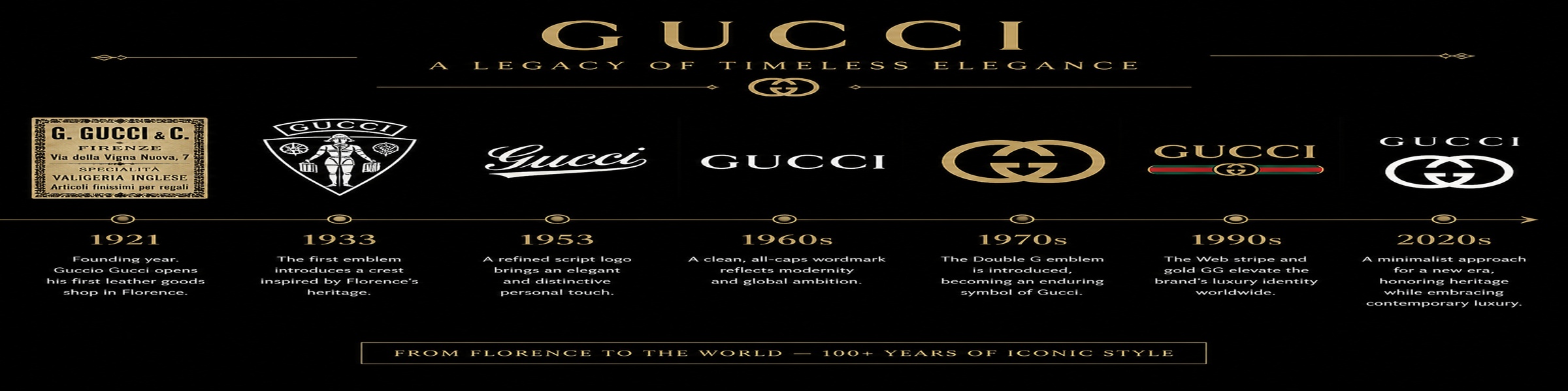
The Gucci logo evolved through deliberate refinements rather than radical reinventions. Each change strengthened the connection between founder legacy and brand identity.
1921-1929
Guccio Gucci founded the brand in Florence after working at London's Savoy Hotel. The original logo was his stylized italicized signature, applied to early leather goods and luggage.
1929-1933
Gucci refined his signature mark, adding a capital 'G' before his surname. This period saw the brand expand from luggage to a broader range of leather accessories.
1933-1960s
Aldo Gucci designed the interlocking double-G logo to honor his father. The two capital Gs facing each other created a chain-link visual that became synonymous with Italian luxury heritage.
1960s-1990
The GG monogram exploded in popularity, appearing on handbags, luggage, and accessories. This era established the double-G as a status symbol recognized worldwide as a marker of luxury and authenticity.
1990-2018
Under creative directors like Tom Ford and Frida Giannini, Gucci refined the logo system. The interlocking Gs appeared in various lockups: standalone monogram, wordmark combinations, and pattern applications.
2019-Present
Alessandro Michele introduced an overlapping Gs variation while keeping the classic interlocking design. The GG monogram now spans heritage collections and contemporary fashion, proving its timeless adaptability.
Brand context
A monogram that spans heritage and contemporary
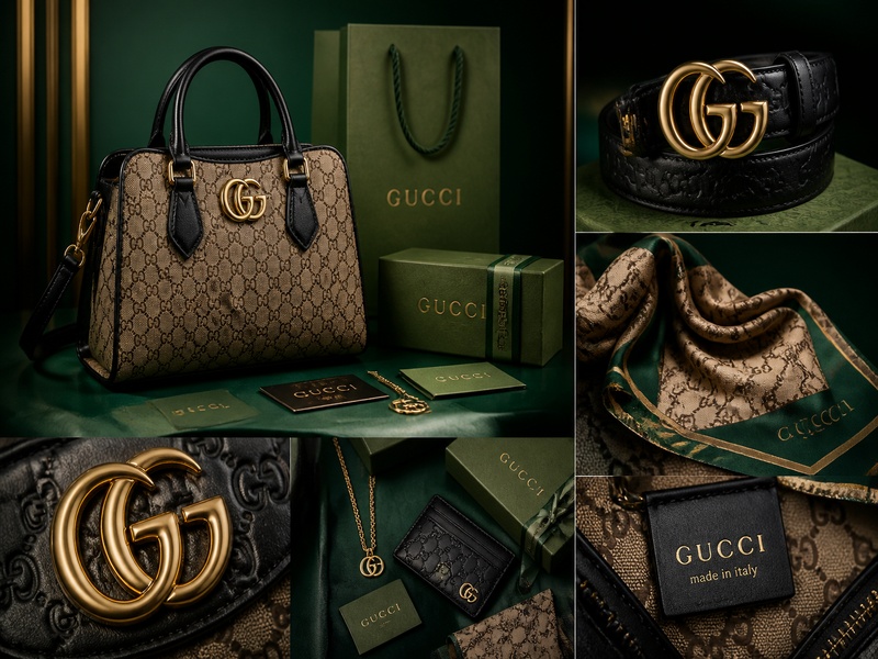
Gucci's GG monogram occupies a unique position in luxury branding: it functions simultaneously as logo, pattern, and material. Unlike marks that sit on products as labels, the interlocking Gs often become the product surface itself—woven into canvas, embossed into leather, cast into hardware.
This integration is what makes the Gucci identity system so powerful. A handbag covered in repeated GG patterns communicates brand identity through density. A single embossed logo on leather communicates refinement and restraint. Both use the same underlying mark, adapted to context.
Creative directors from Tom Ford to Alessandro Michele have worked within this system rather than replacing it. They've applied the GG monogram to new categories (streetwear collaborations, digital applications, sustainability initiatives) while maintaining its core recognition. That adaptability is what makes the double-G a truly timeless design.
Application system
A logo that becomes the product
The GG monogram behaves differently than most luxury logos. It appears as standalone hardware on handbags, as repeated pattern on luggage and accessories, as embossed detail on leather goods, and as woven textile in apparel. That material flexibility is central to Gucci's brand density.
This application system creates multiple recognition points across a single product. A Gucci handbag might feature GG hardware, a green-red stripe, and monogram-patterned lining—all using the same core visual vocabulary. That consistency builds brand recognition through repetition without requiring different logos for different product categories.
Visual evidence
The GG monogram across product, time, and application
These visuals show how the Gucci logo behaves in real brand contexts: from evolution timeline to product integration.
Keep exploring
Related internal reads
Use these pages to compare Gucci's GG monogram with other luxury fashion identity systems.
Prada Logo Analysis
Compare Gucci's GG monogram to Prada's wordmark-first identity and minimalist luxury approach
Chanel Logo Design
See how another heritage luxury house uses interlocking letters to encode founder legacy
Louis Vuitton Logo Design
Explore how monogram patterns define luxury brand identity across product categories
Sources
Reference links used for factual grounding
These sources help anchor the timeline, founding facts, and design history around the Gucci identity.
Gucci Official Heritage
Official brand timeline from founding through modern creative directions
Britannica: Gucci History
Comprehensive encyclopedia entry on Gucci's origins, family history, and global expansion
Designhill: Gucci Logo Analysis
Detailed breakdown of the GG monogram evolution and design elements
Need more logo inspiration?
Ready to create a logo with heritage? Get inspired by Gucci's GG monogram
The Gucci identity shows how founder initials can become a global language of luxury. Study more fashion logos to understand what makes a heritage brand mark work across materials, eras, and markets.