01 · Design philosophy
Two initials, one unmistakable signature
Few fashion marks are as instantly recognizable as Chanel’s interlocking double C. Widely associated with Gabrielle “Coco” Chanel and generally dated to the 1920s, the emblem turns the founder’s initials into a balanced monogram that functions as both signature and status marker.
Two mirrored C shapes face outward while locking together at the center. The result creates visual tension without clutter: control, order, and permanence rather than decoration. That reduction reflects Chanel’s broader approach to fashion—clean silhouettes, functional elegance, and a modern idea of femininity.
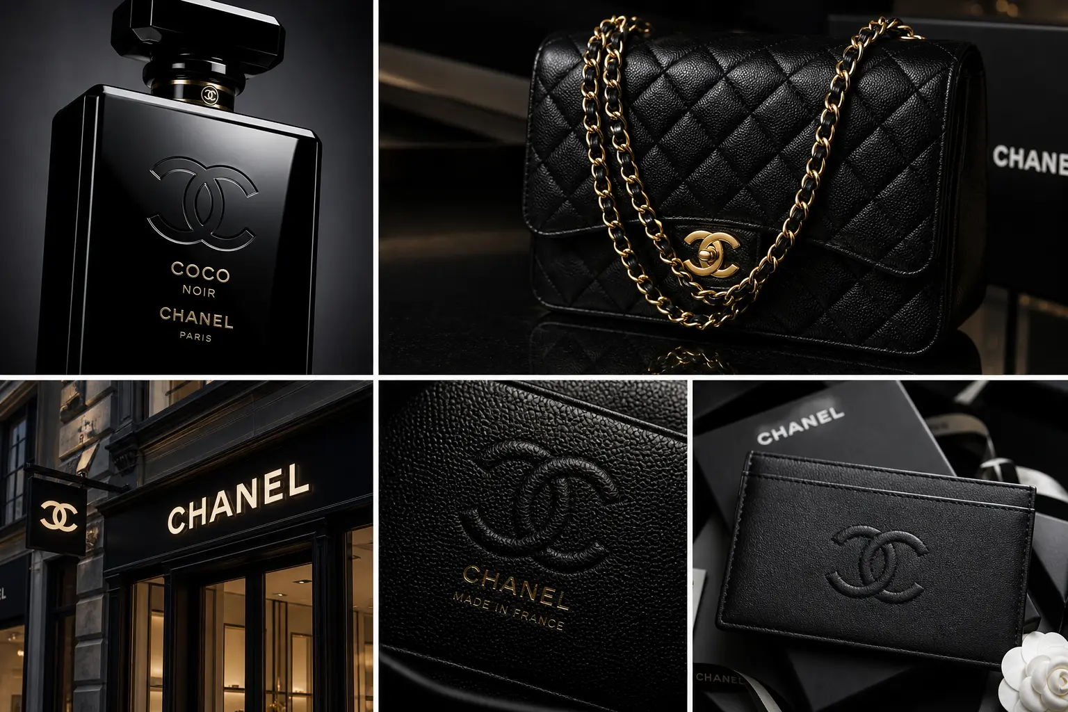
The mark’s geometry also makes it practical. It can stand alone on a clasp, sit above a wordmark on packaging, appear embossed on leather, or scale to boutique signage without losing recognition. The logo behaves consistently across metal, print, glass, fabric, and digital environments.
The luxury equation
Fewer elements + precise proportion + consistent application = a mark that feels confident instead of ornamental.
Founder initials · mirrored geometry
02 · Color & typography
Quiet authority in black and white
Black signals authority, sophistication, control, and exclusivity. White introduces clarity, purity, and space. Together, they form a premium contrast system that makes the emblem feel serious and composed while giving it room to breathe.
The monochrome discipline shifts attention back to proportion, spacing, and form. Even when the emblem appears in gold, enamel, or metallic finishes, the underlying language remains restrained. The same system can move from perfume bottle to handbag hardware, boutique signage, or mobile screen without asking the audience to relearn the identity.
The wordmark supports rather than competes with the symbol. Its all-caps sans-serif construction, crisp strokes, and generous spacing feel modern, formal, and neutral. The uppercase rhythm adds authority, while the absence of flourish preserves the house’s deliberate steadiness.
Black
#000000
Authority, sophistication, control
White
#FFFFFF
Clarity, space, purity
Metallic accent
#B79B62
Craftsmanship in hardware and packaging
03 · Historical evolution
A rare case of near-perfect consistency
Chanel’s identity history is notable less for dramatic redesigns than for disciplined continuity. Changes occur primarily in application—materials, hardware, campaign styling, store architecture, and digital presentation—while the emblem stays fundamentally intact.
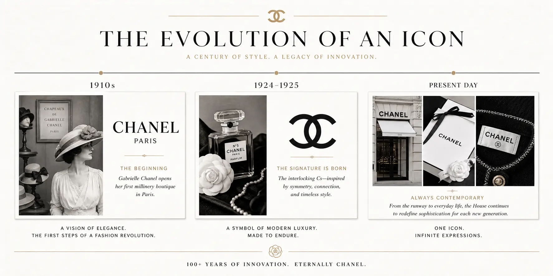
1910
Gabrielle Chanel opens Chanel Modes, her millinery boutique at 21 rue Cambon in Paris.
1913–1918
The house expands through Deauville, Biarritz, and the iconic 31 rue Cambon address.
1920s
The interlocking C emblem is generally associated with this period; its exact first appearance is discussed in several historical accounts.
Today
The core monogram remains fundamentally intact while applications evolve across fashion, fragrance, beauty, accessories, and digital touchpoints.
04 · Design highlights
Why the double C endures
Chanel proves that luxury does not come from adding more details. It comes from making a few deliberate choices and protecting them across generations.
Recognition without explanation
Two mirrored initials are enough to make the house recognizable without a supporting illustration or slogan.
Luxury through restraint
The identity removes decoration and lets proportion, contrast, material, and consistency create a premium impression.
One mark, many materials
The double C remains legible as print, embossing, enamel, jewelry hardware, storefront signage, or a digital avatar.
05 · Application system
One symbol, many luxury contexts
The double C appears across fragrance, beauty, fashion accessories, jewelry hardware, packaging, storefronts, and editorial environments. The symbol’s stable geometry lets each material add tactility without changing the core identity.