01 · Design Philosophy
The Hand-Drawn Legacy
In 1886, when pharmacist John Stith Pemberton created his famous beverage formula in Atlanta, Georgia, his bookkeeper Frank Mason Robinson made a decision that would define one of history's most recognizable brands. Robinson not only named the drink "Coca-Cola"—believing the two "C"s would stand out brilliantly in advertising—but also hand-lettered the name in Spencerian script, a flowing penmanship style that dominated American business correspondence from 1850 through the 1920s.
This wasn't an aesthetic whim. Spencerian script represented professionalism, sophistication, and cultural currency in late 19th-century America. Platt Rogers Spencer's handwriting system, taught through textbooks like the Spencerian Key to Practical Penmanship, shaped how Americans learned to write for business correspondence. By choosing this style, Robinson positioned Coca-Cola within the visual language of established, trustworthy commerce.
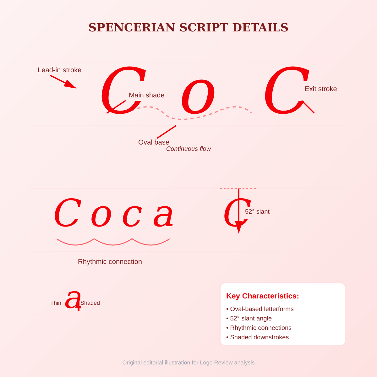
The flowing, rhythmic quality of the script—its oval-based letterforms, moderate slant, and continuous connective strokes—gave the logo movement and elegance. Unlike rigid, constructed logotypes, the Spencerian script felt alive, suggesting craftsmanship and personal attention. This humanistic quality would prove critical as the brand scaled globally: the hand-drawn warmth anchored a mass-produced product in individual experience.
Coca-Cola Red
#F40009
Energy, passion, appetite stimulation
White
#FFFFFF
Contrast and clarity
Black
#1E1E1E
Text and accents
02 · Color Strategy
The Psychology of Coke Red
Coca-Cola Red (#F40009) has become so synonymous with the brand that James Sommerville, former VP of Global Design at Coca-Cola, called it the company's "second secret formula." This vivid, high-saturation red does more than identify—it triggers immediate psychological associations.
Energy and Excitement — Red, across cultures, signals vitality, passion, and action. Neuroscientific research demonstrates that red accelerates heart rate and captures attention faster than any cool color. For a beverage promising refreshment and uplift, red delivers immediate visual energy.
Appetite Stimulation — Color psychology consistently shows red increases appetite and food cravings. Restaurants and food brands use red strategically for this reason. Coca-Cola's red literally makes consumers thirsty.
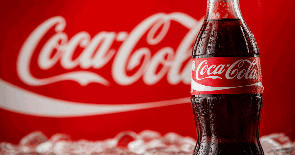
Contrast and Recognition — The red-on-white (or white-on-red) combination creates maximum contrast. The white Spencerian script against the red background produces a high-impact focal point readable at any scale—from a 12-pixel favicon to a 40-foot billboard.
03 · Typography
The Script That Became a Symbol
The Coca-Cola logo is not set in a font—it is hand-lettering, originally drawn by Frank Mason Robinson in 1886 using Spencerian script principles. This distinction matters critically: the logo was designed to spell "Coca-Cola" specifically, not to function as a complete alphabet.
Over decades, the script has been refined and strengthened but never fundamentally changed. Subtle adjustments improved consistency and reproduction quality, yet the essential character—those flowing "C"s, the rhythmic sweep of letters, the elegant swoop of the final "a"—remains intact from Robinson's original hand.
This continuity required discipline. In 1890, the company briefly experimented with a highly decorative "swirly" logo featuring heavy spirals and a "diamond" label style. This radical departure, laden with ornamental excess, was abandoned within a year. The failure of this experiment reinforced what Robinson understood instinctively: the script's power lay in its clarity, rhythm, and uncluttered flow.
Logo Type
Hand-lettered
Spencerian Script (1886)
Brand Colors
Red · White · Black
A restrained three-color palette that proves disciplined simplicity outperforms elaborate schemes.
04 · Historical Evolution
Consistency as Strategy
The Coca-Cola logo's history demonstrates evolution over revolution—gradual refinement rather than dramatic redesign. This stability is unprecedented. Most global brands redesign every 7-10 years to stay current. Coca-Cola's refusal to change signals confidence: the logo is not a design choice to be updated, but a heritage asset to be preserved.
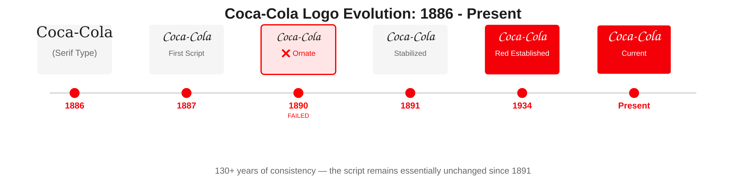
1886
Robinson wrote "Coca-Cola" in simple serif typography for early advertisements.
1887
First Spencerian script logo appeared. Flowing hand-drawn letterform established core identity.
1890
Brief "swirly" anomaly—heavily decorated version abandoned within a year for clarity.
1891-1903
Script stabilized into modern form. Red began appearing in advertisements and signage.
1934
Intense Coca-Cola Red (#F40009) established, completing core identity that persists today.
Present
Logo remains essentially unchanged—white Spencerian script on red for over 90 years.
05 · Design Highlights
Why This Logo Works
Several principles explain the Coca-Cola logo's extraordinary durability and recognition. These factors created a logo that transcends its medium. The Spencerian script, once just a handwriting style, became a symbol. Coca-Cola Red, once just a color, became a promise of refreshment and joy.
Memorability Through Simplicity
The logo does one thing perfectly: spell the brand name elegantly. No symbols, no icons, no visual metaphors. The wordmark itself became the brandmark.
Scalability Across Media
The clean, flowing script works at any size. Unlike intricate logos that collapse when reduced, the Spencerian letterforms remain distinct from highway billboards to mobile app icons.
Cultural Anchoring
By preserving a handwriting style that vanished from daily life, the logo acquired vintage prestige. What began as contemporary became timeless, then classic, then iconic.
Dual 'C' Dominance
Robinson's insight—that two 'C's would stand out in advertising—proved prescient. The repeated curves create visual rhythm and symmetry that the eye tracks instantly.
Color Ownership
Coca-Cola owns red more definitively than almost any brand owns any color. Hide the script, remove the text, show only the red field—billions recognize the brand from color alone.
Consistency Compounds
Every year the logo remains unchanged, accumulated recognition deepens. Mental availability requires repetition over time. Coca-Cola has invested 130+ years in the same visual identity.
06 · Application System
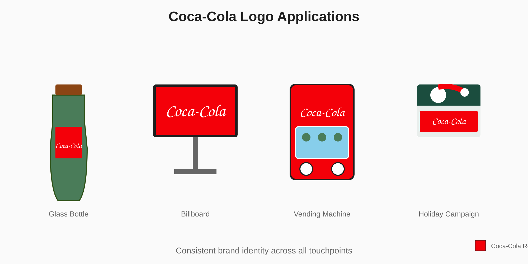
One identity across every customer touchpoint
The Coca-Cola logo performs across product packaging, retail environments, digital platforms, and merchandise—maintaining recognition whether printed on a bottle, displayed on a billboard, or rendered as a mobile app icon.