01 · Design Philosophy
From Architecture to Icon
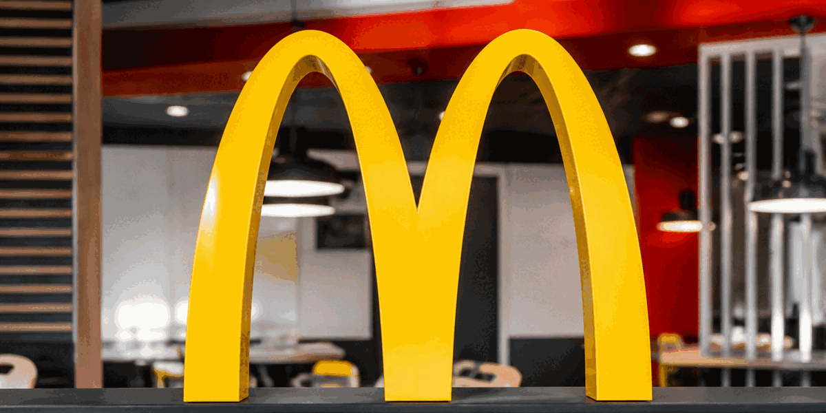
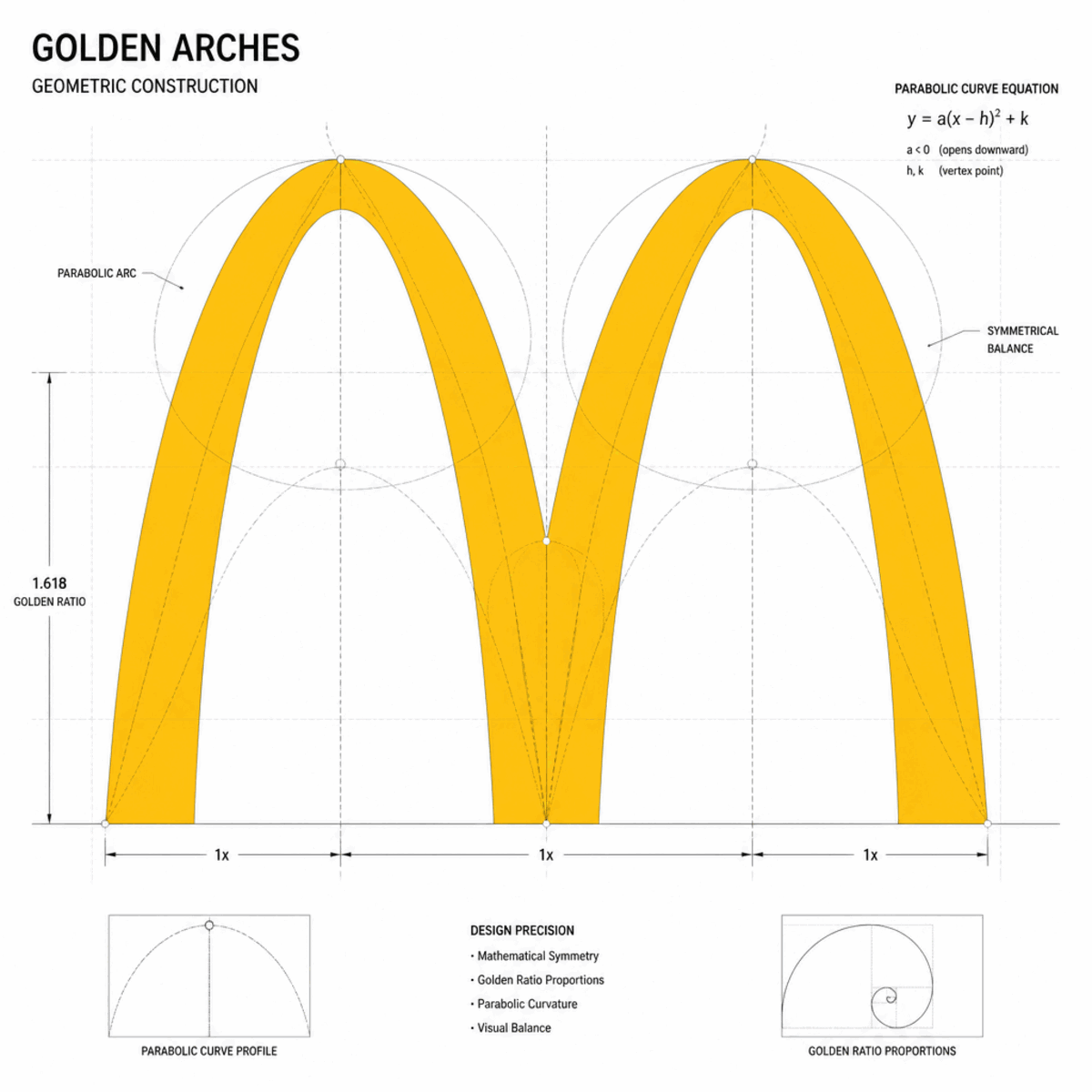
The golden arches are the rare logo that began not as a drawing, but as a building. In 1952, Richard and Maurice McDonald commissioned architect Stanley Clark Meston to design a restaurant that would stand out on American highways. His solution: two 25-foot yellow parabolic arches flanking the structure—one at each end of the building.
From certain angles, those arches formed an 'M' shape. It wasn't intentional design—it was geometry. But Ray Kroc, who acquired McDonald's in 1961, recognized the potential. In 1962, Jim Schindler, McDonald's head of engineering and construction, transformed the three-dimensional arches into a flat logo. The architectural became graphic. The building became a brand.
This origin story explains the logo's unique character. Unlike abstract symbols invented in design studios, the golden arches carry the DNA of physical space, of roadside America, of the drive-in era. The curves aren't arbitrary—they're the mathematical parabolas of mid-century engineering, preserved in graphic form.
McDonald's Yellow
#FFC72C
Happiness, warmth, appetite
McDonald's Red
#DA291C
Energy, passion, urgency
Black
#000000
Text and contrast
02 · Color Strategy
The Psychology of Yellow and Red
McDonald's yellow-red combination is perhaps the most studied fast food color scheme in the world. Each color was selected not for aesthetic preference, but for measurable psychological impact.
McDonald's Yellow (#FFC72C) — Yellow, across cultures, signals happiness, sunshine, and optimism. But in food branding, it serves a more specific function: appetite stimulation. Yellow triggers salivary response. Combined with the warm glow of restaurant lighting, it makes customers hungry before they've ordered.
McDonald's Red (#DA291C) — Red creates urgency. It raises heart rate, captures attention faster than any other color, and triggers impulse behavior. For a fast food restaurant, red says 'act now'—the perfect message for quick-service dining.
The Combination — Yellow and red together create what psychologists call 'attentional capture.' The high contrast and warm palette are impossible to ignore on a cluttered highway or a busy street. The colors work at any scale: a roadside billboard, a drive-thru menu board, a smartphone app icon.
03 · Typography
The Wordmark That Supports the Symbol
Unlike Coca-Cola, where the wordmark IS the logo, or Starbucks, where text disappeared entirely, McDonald's occupies a middle position. The 'McDonald's' wordmark accompanies the golden arches, but the arches alone carry the brand.
The typography is deliberately utilitarian: bold sans-serif, all caps, straightforward. It doesn't compete with the symbol. When the arches appear without text—a store sign, a mobile app icon—nothing is lost. When the wordmark appears alone (receipts, legal documents), it functions clearly but carries less emotional weight.
This hierarchy—symbol first, wordmark second—reflects modern brand architecture. As screens shrink and attention fragments, symbols scale in ways text cannot. The golden M works at 16 pixels; the wordmark does not.
Logo Type
Geometric Symbol
Derived from architectural parabolas (1962)
Brand Colors
Yellow · Red · Black
A high-impact fast food palette engineered for appetite stimulation and urgency.
04 · Historical Evolution
From Speedee to Symbol
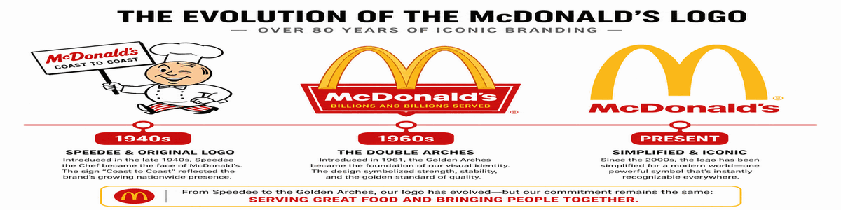
McDonald's logo evolution tells the story of American branding itself: from mascot-based illustration to pure geometric abstraction. The journey spans three distinct eras—character, architecture, and symbol—each representing a different philosophy of brand identity.
1940
McDonald's Bar-B-Q restaurant opens in San Bernardino, California. No formal logo yet—standard restaurant signage.
1948
Speedee the chef mascot debuts. A winking, hamburger-headed character represents the fast-service concept.
1952-1962
Architectural golden arches built into restaurants. Two yellow parabolic arches frame the building, forming an 'M' from certain angles.
1962
Jim Schindler creates first graphic golden arches logo. The architectural elements become a flat brand symbol.
1968
Logo simplifies to the single arch M-shape we recognize today. More abstract, more scalable, more memorable.
2006-2018
Further refinement: cleaner geometry, bolder curves. Logo works in yellow-only or red background variants for maximum flexibility.
05 · Design Highlights
Why the Golden Arches Work
Six principles explain the extraordinary durability and recognition of the McDonald's logo. These factors created a symbol that transcends its fast food origins to become a global cultural artifact.
Recognition Without Words
The golden arches have achieved the ultimate goal of logo design: instant global recognition without any text. A child in Tokyo, a driver in São Paulo, a pedestrian in Paris—all know the symbol instantly.
Architectural to Abstract
Unlike most logos that begin as graphic designs, the golden arches started as physical architecture. The transition from building element to abstract symbol created a unique origin story no competitor can replicate.
Hunger Psychology
Research suggests the golden M subconsciously triggers hunger associations. The brain connects the shape with memories of food, creating an immediate physiological response before conscious recognition.
Yellow-Red Color Mastery
The yellow-red combination is psychology in action. Yellow stimulates happiness and appetite; red creates urgency and energy. Together, they say 'eat here, eat now' without a single word.
Simplification as Power
From detailed mascot to pure geometric form—the journey of simplification demonstrates that recognition grows stronger as the symbol becomes simpler, not more complex.
Cultural Icon Status
The golden arches have transcended branding to become a cultural artifact. They represent not just a restaurant, but an era of American business, globalization, and mass-market design.
06 · Application System
One symbol, infinite contexts
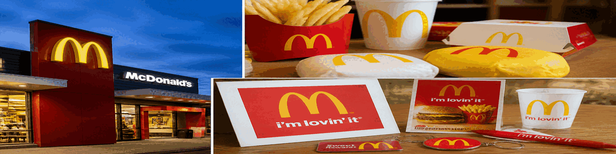
The golden arches perform across restaurant signage, product packaging, digital platforms, and global advertising—maintaining instant recognition whether displayed on a highway billboard, printed on a fry container, or rendered as a mobile app icon.