01 · Design Philosophy
The Mythological Siren
At the heart of Starbucks' visual identity sits a twin-tailed siren—a mythological figure whose origins trace back to ancient Greek folklore and medieval European woodcuts. When founders Jerry Baldwin, Zev Siegl, and Gordon Bowker established Starbucks in Seattle's Pike Place Market in 1971, they sought a maritime emblem that would reflect their seafaring name, inspired by Herman Melville's Moby Dick.
Designer Terry Heckler discovered the perfect symbol in a 16th-century Norse woodcut: a twin-tailed mermaid, or Melusine, whose alluring presence captured the seductive power of coffee itself. As Heckler described it, she became "the perfect metaphor for the siren song of coffee that lures us cupside."
The siren's twin tails also carry practical design benefits—they enable symmetrical composition within a circular frame, creating visual balance that works across scales, from massive storefront signage to tiny app icons.
Starbucks Green
#00704A
Natural freshness and growth
White
#FFFFFF
Clarity and contrast
Black
#000000
Text and accents
02 · Color Strategy
The Psychology of Starbucks Green
The decision to adopt Starbucks Green (#00704A, Pantone 3425 C) in 1987 marked a pivotal transformation from commodity retailer to lifestyle brand. Originally, Starbucks used brown tones befitting a coffee bean retailer—earthy, traditional, and product-focused.
When Howard Schultz acquired the company and merged it with his Il Giornale café concept, green replaced brown as the primary brand color. This shift was strategic. Brown carried associations with commodities and wholesale trade. Green, by contrast, communicates natural freshness, growth, and environmental consciousness.
Psychologically, mid-dark greens like #00704A project groundedness, trustworthiness, and premium positioning. The restrained palette—primarily green, white, and black—ensures the brand remains distinctive across thousands of global locations.
03 · Typography
Custom Typefaces for a Wordless Mark
Since 2011, the Starbucks logo itself contains no text—a bold statement of brand recognition. However, the company maintains a sophisticated typographic system for all other brand applications.
Starbucks employs three custom typefaces: SoDo Sans, a versatile sans-serif used frequently for body copy; Lander, a serif typeface reserved for expressive moments; and Pike, a condensed font for functional headlines and wayfinding.
Historically, the wordmark that encircled the siren (removed in 2011) used Freight Sans Black, a rounded humanist sans-serif that complemented the organic curves of the siren figure. The removal of all text demonstrates the ultimate confidence of a brand that has achieved universal recognition.
Logo Evolution
1971 → 2011
Custom Typefaces
SoDo Sans · Lander · Pike
A tripartite system that communicates across contexts from casual menu boards to premium packaging.
04 · Historical Evolution
From Woodcut to Minimalist Icon
The Starbucks logo has undergone four major transformations over five decades, each iteration maintaining core elements while stripping away unnecessary complexity.
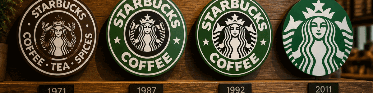
1971
Original brown woodcut-style siren with bare breasts, surrounded by "Starbucks Coffee, Tea and Spices" text.
1987
Logo turned green following Il Giornale merger. Modernized siren with cleaner lines and simplified text.
1992
Cropped to focus on siren's face and upper torso. Emphasized welcoming expression as brand expanded nationally.
2011
Radical simplification: outer ring and text removed entirely. Siren stands alone in monochromatic green.
05 · Design Highlights
Recognition Without Words
The current Starbucks logo represents the pinnacle of minimalist brand design. It achieves what few global brands have accomplished: instant recognition without a single letter of text.
Radial symmetry at every scale
The siren's figure occupies a perfect circle, creating balanced visual weight that works from a 40-foot storefront sign to a 16-pixel favicon.
Recognition without words
Since 2011, the logo contains no text—a bold statement of brand recognition. The siren stands alone as a globally recognized symbol.
Anthropomorphic connection
Humans are hardwired to recognize faces. Centering the brand around a mythological face creates emotional connection that geometric logos cannot achieve.
Heritage preservation
Despite modernization, the wavy, woodcut-inspired quality of the siren's hair retains the character of the original 1971 illustration.
06 · Cultural Significance
Maritime Trade Meets Coffee Culture
The siren symbol embodies multiple layers of cultural meaning that have accumulated over Starbucks' 50-year history.
Maritime Heritage — Seattle's identity as a major Pacific port city informs the logo's seafaring theme. The siren represents the romance of ocean trade, connecting customers to the global journey coffee beans take from origin to cup.
Coffeehouse Tradition — European coffeehouses have long served as intellectual gathering spaces. The siren, with her mythological allure, positions Starbucks as a destination for sensory experience and social connection.
Global Recognition — The logo's universality—free from text and language barriers—facilitates global expansion. The siren is as recognizable in Tokyo, Dubai, or London as she is in Seattle.
Brand Promise
"The Third Place"
A welcoming space between home and work where communities gather and connections form over coffee.
Cultural Impact
35,000+
Stores worldwide serving millions daily
07 · Application System
One identity across every customer touchpoint
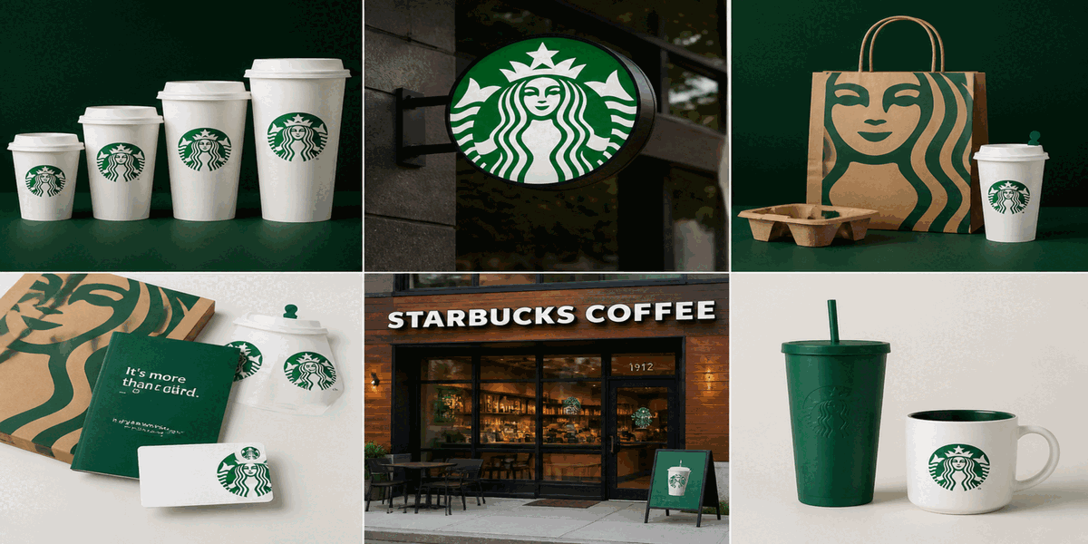
The Starbucks logo performs across product packaging, retail environments, digital platforms, and merchandise—maintaining recognition whether printed on a coffee cup, displayed on a storefront, or rendered as a mobile app icon.