01 · Design Philosophy
Typography as the Brand
Most logos start with a symbol and add text later. Dunkin' took the opposite path. In 1976, designers made a radical decision: remove every icon, mascot, and illustration. Leave only the name. The result was a wordmark-only identity that proved typography alone could carry a global brand.
This wasn't minimalism for style—it was strategic. As Dunkin' expanded from a regional donut shop to a national coffee chain, the logo needed to work on cups, signage, uniforms, packaging, and eventually mobile apps. A single bold wordmark scaled in ways detailed illustrations never could.
The 2019 rebrand doubled down on this philosophy. When Jones Knowles Ritchie simplified "Dunkin' Donuts" to "Dunkin'," they removed the last vestige of literal product reference. The logo now says nothing about coffee or donuts—it relies entirely on recognition. And that recognition comes from 50 years of consistent pink-orange color blocking and rounded, friendly letterforms.
Dunkin' Orange
#F58220
Energy, warmth, appetite
Dunkin' Pink
#DA1884
Friendliness, sweetness, fun
White
#FFFFFF
Background and contrast
02 · Color Strategy
Breaking Coffee Industry Norms
Walk down the coffee aisle of any grocery store, and you'll see browns, greens, and muted earth tones. Dunkin's pink-orange combination doesn't just stand out—it deliberately contradicts category conventions.
Dunkin' Orange (#F58220) — Orange triggers energy, warmth, and appetite. In food branding, it signals action and approachability. For a quick-service chain built on speed and convenience, orange says "get it fast, feel good about it."
Dunkin' Pink (#DA1884) — Pink rarely appears in food logos. It's associated with sweetness, youth, and playfulness—not typically coffee brand attributes. But Dunkin' isn't selling artisanal espresso culture; it's selling friendly, accessible, everyday coffee. Pink makes that promise visible.
The Combination — Together, pink and orange create electric energy. They're high-contrast, impossible to ignore, and work across every medium: a highway billboard, a coffee cup sleeve, a smartphone app icon. The palette has remained unchanged since 1976 because it works—and because competitors can't copy it without looking like imitations.
03 · Typography
Dunkin Sans: Personality in Letterforms
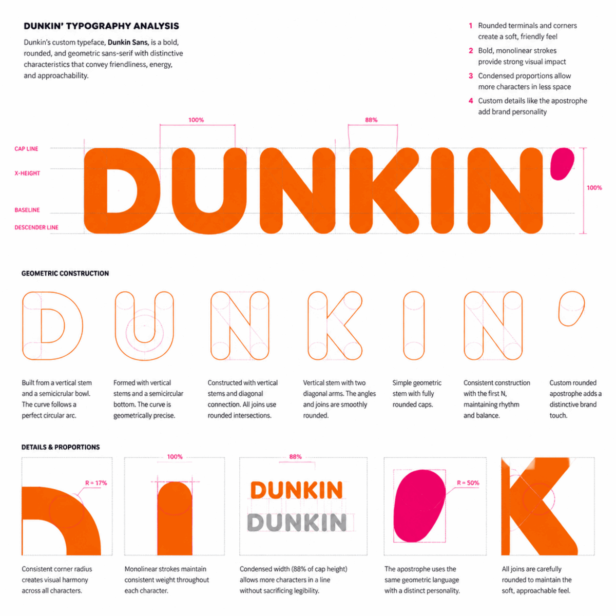
In 2019, Dunkin' introduced a custom typeface: Dunkin Sans. Designed by Jones Knowles Ritchie, it draws inspiration from the rounded curves of 1970s Souvenir and the bold weight of Frankfurter—the two typefaces that defined Dunkin's visual identity for decades.
The result is typography that carries personality without illustration. The thick strokes and rounded corners feel friendly and approachable—the exact traits Dunkin' wants customers to associate with morning coffee runs. At the same time, the condensed proportions and tight spacing create efficiency and speed.
A single detail adds unexpected character: the apostrophe. Rendered in bright pink against the orange wordmark, it's the only break in the color blocking. That small punctuation mark humanizes the typography, reminding customers that "Dunkin'" is a contraction—a nickname, not a formal name. It's the brand saying "we're on a first-name basis with America."
Logo Type
Wordmark
Typography-driven identity (2019)
Typeface
Dunkin Sans (Custom)
Bold, rounded sans-serif inspired by 1970s Souvenir and Frankfurter letterforms.
04 · Historical Evolution
Seven Decades of Simplification
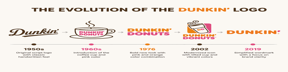
Dunkin's logo evolution tells a story of strategic reduction: from illustrated mascots to iconic typography. Each redesign stripped away elements that didn't scale, leaving a core identity built on color and letterforms.
1950
Dunkin' Donuts opens in Quincy, Massachusetts. The first logo features simple script lettering in brown—a traditional, almost artisanal appearance suited to the era's diners.
1960
Hot pink debuts on the logo. A stylized coffee cup appears with the brand name in a circular donut-shaped frame. The playful color signals a shift toward modern, approachable branding.
1976
The iconic pink-orange combination emerges. Designers remove illustrations entirely, leaving only bold typography. 'Dunkin'' in orange, 'Donuts' in pink—this version remains for 26 years.
2002-2007
A steaming coffee cup returns to the logo, but in simplified form. The DD monogram appears on cups. The wordmark gains subtle refinements while preserving the 1976 color blocking.
2019
The biggest change in brand history: Dunkin' drops 'Donuts' from both name and logo. Jones Knowles Ritchie creates Dunkin Sans, a custom typeface. A single pink apostrophe adds personality to the orange wordmark.
2022
Minor refinements to color and typography for digital optimization. The orange deepens to pumpkin, the pink darkens for better contrast. The apostrophe's pink shifts to echo the brown tones of 1950.
05 · Design Highlights
Why the Dunkin' Logo Works
Six principles explain the extraordinary recognition and adaptability of the Dunkin' logo. These factors created an identity that transcends typography to become a cultural marker of American coffee culture.
Recognition Through Color
The pink-orange combination is so distinctive that customers recognize the brand from color alone. In a coffee industry dominated by browns and earth tones, Dunkin's palette cuts through visual clutter with electric intensity.
Digital-First Simplification
The 2019 rebrand removed every element that didn't translate to mobile screens. No coffee cup. No donut icon. Just bold typography and iconic colors—perfect for app icons, social media, and digital ordering.
Brand Name Evolution
Dropping 'Donuts' wasn't arbitrary—it reflected business reality. Coffee and beverages now drive 60%+ of sales. The shortened 'Dunkin'' mirrors how customers already referred to the brand, making the change feel natural rather than forced.
Unconventional Color Strategy
Pink rarely appears in food branding, yet Dunkin' made it work. The unusual palette signals approachability and fun, differentiating the brand from 'serious' coffee culture competitors. It says: fast, friendly, affordable.
Typography as Identity
When you strip away symbols and icons, typography becomes the brand. The rounded, bold letterforms of Dunkin Sans carry personality, warmth, and confidence—all without a single illustration.
Everyday Accessibility
The logo's design philosophy matches Dunkin's business model: speed over ceremony, value over pretension. Bold colors and thick letterforms say 'grab and go' without words. It's branding for real life, not luxury experiences.
06 · Application System
One wordmark, infinite applications
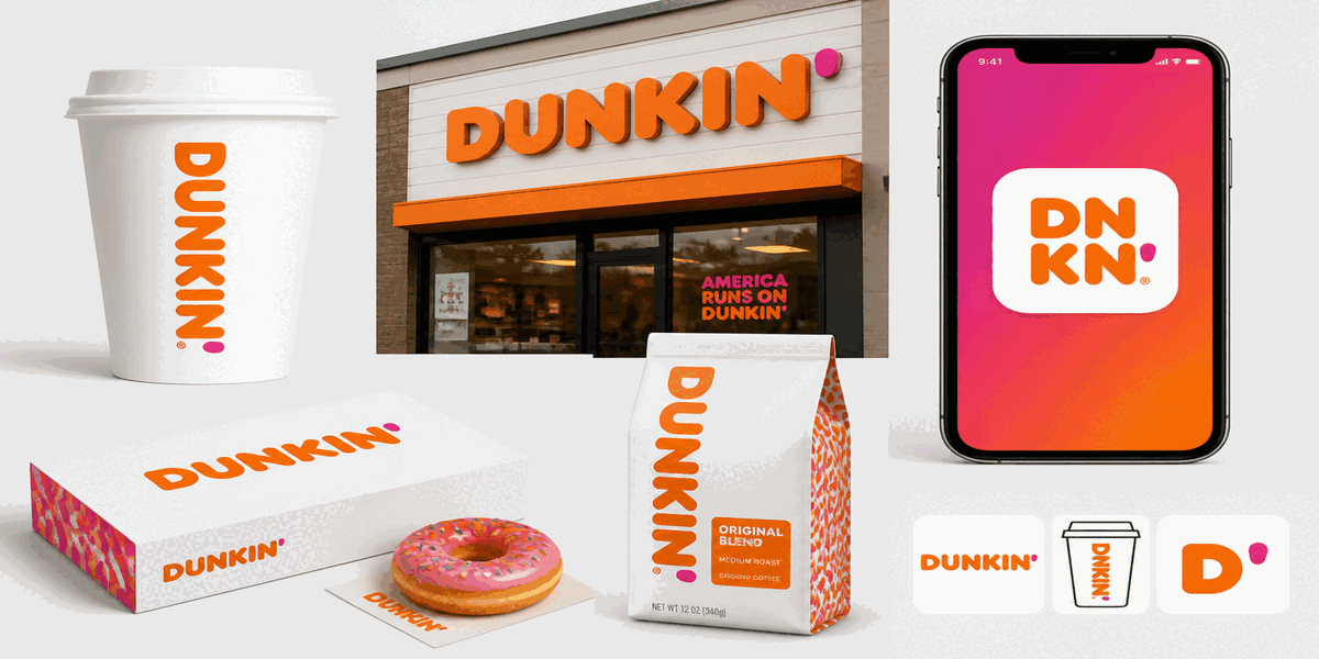
The Dunkin' wordmark performs across coffee cups, signage, mobile apps, delivery vehicles, and merchandise—maintaining instant recognition whether displayed on a 40-foot billboard or a 16-pixel app icon.