01 · Design Philosophy
The Chili Pepper as Cultural Symbol
The Chipotle logo's most distinctive element—a stylized chili pepper enclosed within a circular badge—is a masterclass in meaningful minimalism. This isn't arbitrary decoration; it's the visual embodiment of the brand's very name.
"Chipotle" refers to a smoked, dried jalapeño pepper, a staple ingredient in Mexican cuisine that delivers deep, complex heat rather than mere spice. By choosing this specific pepper as its icon, Chipotle immediately communicates its culinary identity: authentic Mexican flavors, bold taste profiles, and respect for traditional ingredients.
The pepper icon works on multiple levels. It signals "spice" to the uninitiated, instantly positioning Chipotle within the Mexican food category. For those who understand the word's meaning, it reveals depth—the slow-smoking process, the patience required to create chipotle peppers, the artisanal approach that distinguishes fast-casual from fast food. This duality (accessible yet knowledgeable) defines Chipotle's brand positioning.
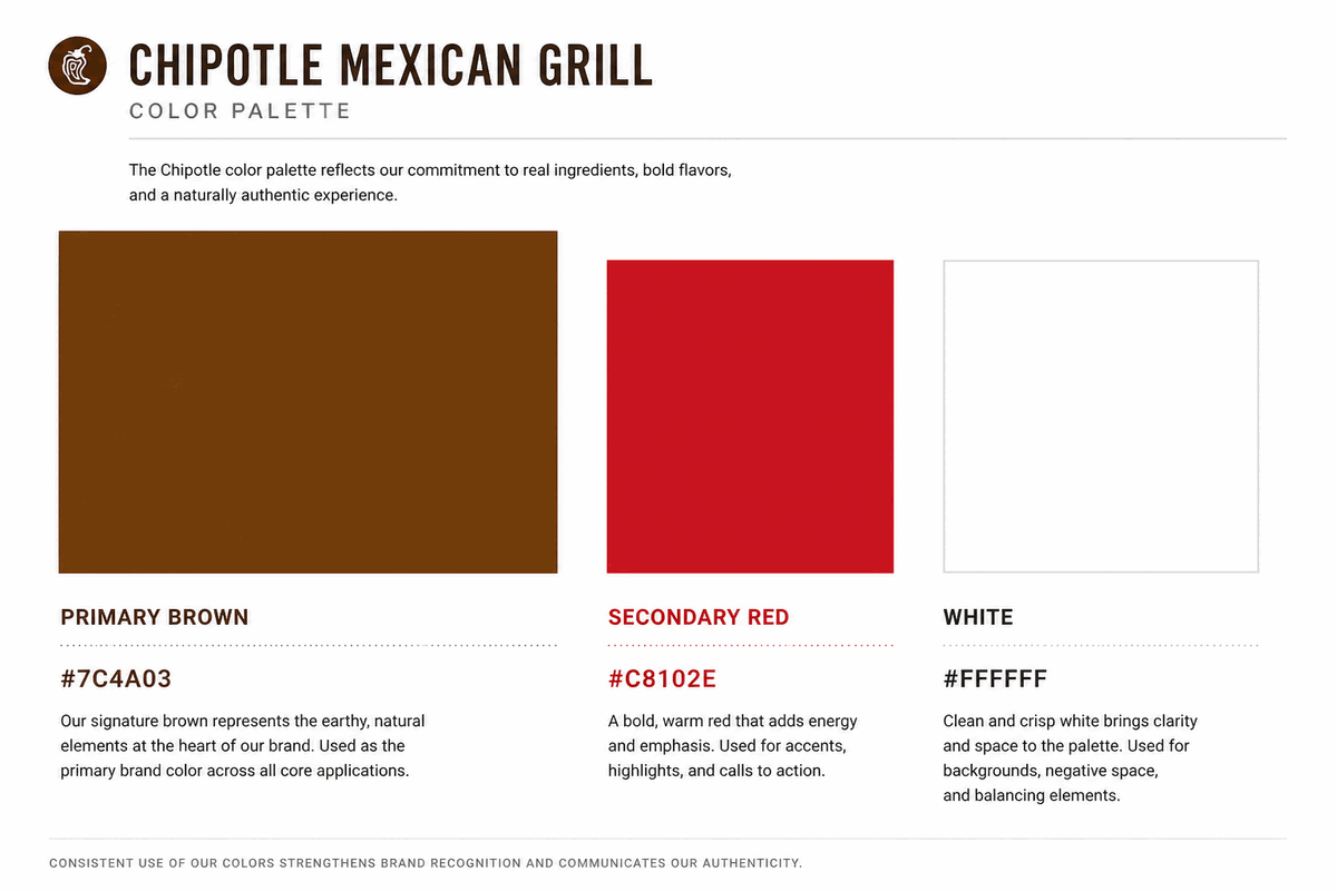
Chipotle Brown
#8B4513
Earth, nature, authenticity
Accent Red
#C8102E
Warmth, appetite, energy
White
#FFFFFF
Contrast and clarity
02 · Color Psychology
Earthy Brown as Brand Signature
While many fast-food chains default to red and yellow (the classic appetite-stimulating combo), Chipotle made a bold strategic choice: earthy brown as its primary brand color. This decision transforms the logo from mere identifier to brand manifesto.
Brown carries powerful associations: earth, nature, authenticity, warmth, organic quality. In a food industry dominated by artificial colors and processed ingredients, brown signals "real." It evokes soil and farming, aligning perfectly with Chipotle's "Food with Integrity" philosophy—their commitment to responsibly raised meats, locally sourced produce, and sustainable practices.
Secondary Red Accents (in some applications) add warmth and appetite stimulation without overwhelming the grounded, naturalistic palette. This restrained color story separates Chipotle from competitors like Taco Bell (bright purple and pink) or Qdoba (energetic flames), positioning it as the sophisticated choice in fast-casual Mexican.
03 · Typography
Bold Sans-Serif Confidence
The wordmark "CHIPOTLE" uses a custom sans-serif typeface with several deliberate characteristics:
- All-uppercase letterforms communicate authority and confidence, establishing presence without aggression
- Bold stroke weight ensures legibility at any scale, from building signage to mobile app icons
- Wide letter spacing creates breathing room, reinforcing the brand's relaxed, approachable atmosphere
- Slight rounding on corners softens the geometry, adding friendliness without sacrificing strength
This typography choice supports Chipotle's positioning as "elevated fast food." It's clean enough for modern sensibilities, bold enough for quick recognition, yet avoids the playfulness of traditional fast-food branding. The absence of serifs signals contemporary, while the custom drawing prevents it from feeling generic.
Logo Type
Wordmark + Icon
Typography-driven with pepper symbol
Typeface
Custom Sans-Serif
Bold, rounded sans-serif with wide spacing for contemporary appeal.
04 · Historical Evolution
From Functional to Iconic
Chipotle's logo evolution tells a story of strategic refinement: from simple utility to iconic symbol. Each iteration added meaning while maintaining simplicity, creating a visual identity that grows stronger with time.
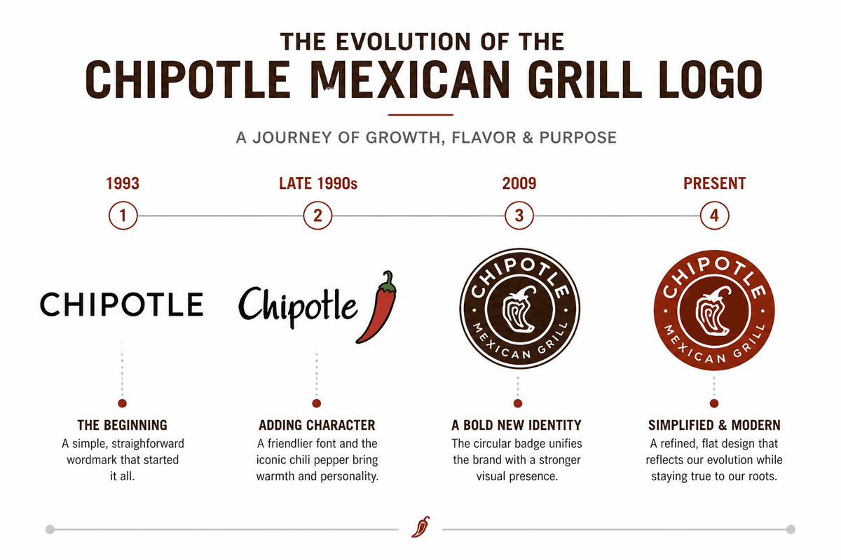
1993
Humble Beginnings — When Steve Ells opened the first Chipotle in Denver, Colorado, the logo was pure utility—a simple sans-serif wordmark with "Mexican Grill" beneath. It matched the restaurant's industrial aesthetic.
Late 1990s
The Pepper Emerges — As Chipotle expanded beyond Colorado, the brand introduced the chili pepper icon and refined the typeface to a friendlier, rounded style. This was the strategic pivot point—shifting from generic restaurant to recognizable brand.
2009
The Modern Badge — The most significant redesign introduced the circular badge format: concentric rings framing the pepper icon, with the wordmark integrated into the design. This version established the visual identity that persists today.
Present
Simplified for Digital — Recent refinements have stripped away complexity, flattening the three-dimensional effects and streamlining the pepper icon to its essential form. This minimalist approach ensures crisp display at small sizes.
05 · Design Highlights
Why the Chipotle Logo Works
Six principles explain the extraordinary recognition and adaptability of the Chipotle logo. These factors created an identity that transcends simple branding to become a cultural marker of the fast-casual dining revolution.
Instant Category Identification
The chili pepper immediately communicates "Mexican food" to global audiences, regardless of language. It's a visual shorthand that transcends borders and cultural barriers.
Scalability at Any Size
The simple shapes work at billboard scale and app-icon size without losing detail. From building signage to smartphone screens, the pepper icon remains crisp and recognizable.
Differentiation Through Color
The brown palette stands apart from the red/yellow fast-food mainstream, signaling premium positioning and quality ingredients in a category dominated by artificial colors.
Authenticity Narrative
Every element—pepper icon, earthy colors, bold typography—supports the "real food" narrative. The logo doesn't just identify the brand; it embodies the "Food with Integrity" philosophy.
Memorable Silhouette
The circular badge with centered pepper creates a strong, unique silhouette. The logo's restraint is its power—it's built to last, simple enough to remain relevant, specific enough to own.
Cultural Revolution Marker
The Chipotle logo is more than visual identity—it's a marker of industry transformation. It represents the invention of fast-casual dining, a space between fast food and sit-down restaurants.
06 · Application System
One badge, infinite applications
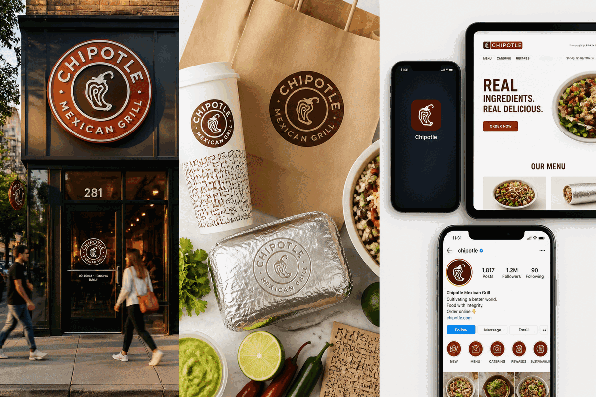
The Chipotle logo performs across storefronts, packaging, mobile apps, and merchandise—maintaining instant recognition whether displayed on a restaurant exterior or a smartphone screen.