01 · Design Philosophy
Directional Arrows as Brand Metaphor
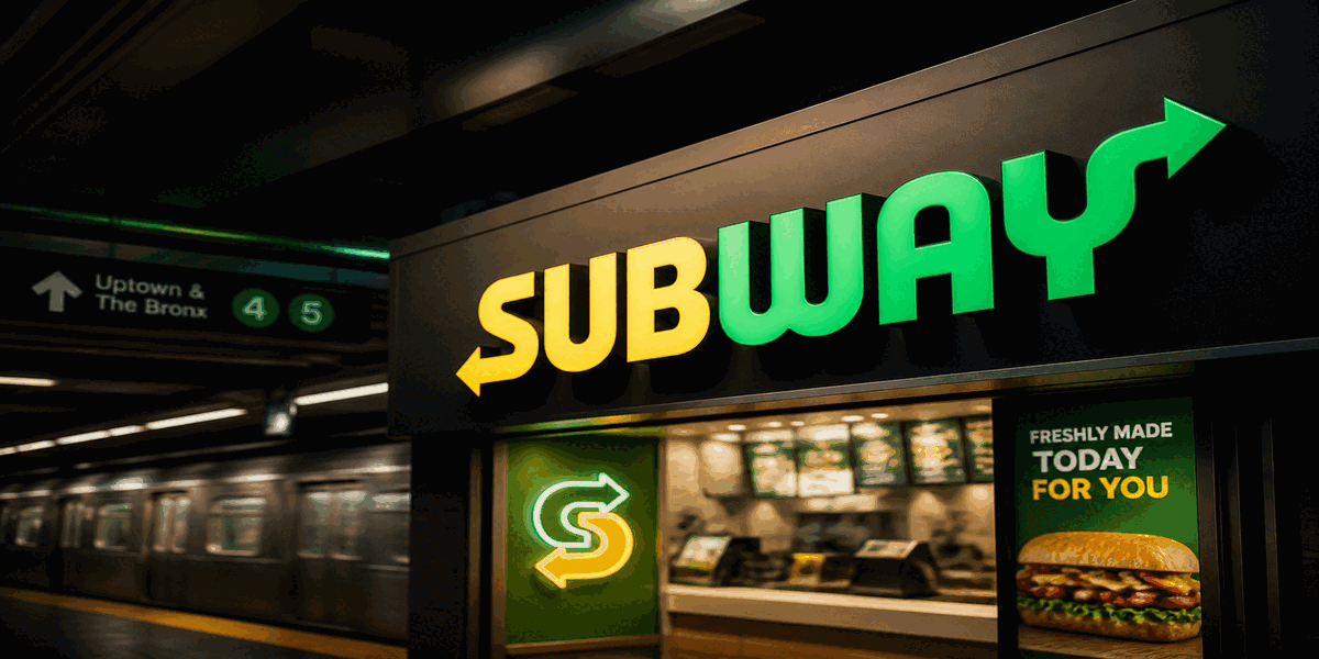
The Subway logo's most distinctive element—directional arrows extending from the "S" and "Y" letters—is a masterclass in meaningful design integration. These aren't decorative flourishes; they're strategic visual devices that communicate the brand's core promise.
The arrows reference subway transit systems: underground trains moving in both directions, suggesting speed, efficiency, and the journey from point A to point B. This transit metaphor aligns perfectly with the brand name itself, creating a self-reinforcing identity system. The arrows imply movement, progress, and getting customers their food quickly—essential values for a quick-service restaurant.
Beyond transportation, the dual arrows symbolize choice and customization. Subway's entire business model centers on made-to-order sandwiches where customers choose every ingredient. The bidirectional arrows visualize this flexibility: go left or right, choose this or that, build your perfect sandwich. It's visual language for the brand's "Eat Fresh, Your Way" promise.
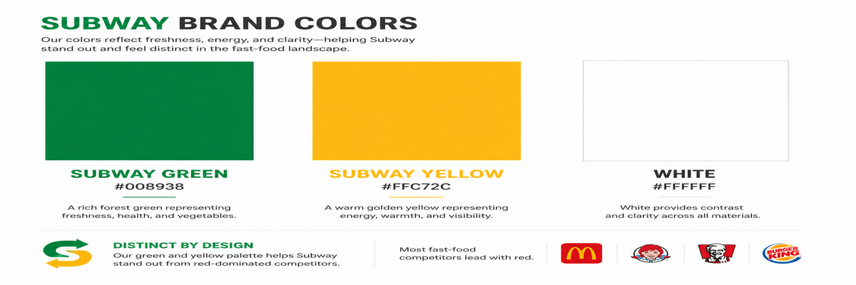
Subway Green
#008938
Freshness, health, vegetables
Subway Yellow
#FFC72C
Energy, warmth, visibility
White
#FFFFFF
Contrast and clarity
02 · Color Psychology
Green and Yellow: Strategic Differentiation
Subway's green and yellow palette is a deliberate strategic choice that differentiates the brand from the red-dominated fast-food landscape. While McDonald's, Burger King, KFC, and countless others use red to stimulate appetite and signal indulgence, Subway signals something different: freshness, health, and natural ingredients.
Subway Green (#008938) carries powerful associations: vegetables, nature, health-conscious choices, growth, and freshness. As consumer awareness of nutrition grew from the 1980s onward, this green palette aligned perfectly with market trends. The color supports decades of "Eat Fresh" positioning, instantly communicating that this isn't greasy fast food—it's fresh, customizable, and lighter.
Subway Yellow (#FFC72C) adds energy, warmth, and visibility. It evokes bread, cheese, and the comfort of freshly prepared food. Combined with green, the palette creates a fresh, approachable aesthetic that stands out in competitive retail environments while maintaining brand consistency across 42,000+ locations worldwide.
03 · Typography
Italicized Bold Sans-Serif Dynamism
The Subway wordmark employs a custom italicized sans-serif typeface that embodies motion and efficiency. The italicization creates inherent forward movement, reinforcing the brand's quick-service promise—speed, convenience, getting you in and out efficiently.
- Bold stroke weight ensures legibility at any scale, from building signage to mobile app icons, projecting confidence across diverse franchise locations worldwide
- Italicized letterforms create dynamic forward lean, suggesting speed and progress while differentiating from static competitor logos
- Custom-drawn letters with integrated arrow elements transform typography into unique brand assets that cannot be replicated
- Rounded terminals soften the geometry, adding approachability and friendliness without sacrificing clarity or impact
The typography balances distinctiveness with functionality. It's bold enough to command attention on busy street corners and busy food courts, yet refined enough for digital platforms and mobile applications. The custom italic angle—approximately 15 degrees—creates maximum motion without sacrificing readability.
Logo Type
Wordmark + Arrows
Typography-driven with directional elements
Typeface
Custom Italic Sans-Serif
Bold, italicized sans-serif with integrated arrow extensions for dynamic brand identity.
04 · Historical Evolution
Five Decades of Strategic Refinement
Subway's logo evolution tells a story of strategic brand building: from humble sandwich shop to global franchise giant. Each iteration refined the identity while maintaining core equity, creating one of the most recognized brand marks worldwide.
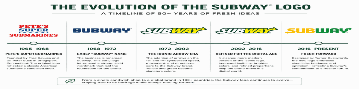
1965-1968
Pete's Super Submarines — The original name and logo were simple text-based designs in red and white/blue. Founded by 17-year-old Fred DeLuca with a $1,000 loan from Peter Buck, the brand started as a single sandwich shop in Bridgeport, Connecticut, with no visual identity strategy beyond basic utility.
1968-1972
The Subway Name Emerges — The name shortened to 'Subway' for easier recognition as franchising began. The logo transitioned to block lettering in various colors, marking the shift from single-store operation to franchise model. This change established the transit metaphor that would define the brand.
1972-2002
The Arrow Era Begins — The most iconic version introduced: italicized yellow letters with green outline and directional arrows on 'S' and 'Y'. This design became embedded in popular culture as Subway expanded globally, establishing the green/yellow palette that signals freshness to this day.
2002-2016
Refinement for Digital — Updated with cleaner proportions, improved kerning, and adjusted color values for digital platforms. This version coincided with Subway becoming the world's largest restaurant chain by location count, requiring a modernized identity for global consistency.
2016-Present
Fresh Forward Redesign — Turner Duckworth created the current logo: bolder, cleaner, with sharper arrows and refined geometry. Part of a comprehensive brand refresh including store interiors, this design maintains recognition while projecting contemporary confidence across 42,000+ locations worldwide.
05 · Design Highlights
Why the Subway Logo Works
Six principles explain the extraordinary recognition and adaptability of the Subway logo. These factors created an identity that transcends simple branding to become a global marker of fresh, customizable quick-service dining.
Directional Arrow System
The arrows on 'S' and 'Y' create dual-directional movement, symbolizing the subway transit metaphor—speed, convenience, and the journey toward healthier choices. They transform ordinary letters into dynamic brand assets.
Instant Global Recognition
With 42,000+ locations worldwide, the Subway logo is one of the most frequently encountered brand marks globally. Its bold simplicity ensures recognition from shopping mall food courts to standalone restaurants across continents.
Color Differentiation Strategy
Green and yellow carve unique positioning in a red-dominated fast-food landscape. While competitors emphasize indulgence with red, Subway signals freshness, health-conscious choices, and natural ingredients—a strategic color decision.
Health-Conscious Positioning
The green palette supports decades of 'Eat Fresh' positioning. As consumer health awareness grew from the 1980s onward, the logo's color psychology aligned perfectly with market trends toward customization and perceived freshness.
Typography as Identity
The custom italicized sans-serif creates dynamic forward motion, reinforcing speed and efficiency. Bold stroke weight ensures legibility at any scale, from building signage to mobile app icons, projecting confidence across diverse franchise locations.
Customization Narrative
The dual arrows imply bidirectional movement and choice—perfectly reflecting Subway's made-to-order model. Customers don't just buy a sandwich; they participate in its creation, choosing every ingredient. The logo visualizes this flexibility.
06 · Application System
One identity, 42,000+ locations
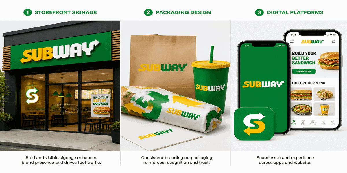
The Subway logo performs across storefronts, packaging, mobile apps, uniforms, and franchise materials—maintaining instant recognition whether displayed on a restaurant exterior in Tokyo, a food truck in São Paulo, or a smartphone screen in Toronto.