01 · Design Philosophy
A Founder Portrait Turned Into Brand Equity
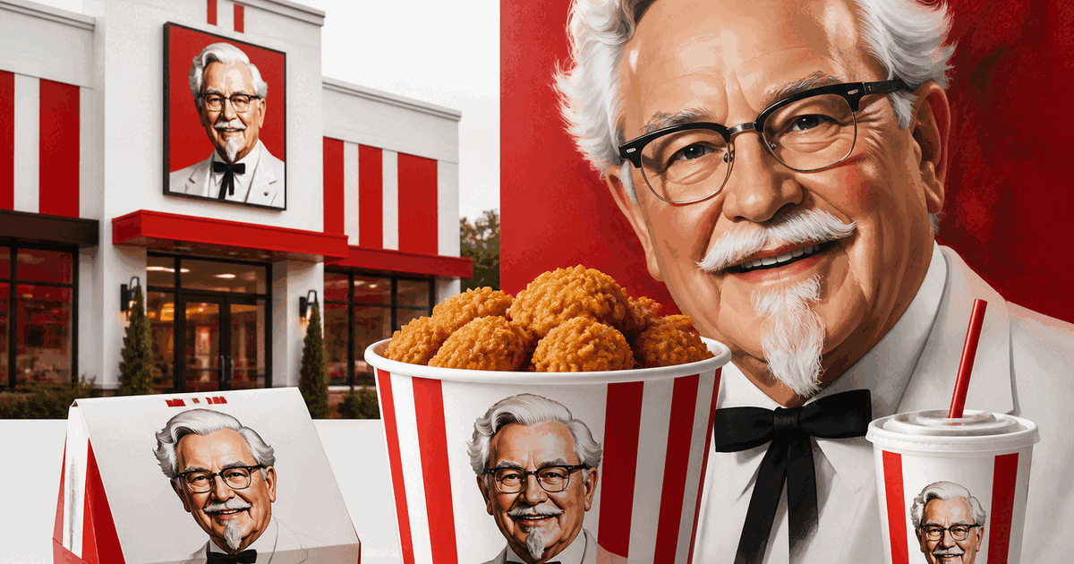
KFC’s logo is built on an unusual decision: instead of hiding behind an abstract emblem, the brand puts Colonel Harland Sanders front and center. That choice makes the identity feel personal before it feels corporate. Customers are not just seeing a restaurant chain; they are meeting the founder figure associated with the original recipe, Southern hospitality, and decades of brand storytelling.
This human-centered strategy matters because fast food is often criticized for feeling industrial or interchangeable. A founder portrait pushes in the opposite direction. The glasses, goatee, warm expression, and ribbon tie create a recognizable character without crossing into cartoon territory. The face implies craft, heritage, and personality, giving KFC an emotional advantage over brands that rely purely on initials or generic food symbols.
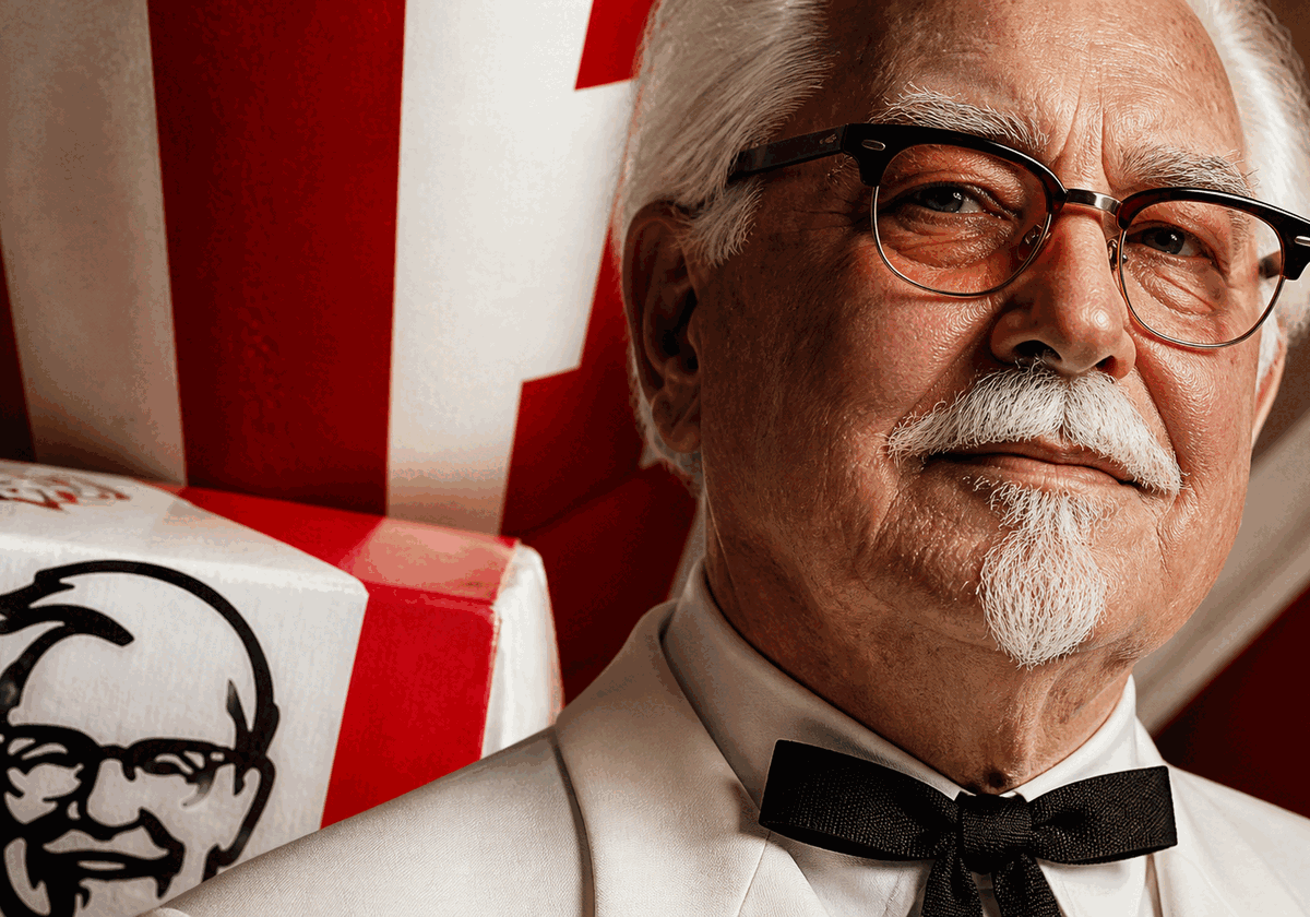
Just as important, the portrait is simplified enough to function like an icon. Good character branding works when a face can be remembered as a shape, not only as a detailed drawing. KFC succeeds because the Colonel is readable at multiple distances: from a roadside sign, on a takeaway bucket, or inside a small mobile app tile. The portrait feels specific, but the silhouette remains instantly legible.
KFC Red
#E4002B
Appetite, urgency, instant recognition
White
#FFFFFF
Cleanliness, contrast, hospitality
Black
#111111
Line detail, portrait definition, authority
02 · Color Strategy
Why Red and White Still Work So Well
KFC’s color system is simple, but strategically sharp. Red is one of the most effective colors in food branding because it increases visual urgency, stimulates appetite, and performs well in crowded retail environments. For KFC, red also adds energy to a brand whose founder portrait might otherwise feel too traditional or static.
White does the balancing work. It gives the identity breathing room, sharpens contrast, and keeps the portrait from becoming visually dense. This is especially important in a logo that contains facial detail. Without white space, the Colonel’s features would collapse into noise. With it, the face feels clean, crisp, and approachable.
The black linework adds a third functional layer: authority and definition. Together, red, white, and black create a system that is bold enough for storefront signage yet controlled enough for packaging and digital surfaces. The palette is not unique in fast food, but the portrait makes it distinctive. KFC does not win by owning red alone; it wins by pairing red with a human face customers already trust.
03 · Typography
A Wordmark That Supports the Character
In the KFC identity system, typography plays a supporting role rather than the starring one. That is the right hierarchy. The portrait is the memory trigger; the wordmark adds speed, clarity, and modern retail practicality. Moving from the full “Kentucky Fried Chicken” name to the shorter “KFC” abbreviation also made the identity more flexible across packaging, menus, storefronts, and digital channels.
- Shorter naming improves readability at small sizes and supports global recognition across language contexts.
- Bold letterforms give the logo enough weight to stand beside the portrait instead of being visually overpowered by it.
- Clean geometry keeps the system contemporary, preventing the heritage portrait from feeling trapped in the past.
- Flexible lockups let the brand lead with the portrait, the initials, or both depending on space and context.
This balance between portrait and type is central to the logo’s longevity. If the typography were too decorative, the identity would become nostalgic in a limiting way. If it were too neutral, the brand would lose personality. KFC’s solution is to let typography do the functional work while the Colonel carries the emotional memory.
Logo Type
Portrait + Wordmark
Character-led identity supported by a concise retail-friendly name
Typography Direction
Bold, Clean, Secondary
The wordmark is designed to stay legible and contemporary while letting the Colonel portrait remain the primary memory device.
04 · Historical Evolution
From Detailed Illustration to Modern Icon
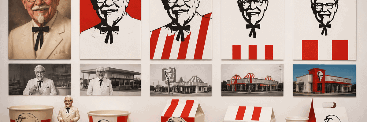
KFC’s visual evolution is a lesson in controlled simplification. The brand did not abandon its founder portrait; it edited it. Over time, the identity moved from more detailed rendering toward cleaner shapes that preserve familiarity while improving reproduction across every modern medium.
1952-1978
Early Kentucky Fried Chicken identities used detailed illustrations of Colonel Sanders with longer typography treatments, emphasizing founder authenticity and Southern recipe heritage as franchising expanded.
1978-1991
The portrait became more standardized for large-scale packaging and signage. This period helped fix the Colonel's glasses, goatee, and string tie as permanent brand memory cues across international markets.
1991-1997
The abbreviation 'KFC' gained prominence as the company modernized its public-facing identity. Shorter naming improved speed, readability, and flexibility across menus, store signs, and advertising.
1997-2006
The logo moved toward cleaner portrait rendering and stronger red framing. The brand preserved its founder equity while adapting to more contemporary quick-service visual systems.
2006-Present
Recent versions simplify the face into bold graphic shapes with crisp linework and a more flexible lockup. The result works across storefronts, cups, delivery apps, and social media without losing the Colonel's personality.
05 · Design Highlights
Why the KFC Logo Stays Memorable
KFC proves that founder branding can scale globally when it is simplified, systematized, and emotionally consistent. These six qualities explain why the logo continues to perform across decades, formats, and markets.
Human Face as Brand Shortcut
Most fast-food logos rely on symbols, mascots, or typography. KFC turns a real person into its central asset. Colonel Sanders' glasses, bow tie, and smile function like a visual signature that customers remember instantly.
Founder Story Built Into the Mark
The portrait does more than decorate the brand. It keeps the founder myth visible at every touchpoint, turning a multinational chain into something that still feels tied to one individual, one recipe, and one origin story.
Red for Appetite, White for Reassurance
The red-and-white palette balances stimulation with clarity. Red delivers energy and food-category relevance, while white prevents the identity from feeling heavy or greasy, supporting a cleaner and more approachable impression.
Portrait Simplified for Screens
As the brand moved from storefront signage to apps, delivery platforms, and social avatars, the Colonel portrait became more graphic and less detailed. The current mark preserves recognition while surviving smaller digital sizes.
Distinctive in a Crowded Category
In a category full of burgers, initials, and abstract shapes, a black-and-white founder portrait immediately separates KFC from competitors. It gives the brand a recognizable silhouette even before the wordmark is read.
Vintage Heritage With Modern Control
The logo keeps heritage cues such as the founder likeness and classic bow tie, yet modernizes them through cleaner geometry, tighter outlines, and stronger contrast. That mix makes the identity feel both familiar and current.
06 · Required Visual Assets
Image requirements for this KFC analysis page
To keep the page production-ready for design and development, the following assets should be prepared in the requested formats. The visual direction should preserve KFC’s classic heritage while emphasizing the Colonel portrait, red-and-white contrast, and real-world quick-service applications.
kfc-logo-hero.svg / kfc-logo-hero@2x.png
Hero image for the top section
Alt text: KFC Colonel Sanders logo in red and white
kfc-logo-evolution.svg / kfc-logo-evolution@2x.png
Timeline visual for historical evolution
Alt text: KFC logo evolution from detailed portrait to simplified icon
kfc-colonel-detail.svg / kfc-colonel-detail@2x.png
Portrait close-up for design philosophy section
Alt text: Colonel Sanders portrait detail in KFC logo
kfc-logo-applications.png / kfc-logo-applications@2x.png
Packaging, storefront, and digital application mockups
Alt text: KFC logo usage in restaurant branding and packaging
07 · Application System
From buckets to storefronts to delivery apps
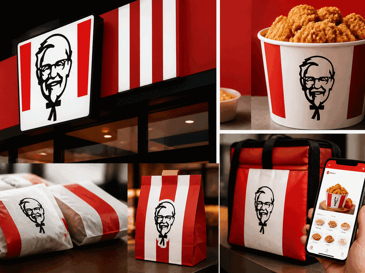
The KFC logo works because it is not trapped in one medium. The portrait and red frame perform on restaurant facades, bucket packaging, paper wraps, uniforms, self-order kiosks, and third-party delivery platforms. That flexibility is essential for a fast-food identity that must be recognized instantly in motion, at distance, and on small screens.