01
Clinical aesthetics can be beautiful
Scientific credibility need not feel cold. Artistic flourishes in typography and soothing green make dermatological expertise feel desirable.
Brand identity breakdown
How the world's first dermatologist-created skincare brand built trust through clinical aesthetics, distinctive horizontal lines, and five decades of visual consistency.
Founded
1968
Founder
Estée Lauder Companies
Industry
Health & Beauty / Skincare
Core palette
Black · White · Green
01 / Philosophy
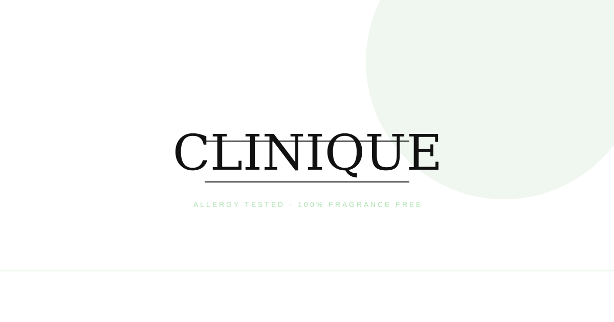
The Clinique logo embodies a fundamental design philosophy that revolutionized the beauty industry: skincare backed by science. Unlike competitors who rely on ornate scripts, floral motifs, or decorative flourishes, Clinique chose a wordmark that communicates medical precision and dermatological expertise.
At the heart of the design is a custom serif typeface with distinctive artistic flourishes. The strokes vary subtly in width, creating an effect that feels handcrafted yet precise—like a physician's careful notation. This tension between clinical accuracy and human warmth defines the brand's visual identity.
The most striking feature is the pair of horizontal lines positioned above and below the wordmark. These lines serve multiple purposes: they frame the brand name with authority, create visual stability, and echo the clinical charts and prescription forms familiar in medical settings.
02 / Color psychology
Celadon green (#ACE1AF) is a soft, soothing shade that suggests growth, healing, and natural renewal without the intensity of forest green or the coldness of clinical teal. For a brand focused on gentle, fragrance-free, allergy-tested products, this color communicates safety and calm.
#111
Authority and clinical precision
#FFF
Purity and clarity
#ACE1AF
Gentle, safe, natural renewal
03 / Typography
The Clinique wordmark uses a custom serif typeface that resembles Jorvik Informal but with unique modifications. Unlike standard serifs that maintain consistent stroke weights, Clinique's letters feature subtle variations that give the wordmark an organic, almost hand-drawn quality.
The "C" curves with unexpected elegance, the "l" and "i" maintain clean verticality, and the "q" descends with a gentle flourish. These details matter because they transform a standard typeface into a proprietary brand asset. No other beauty brand looks quite like Clinique.
04 / Evolution
Unlike many brands that undergo dramatic visual transformations, Clinique has maintained remarkable logo consistency since its 1968 founding. This stability reflects strategic intention rather than design stagnation.
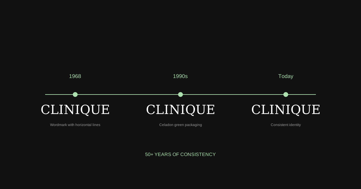
1968
Core wordmark established with horizontal lines
1970s-80s
Celadon green packaging becomes signature
1990s-2000s
Minimalist black-and-white applications
Today
Consistent identity across 135+ countries
05 / Design highlights
01
Scientific credibility need not feel cold. Artistic flourishes in typography and soothing green make dermatological expertise feel desirable.
02
The horizontal lines above and below the wordmark function as authority markers—visual shorthand for credentials and trust.
03
Celadon green allows consumers to locate Clinique from across a department store—a functional navigation tool in crowded retail.
04
50+ years of visual stability has built recognition that competitors cannot easily replicate. Trends fade; equity remains.
06 / Application
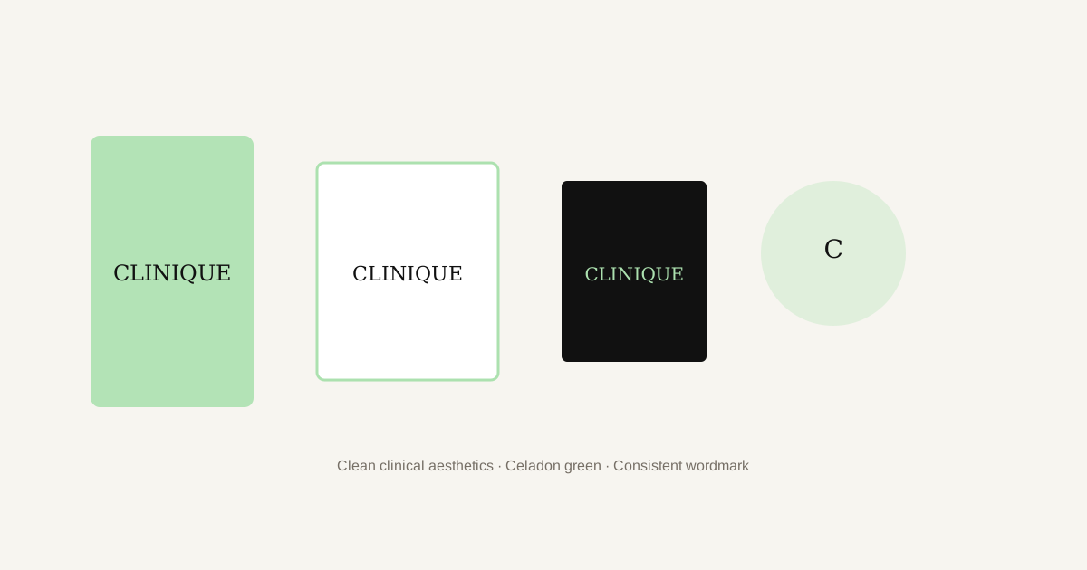
From luxury packaging to mobile interfaces, the Clinique identity stays clear because it doesn't compete with its context. The clean wordmark and distinctive green create instant recognition across 135 countries.
Clinique demonstrates that clinical credibility and beauty elegance are partners, not opposites. Explore more identity systems, then create your own mark with commitment to consistency.
Explore logo inspiration