01
Recognition in the name
A wordmark can be as memorable as a symbol when one carefully controlled letter becomes its signature.
Brand identity breakdown
How one enlarged letter, a monochrome palette, and six decades of restraint built a global beauty icon.
Founded
1909
Founder
Eugène Schueller
Industry
Health & Beauty / Cosmetics
Core palette
Black · White
01 / Philosophy
L'Oréal stands apart from an industry filled with ornamental icons, floral motifs, and decorative flourishes. Instead of asking consumers to decode a picture, it puts confidence in the name itself.
The enlarged O creates an unmistakable point of emphasis while the rest of the name remains immediately readable. That balance—familiarity with a single unexpected detail—makes the mark easy to remember across more than 150 countries.
02 / Color strategy
Monochrome communicates sophistication and expertise, while leaving room for every product line to express its own personality.
Authority, research, and seriousness. A stable master-brand anchor for a science-led company.
Clarity, purity, and breathing room. A flexible field that lets the wordmark adapt everywhere.
03 / Typographic detail
The logo uses a clean sans-serif with minimal ornamentation. Its character comes from proportion: the dominant first character guides the eye into smaller capital letters, creating a two-tier rhythm without sacrificing legibility.
04 / Evolution
The identity gradually removed backgrounds and decoration, trusting that well-designed letters could carry the brand.
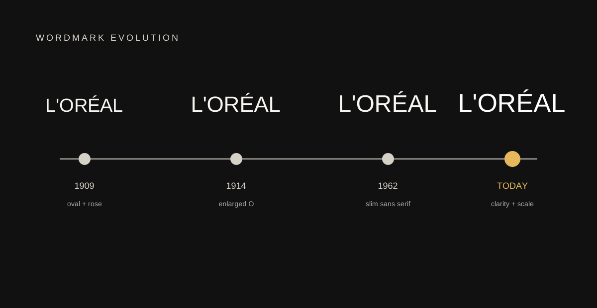
1909–10
Oval and rose-colored sans serif
1914–62
The enlarged O becomes a core signature
1962
Slim sans serif establishes the modern direction
Today
A stable wordmark built for global scale
05 / Lessons
01
A wordmark can be as memorable as a symbol when one carefully controlled letter becomes its signature.
02
Black and white work beside every product color, channel, market, and sub-brand without competing for attention.
03
Keeping a recognizable core for decades gives every new campaign the benefit of accumulated brand memory.
04
The clean, precise sans serif reflects L'Oréal's science-led heritage rather than copying category clichés.
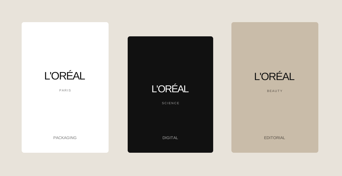
06 / Application
From a luxury bottle to a mobile interface, the wordmark stays clear because it does not compete with its context. That flexibility is strategic, not decorative.
L'Oréal proves that restraint can command attention. Explore more identity systems, then build a mark that earns recognition through focus.
Explore logo inspiration