01 · Design Philosophy
Confidence in the Name
The Maybelline logo demonstrates one of the most powerful principles in brand design: when a name is strong enough, it needs nothing else. Unlike competitors who rely on floral motifs, feminine curves, or decorative symbols, Maybelline built its entire visual identity on a wordmark.
This choice reflects supreme confidence—the brand believes its name alone can carry recognition across 90+ countries and decades of changing beauty trends.
The current wordmark uses bold uppercase letters with clean, geometric lines. The typography is unapologetically modern: straight stems, consistent stroke width, and minimal ornamentation. This is not the delicate script of early 20th-century femininity, nor the playful curves of contemporary indie beauty brands. Maybelline's typography projects authority, professionalism, and mass-market scale. The design says: we are the global leader, and we don't need decoration to prove it.
Logo Type
Wordmark Only
No symbols, mascots, or decorative elements
Brand Colors
Black · Magenta · White
A versatile palette that works across price points and product categories.
Black
#000000
Authority, timelessness, professionalism
Magenta
#E91E8C
Confidence, creativity, bold femininity
White
#FFFFFF
Clean background, contrast
02 · Color Psychology
Black, Magenta, and the Modern Woman
Maybelline's color palette combines two powerful signals: black for authority and magenta for energy. This is not the delicate pink of traditional feminine beauty brands, nor the minimalist monochrome of luxury houses. The magenta accent—applied selectively in marketing materials, packaging highlights, and digital contexts—adds vibrancy to the foundational black wordmark without overwhelming it.
Black conveys professionalism, timelessness, and universal applicability. For a brand that produces everything from drugstore mascaras to prestige collaborations, black provides a neutral anchor that works across price points and product categories. It signals reliability and consistency—the same Maybelline quality whether you're buying in a Paris pharmacy or a Shanghai department store.
Magenta represents confidence, creativity, and bold femininity. The color choice aligns perfectly with Maybelline's brand positioning: makeup for the modern woman who experiments, expresses herself, and refuses to be subtle. This is not safe beige or conservative nude—magenta declares that beauty should be seen.
The palette also supports the brand's famous tagline: "Maybe she's born with it. Maybe it's Maybelline." A monochrome logo might have felt too corporate for this playful, intriguing message. The magenta accent provides just enough color personality to make the tagline feel natural.
03 · Typography
Evolution from Script to Strength
Maybelline's typographic journey spans over a century, reflecting the brand's transformation from a family startup to a global powerhouse. The evolution reveals a brand learning to express confidence through increasingly simplified forms.
1920–1935
Elegant script typeface with handwritten qualities. Letters flowed into one another, creating an intimate, personal feeling appropriate for a brand named after the founder's sister. This design communicated femininity and handcrafted care—values that resonated in an era when makeup was still considered a private ritual.
1992
A major shift to uppercase letters in a clean sans-serif typeface. The change reflected the brand's growth from niche product line to mainstream cosmetics powerhouse. Uppercase letters project strength, confidence, and mass-market authority.
1996–2002
After L'Oréal's acquisition, Maybelline refined the wordmark further: thinner strokes for a sleeker appearance, addition of "New York" to the secondary line, and increased letter spacing for better legibility across applications.
2019–Present
The most recent update reintroduced boldness. Thicker strokes and stronger letterforms restored visual impact. The typography now uses a font similar to Sansettica 3 Regular Expanded, optimized for clarity at any scale—sleek enough for digital screens, bold enough for retail packaging.
04 · Historical Evolution
From Sister's Secret to Global Icon
The Maybelline story begins not in a boardroom but in a family home. In 1913, 19-year-old Thomas Lyle Williams watched his sister Mabel apply a mixture of Vaseline and coal dust to her eyelashes—a homemade beauty trick common among women who couldn't afford commercial cosmetics.
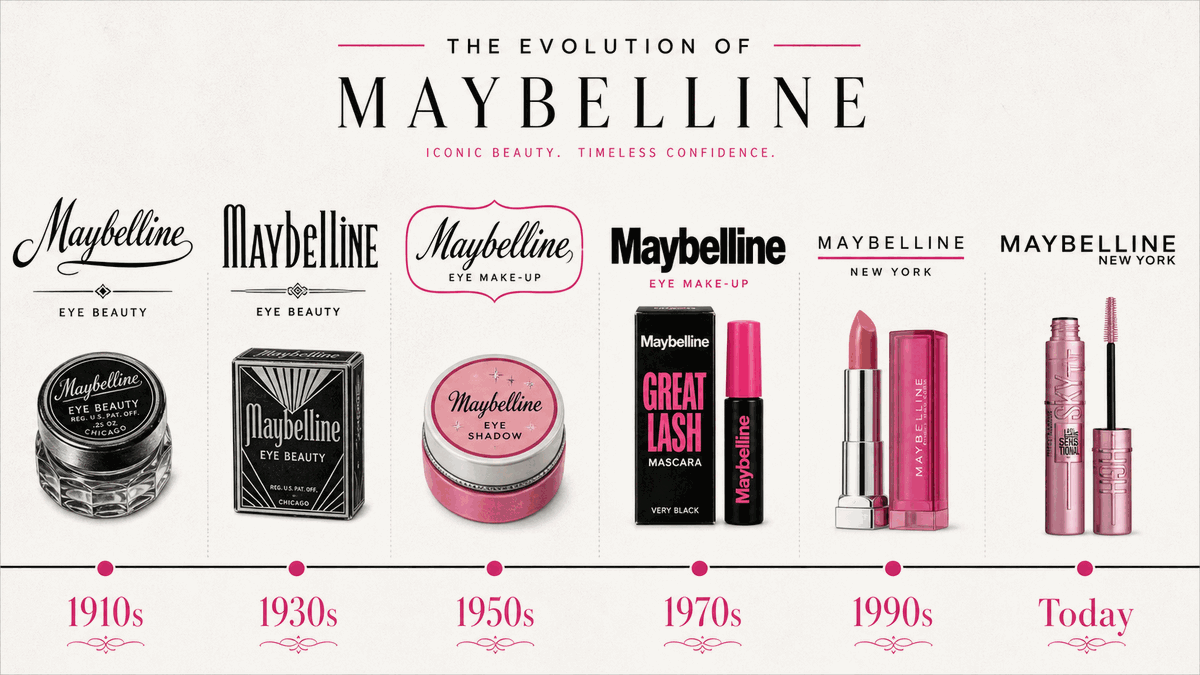
1920-1935
Elegant script typeface with handwritten qualities. Letters flow together, creating intimate, personal feeling appropriate for a brand named after the founder's sister.
1992
Major shift to uppercase sans-serif. The change reflects growth from niche product to mainstream powerhouse. Uppercase projects strength, confidence, and mass-market authority.
1996-2002
After L'Oréal acquisition, wordmark refines further. Thinner strokes project sophistication. 'New York' added to secondary line. Increased letter spacing enhances legibility.
2019-Present
Reintroduced boldness. Thicker strokes restore visual impact that had been diluted. Current design balances modernity with confidence—sleek for screens, bold for packaging.
05 · Design Highlights
Lessons from a Century-Old Wordmark
Six principles explain the extraordinary durability and effectiveness of the Maybelline logo. These factors created an identity that transcends beauty trends to become a global standard.
Wordmark-Only Power
Maybelline proves that when a name is strong enough, it needs nothing else. No symbols, mascots, or decorative elements—just typography that projects confidence across 90+ countries.
Strategic Color Accent
The black wordmark works universally, while strategic magenta application injects energy where appropriate. This two-tier color system enables contextual adaptation: monochrome for corporate, color for consumer.
Typography as Authority
Bold uppercase sans-serif communicates mass-market confidence, not artisanal delicacy. The typography matches the brand's positioning: accessible, reliable, and global.
Evolution, Not Revolution
Each update preserved core elements while refining execution. From intimate 1920s script to bold modern wordmark—the brand built recognition gradually over a century.
Name as Memory Device
Maybelline combines personal history (Mabel), product function (Vaseline), and phonetic elegance (bell sound suggesting beauty). The right name makes visual complexity unnecessary.
New York Cachet
The addition of 'New York' leverages the city's fashion credibility. This secondary line creates visual balance while associating the brand with urban sophistication since 1996.
06 · Application System
One Wordmark, Infinite Contexts
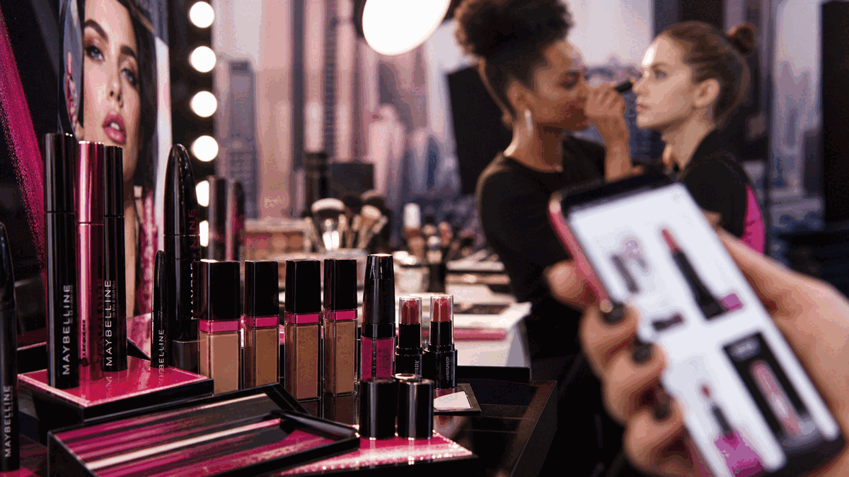
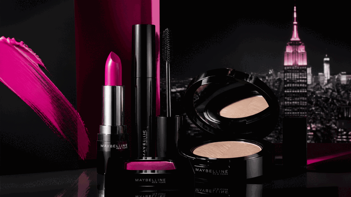
The Maybelline wordmark performs across cosmetics packaging, retail displays, digital advertising, and global campaigns—maintaining instant recognition whether displayed on drugstore shelves, prestige collaborations, or smartphone app icons.