
01 · Design Philosophy
A wordmark that refuses to grow up
Most technology companies spend their first decade trying to look serious. eBay spent its first decade looking like a sticker on a kid's lunchbox — four primary colors, letters piled on top of each other at different heights, a wordmark so cheerful it barely registered as corporate. That was not an accident. It was a deliberate bet that a marketplace built on strangers trusting strangers should feel friendly before it felt powerful. Two decades and one redesign later, the bet still pays off.
Design takeaway
Let personality do the heavy lifting before authority does.
02 · Color Psychology
Four colors, four promises
eBay's palette is the most distinctive thing about its brand. Red (#E53238) on the "e" signals energy and urgency — the countdown, the bidding war. Blue (#0064D2) on the "b" provides trust and stability, essential when strangers send payments to strangers. Yellow (#F5AF02) on the "a" injects optimism and the thrill of discovery. Green (#86B817) on the "y" carries growth, success, and renewal. Together they form a complete emotional arc: excitement leading to trust, then joy, then satisfaction — mirroring the actual experience of using eBay.
Design takeaway
Let each color do one job, and let the combination tell a story.
03 · Typography
From overlapping chaos to clean alignment
The original wordmark, used from the founding era through 2012, was a sans-serif with letters overlapping at different heights and rendered with transparency so colors blended where they met. The 2012 refresh by Lippincott and eBay's in-house team brought every letter to a single baseline, removed the overlap, and thinned the strokes into a sleeker contemporary sans-serif. The letters now touch but do not collide — a distinction President Devin Wenig explained as representing "our connected and diverse eBay community." The wordmark stayed lowercase, approachable, and icon-free.
Design takeaway
Mature the geometry without killing the personality.
Color palette
The four colors that make the brand
eBay Red
#E53238
Energy, urgency, excitement
eBay Blue
#0064D2
Trust, stability, security
eBay Yellow
#F5AF02
Optimism, discovery, joy
eBay Green
#86B817
Growth, success, renewal
04 · Historical evolution
From AuctionWeb to the connected wordmark
eBay's visual history is shorter than most competitors' — roughly thirty years and only one significant redesign — but each stage maps onto a decisive moment in the company's identity. From a monochrome side project to the most colorful wordmark in e-commerce, the evolution shows how a playful mark can mature without losing its spirit.
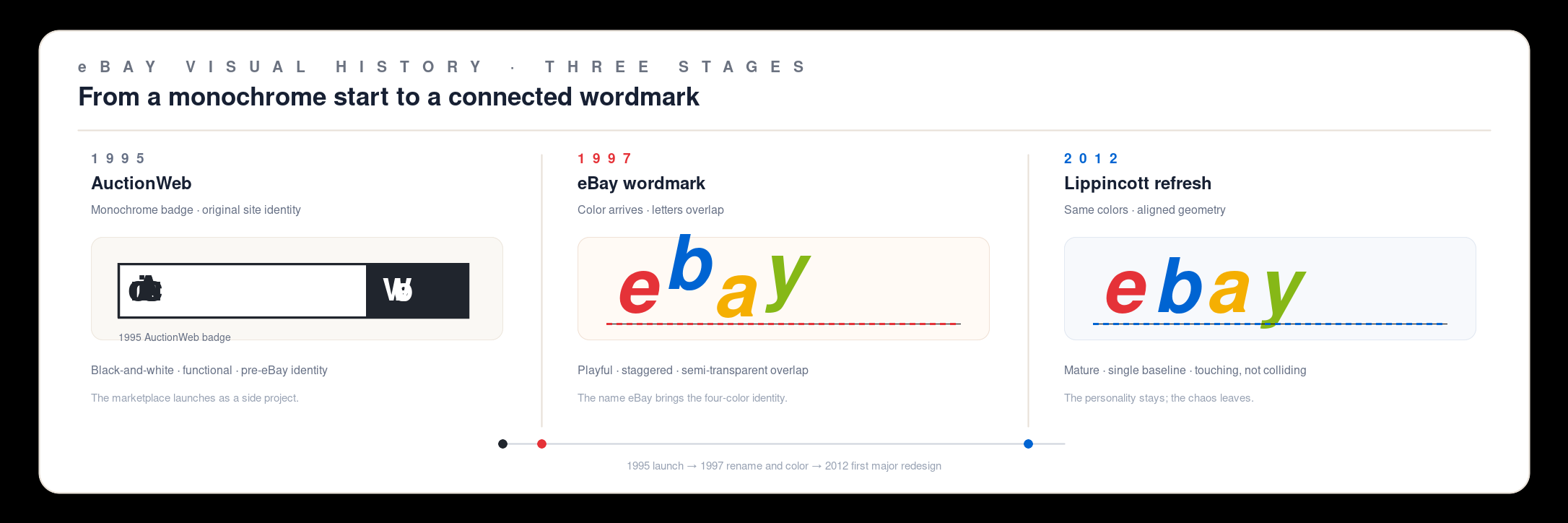
1995
Pierre Omidyar launched AuctionWeb over Labor Day weekend from his home in San Jose, California. The first sale was a broken laser pointer for $14.83.
1997
Renamed eBay after Omidyar's consulting firm Echo Bay Technology Group. The iconic colorful four-letter wordmark debuted with overlapping, staggered-height letters.
1998
eBay went public on September 24. The IPO was one of the most successful of the dot-com era, with shares nearly tripling on the first day.
2012
Lippincott and eBay's in-house team introduced the first new logo since the founding era: aligned baseline, touching letters, same four colors preserved.
Today
The 2012 wordmark remains in use. In an industry where logos change every 5–7 years, eBay's restraint is itself a design decision.
05 · Design highlights
Why four colors survived the cull
The most revealing decision in eBay's logo history is the one Lippincott did not make. When the agency cleaned up the wordmark in 2012, it removed the overlap, the transparency, the staggered heights, and the heavier strokes — every element that made the original look untidy. It did not remove a single color. Four colors survived the cull because they are not decoration. They are the brand. Each letter functions as an independent unit; the red "e" alone carries enough signal for an app icon. That modularity gives eBay flexibility that single-color wordmarks lack.
Most chromatically complex
The only major e-commerce logo requiring four ink wells
Modular recognition
Each colored letter works as a standalone identifier
Diversity encoded
Four colors imply a bazaar, not a curated catalog
06 · Brand application
One mark, millions of transactions
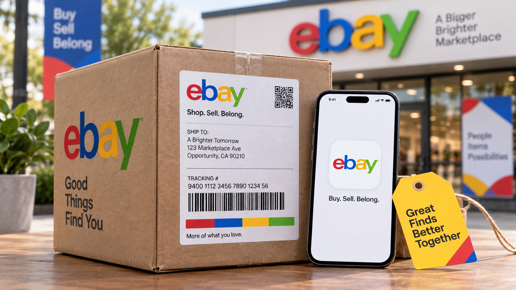
eBay's identity operates across a shipping box, a smartphone app icon, a price tag, and a marketplace storefront sign. The four-color wordmark stays legible at every scale because each letter is a high-contrast unit against any background. The palette extends beyond the logo into category icons and section headers, creating a visual system rather than a single mark.
Brand background
From a broken laser pointer to a global marketplace
eBay was founded by Pierre Omidyar, who launched the site — originally called AuctionWeb — over Labor Day weekend in September 1995 from his home in San Jose, California. The first sale set the tone for everything that followed: a broken laser pointer, bought for $14.83 by a collector who specifically wanted broken laser pointers. Omidyar later launched the Feedback Forum, letting buyers and sellers rate each other publicly — an early answer to the problem of trust between strangers on the internet. The company went public on September 24, 1998, acquired PayPal in 2002, and grew into a global marketplace operating in 190 markets with billions of live listings.