Airbnb Logo Design Analysis

Design Concept
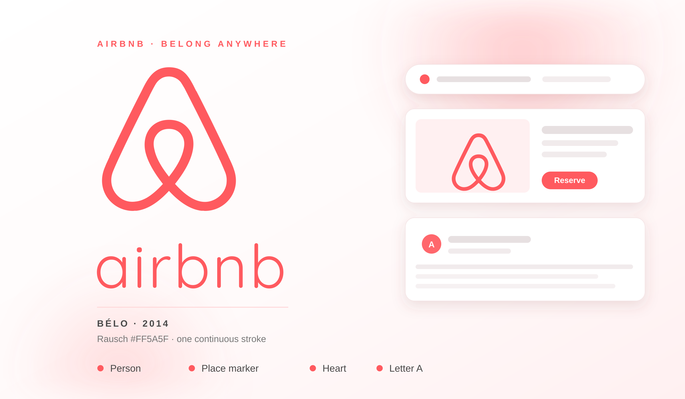
Airbnb's logo, known as the "Bélo," represents belonging through a clever combination of symbols: a heart (love), a location pin (place), and the letter A (Airbnb). This multi-layered design tells a complete story about the brand's mission—creating a world where anyone can belong anywhere. The continuous line forming all elements suggests seamless connection between hosts and guests, travel and home.
Design Style Analysis
The Airbnb logo is a masterclass in geometric abstraction and symbolic layering. The design achieves remarkable complexity through simplicity—a single continuous stroke that incorporates multiple meanings. The rounded, organic shapes create warmth and approachability, essential for a hospitality brand. The logo works equally well as a standalone symbol and in combination with the wordmark, demonstrating versatility across applications from app icons to property signage.
Color Palette
Rausch
#FF5A5F
White
#FFFFFF
Thunder
#484848
Typography Recommendation
Primary Font
Airbnb Cereal
Secondary Font
Circular
Airbnb Cereal is a custom typeface designed specifically for the brand, featuring rounded, friendly letterforms that complement the logo's organic shapes. The custom font ensures brand consistency across all touchpoints.
Industry Context
Airbnb's logo represents a paradigm shift in hospitality branding—from traditional emblems to human-centered design that tells an emotional story. The brand's choice to create a symbol rich with meaning demonstrates the evolution of travel branding toward emotional connection. The logo's success in creating a recognizable global symbol proves that hospitality logos can transcend functionality to become cultural icons. The bold coral color differentiates Airbnb from traditional hospitality brands while the symbolic richness creates deeper brand engagement.