Logo Review Guide
How to Review a Logo on Business Cards
Learn how to review a logo on business cards for physical scale, hierarchy, contrast, legibility, and contact context before approving a printed design.
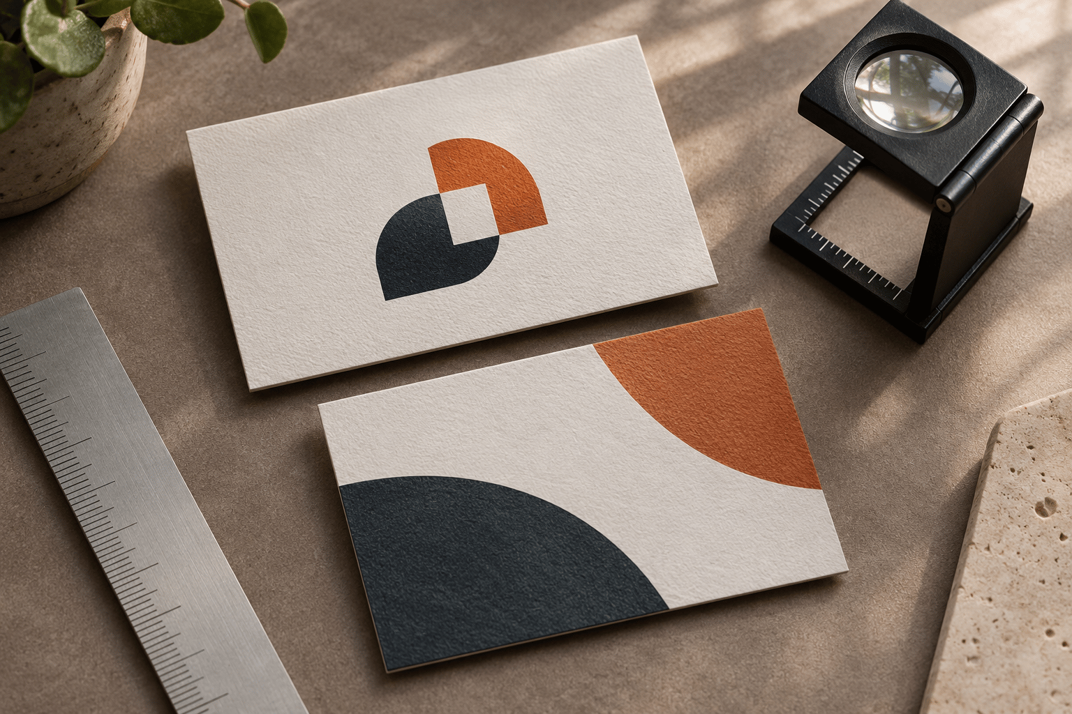
A logo can look balanced on a large screen and still feel wrong on a business card. At physical size, thin strokes may fade, small type may lose clarity, and a mark that looked prominent in a mockup may compete with a name, title, phone number, email address, or QR code.
This guide reviews an existing logo in its actual business-card context. The goal is to identify the smallest responsible change—not to redesign an approved identity because one proof feels crowded. A physical proof is useful evidence, but it is not a guarantee for every press, stock, viewing condition, or future run.
Start with the complete card
Record the card and its production conditions
Gather the front and back artwork, approved logo files, intended stock and finish, printer proof, card size and orientation, logo variant and colorway, clear space, bleed and trim, and all nearby contact content. Note the lighting and distance in which someone normally reads the card.
Keep the source file and physical proof together. A digital mockup shows composition, but it cannot reveal whether a fine line survives on textured stock or whether a QR code remains usable after final size and finish. For shared language around clarity, contrast, scalability, and application fit, use the Logo Evaluation Criteria.
1. Check the logo at its real physical scale
Begin with the finished card in hand at a normal conversation distance, then inspect closely to diagnose issues. Look for wordmark letters that merge, thin strokes or counters that close, a symbol whose silhouette loses clarity, unexpected whitespace in the placed asset, an unbalanced lockup, or a tagline that is technically present but not practically readable.
There is no universal business-card logo size. The right size depends on detail, clear space, card dimensions, surrounding type, paper, ink, and viewing distance. Use a documented minimum size where one exists, then verify the visible mark on the actual card. Check asset bounds before enlarging it.
2. Review hierarchy with contact information
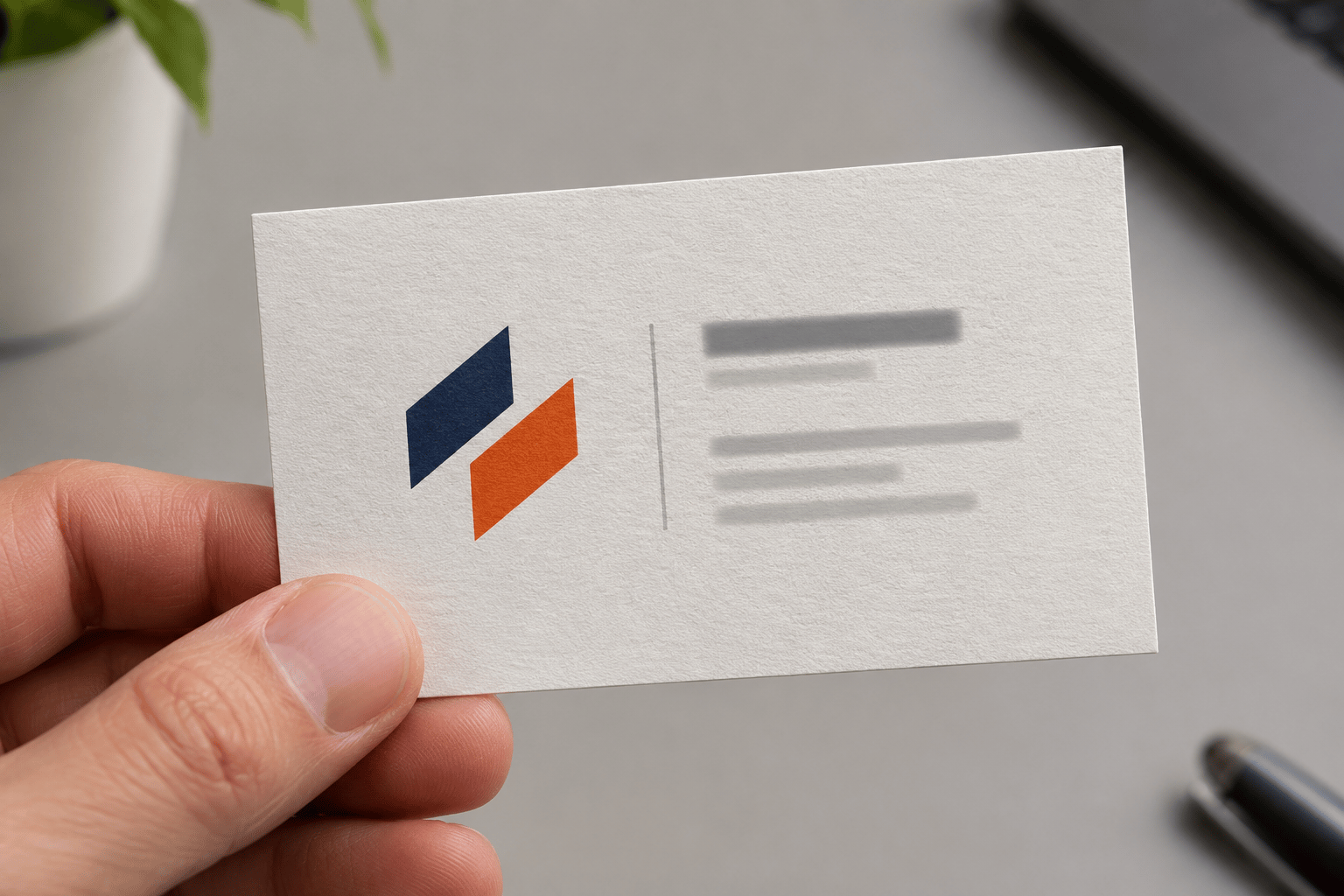
A business card must help someone identify the organization and person, then find the preferred contact action. Ask whether the logo has separation from the name and contact block, whether the most important information is prioritized, whether it aligns with the grid, and whether the hierarchy survives a long name, title, URL, translation, or QR code.
A crowded card is not automatically evidence that the logo is wrong. Too much contact information, an oversized QR code, generous padding, or an unclear type hierarchy may be the cause. Test those relationships before changing the logo artwork.
3. Compare front and back as one identity system
Review both sides together, including the moment when someone turns the card over. Check that each approved variant and colorway is used intentionally, visible sizes feel related, clear space is preserved near edges and treatments, and a reversed logo remains clear on a dark or saturated background.
A symbol-only front and full lockup on the information side may be an intentional system. An accidental crop, unapproved color change, or different wordmark spacing is a different finding. Check the identity rules before calling two treatments inconsistent.
4. Test contrast, ink, and material
Paper absorbs ink, uncoated stock changes fine-detail edges, and dark coverage can alter nearby type. Inspect light and dark treatments, one-color versions, small reversed details, foil or embossing, and the color relationship between logo and contact typography under ordinary indoor lighting.
Do not add a shadow, outline, or glow as a generic fix. First check the approved colorway, background, stock, ink coverage, and spacing. Classify a difference as an asset, color-management, print-process, material, or layout issue so the right owner acts next.
5. Separate logo problems from card problems
Record the side, approximate logo size, stock and finish, lighting, nearby content, visible failure, and proposed next step. Classify findings as an asset issue, identity-system issue, layout issue, production issue, or content issue. Photograph the physical proof when the issue cannot be reproduced from the source file.
For an illustrative example, a strong horizontal mark can remain clear on the front while the back feels crowded beside a long title, two phone numbers, a URL, and a QR code. That points to hierarchy and content testing—not a claim that the logo failed or that a redesign will produce business results. Compare this method with the Restaurant Logo Review example.
A practical approval checklist
- The approved variant, proportions, and colorway are used.
- The visible mark remains clear at actual physical size.
- Asset bounds do not add unexpected whitespace.
- Logo, name, title, contact block, and QR code have intentional hierarchy.
- Front and back form one identity system.
- Contrast, stock, ink, finish, and reversed treatments have been reviewed.
- Each issue is classified and its next step recorded.
The Logo Review Tool can organize a structured first pass across clarity, contrast, accessibility, scalability, versatility, and application fit. It does not replace a physical proof, printer checks, QR testing, or final artwork approval. Related reading: inspect a logo before printing, review a logo on real packaging, and prepare a logo handoff package.
Business card logo review FAQ
How large should a logo be on a business card?
There is no universal size that works for every logo or card. Choose a size that preserves the mark’s clarity and hierarchy alongside the name, contact details, clear space, card stock, and intended viewing distance. Use any documented brand minimum as a starting point, then verify the visible mark on a physical proof.
Should the logo be on both sides of a business card?
Not always. A logo can appear on one side, both sides, or in different approved variants when the identity system and card hierarchy support that choice. Review the front and back together, and avoid repeating or cropping the mark simply to fill space.
Why does my logo look different when printed?
Paper, ink, finish, color management, and print method can change perceived color, edge sharpness, and fine-detail visibility. Compare the physical proof with the source artwork and classify the issue before changing the logo.
Should a QR code be larger than the logo on a business card?
Not by default. The QR code needs enough space and contrast to be tested on the finished card, while the logo needs a clear role in the hierarchy. Size both according to their purposes, then review whether the brand and contact action can be found without one overwhelming the other.
Can a business card logo review prove that the card will generate more business?
No. A visual review can identify scale, hierarchy, contrast, and production concerns in a specific card design. It cannot establish networking, sales, recognition, or conversion outcomes. Treat the review as a quality and consistency check.