Logo Review Guide
How to Review a Logo on Real Packaging
Learn how to review an existing logo on real packaging for hierarchy, legibility, contrast, scale, and reliable reproduction before you approve production artwork.
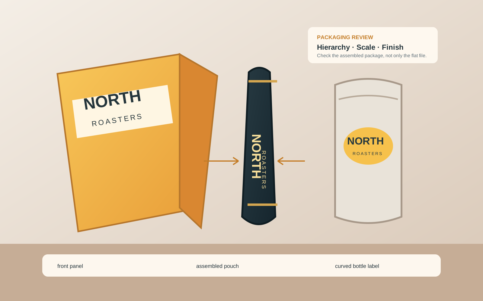
A logo that looks balanced on a blank artboard can become too small, too quiet, or hard to reproduce once it shares a package with product names, claims, ingredients, barcodes, folds, seams, and finishing effects. Reviewing the logo on real packaging before approval helps you find those problems while the artwork can still be changed.
This guide is for owners of an existing logo. The goal is not to redesign the identity from a single mockup. It is to test whether the approved mark has the right visual priority, remains legible at its finished size, and can be reproduced on the actual package material and production process. For a broader vocabulary, start with the Logo Evaluation Criteria, then apply those criteria to the formats and conditions that matter to your product.
Start with the real package
Collect the conditions before judging the logo
Record the package type, finished dimensions, visible front panel, substrate, printing process, number of inks, surface finish, expected viewing distance, and every fold, seam, gusset, corner, cap, or closure that can affect the mark. Also note the product copy, barcode, instructions, and claims that compete for attention.
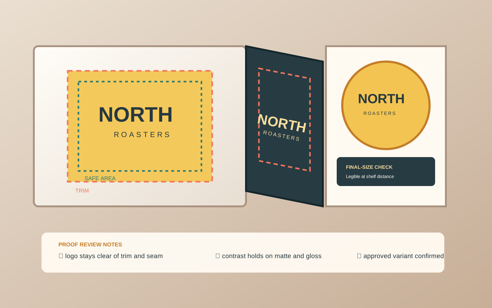
Ask the packaging designer or printer to identify trim, bleed, safe area, folds, and non-printing guides. Never evaluate placement from a flat screen file if the package will be folded, wrapped, filled, or curved.
1. Check the logo’s hierarchy on the front panel
A package has a visual sequence. Someone should be able to tell what the product is, what the brand is, and what makes this item different without the logo competing with every message. Review the front panel at approximately the size and distance a shopper will encounter it.
- Can you find the brand mark quickly without making it the largest element by default?
- Is the product name clear enough to identify the item?
- Does the logo have separation from claims, illustrations, patterns, and other type?
- Does a smaller approved variant preserve the recognizable core?
- Does the mark still feel like the same identity beside the rest of the product line?
Do not solve weak hierarchy by enlarging the logo automatically. First identify whether the problem is size, placement, contrast, surrounding content, or an unclear relationship between brand and product information.
2. Test legibility at the finished size
Zoomed-in artwork hides problems. Export or preview the package at its finished dimensions, then inspect the logo at a realistic viewing distance. If the package is small, print a scale mockup or use a physical blank structure.
- Small wordmark text becoming difficult to read.
- Counters closing in letters or symbols.
- Thin strokes fading against the material.
- Tight spacing between the logo and nearby copy.
- A lockup becoming muddy or landing under a fold, curve, seam, or closure.
Test the primary logo and every approved compact, stacked, reversed, or one-color treatment separately. Do not invent a new variant during production review and label it approved without a design decision.
3. Inspect contrast against the actual surface
Contrast is a relationship between the logo and its background, not a property you can judge from the logo file alone. A light mark on dark reflective film may lose separation, while a dark mark on uncoated or textured stock may spread or soften.
Review the intended color, image, pattern, and finish. Check both the outer edge and internal relationships between symbol, wordmark, and small text. Inspect a one-color treatment if the package process restricts inks.
Avoid using a glow, drop shadow, or outline as a universal fix. If the background is busy, consider a calmer placement area, an approved colorway, or a deliberate container shape. Confirm color conversion and spot-color requirements with the printer.
4. Review placement, clear space, and package geometry
Required clear space should come from the brand system or an approved decision, not from a convenient guess after the layout is crowded. Check the mark against trim and bleed, folds and seams, closures, labels, product copy, illustrations, barcodes, label edges, and panel transitions.
A logo crossing a fold may be intentional, but test it on the assembled package. On a pouch or bottle, flat artwork cannot represent how the viewer sees the mark after filling, sealing, or wrapping. Ask for a structural mockup or physical sample when geometry affects recognition.
5. Check reproduction, not just appearance
Confirm the production method, supported file format, color workflow, minimum line or type guidance, and whether a proof is available. Review the approved logo file, vector suitability, effective resolution for raster elements, linked assets, fonts, transparency, overprint, trapping, clipping masks, and any foil, embossing, varnish, or finishing layers.
A vector logo can scale cleanly while fine details remain too delicate for a process. Enlarging a small raster does not restore missing detail. Ask the packaging supplier which limits apply to this job rather than importing a generic threshold.
6. Use a proof that answers the right question
A screen proof helps review hierarchy and placement. A scale print or structural mockup helps review size and geometry. A color-managed proof helps with color evaluation, while a production sample reveals material, finish, and process effects that a screen cannot represent.
- Inspect the assembled package from front, side, shelf, and handling views.
- Compare the logo at finished size, not only in a large detail view.
- Record the package version, supplier or process assumptions, logo variant, and unresolved limitations.
- Repeat the relevant review if material, finish, supplier, or process changes.
For a structured first pass on the existing mark, use the Logo Review Tool. It is a review aid—not a printer specification, physical proof, or automatic packaging approval. For preflight details, see How to Inspect a Logo Before Sending It to Print.
Packaging logo approval checklist
- The current approved logo and variant are used.
- Structure, finished size, substrate, process, and finish are documented.
- Hierarchy, finished-size legibility, contrast, clear space, trim, folds, and safe areas are checked.
- Color, file, and finishing requirements are confirmed with the production partner.
- A suitable scale, structural, color, or production proof has been reviewed when risk warrants it.
- The approved package version and logo treatment are recorded for production.
For related guidance, read How to Test a Logo Before Launch and What Belongs in a Logo Handoff Package?.
Packaging logo review FAQ
How large should a logo be on packaging?
There is no single correct size for every package. Set the size in relation to the package dimensions, viewing distance, product-information hierarchy, clear-space rules, and the logo’s legibility at the actual production size. Review a scale mockup or proof instead of choosing a percentage of the package by habit.
Should the logo always be the largest element on the front of a package?
No. The logo should have an intentional role in the hierarchy, but the product name or key information may need to lead in some categories. The important test is whether viewers can identify the brand and product without the logo competing with every other element or becoming too small to read.
Can I approve a packaging logo from a digital mockup alone?
A digital mockup can help review layout and hierarchy, but it cannot fully represent material, ink, finish, folds, curves, or production variation. When those conditions matter, review a scale, structural, color, or production proof that answers the specific risk you need to evaluate.
Should I use a simplified logo on small packaging?
Use a simplified, compact, stacked, reversed, or one-color version only when it is an approved part of the logo system or has been separately approved for that application. Test the chosen version at the finished size; do not simplify the mark informally during production and treat the result as the master.
What should I do if the logo is legible on screen but not on the package?
Record the condition that causes the failure: size, background, surface, finish, fold, process, or nearby content. Then test focused options such as moving the logo, using an approved colorway or variant, increasing separation, adjusting surrounding content, or revising the identity system. Confirm the change with the packaging designer and production partner before approval.
A reliable packaging review is not about making a logo larger or exporting more files. It is about matching the approved mark to the real package, testing it at the real size and distance, and recording a production decision that the brand owner and supplier can trust.