



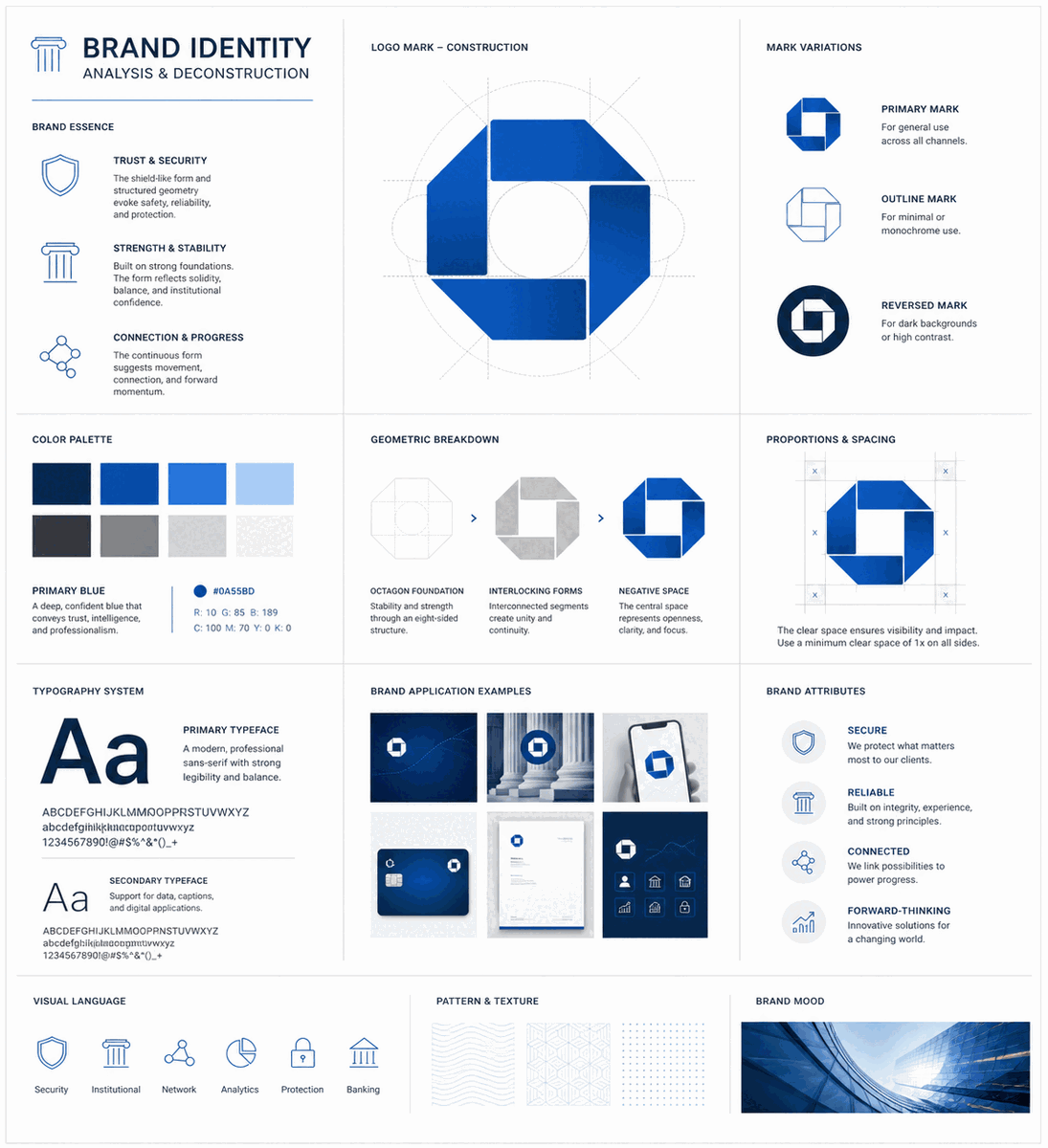

Finance logos must accomplish something difficult: make money feel approachable. Whether it's a traditional bank, a fintech startup, or an investment firm, the visual identity must balance trust and stability with innovation and accessibility.
Traditional finance: heritage and stability
Established financial institutions favor conservative design. Navy blue dominates, symbolizing trust and authority. Serif typography conveys heritage and expertise. Shield and pillar motifs suggest protection and strength. These logos communicate: "Your money is safe with us."
Fintech disruption: friendly and modern
New financial brands—like Robinhood, Stripe, and Venmo—challenge convention with vibrant colors, playful shapes, and approachable typography. Bright greens, purples, and gradients signal innovation while maintaining financial credibility.
Trust signals across all sectors
- Blue: Reliability, professionalism, trust
- Green: Growth, money, prosperity
- Gold: Premium service, wealth management
- Minimal shapes: Clarity and transparency
Typography evolution
While traditional banks use classic serifs, modern financial services embrace custom sans-serif typefaces. The trend is toward cleaner, more readable designs that work seamlessly across mobile apps and digital platforms.
The humanization trend
Finance logos increasingly incorporate human elements—faces, hands, community symbols—to counter the industry's cold, impersonal reputation. Friendly illustrations and warm color accents make financial services feel more accessible.
Scalability and adaptability
Finance logos appear everywhere—from ATM screens to business cards to app icons. Versatility across formats is essential.
Traditional finance: heritage and stability
Established financial institutions favor conservative design. Navy blue dominates, symbolizing trust and authority. Serif typography conveys heritage and expertise. Shield and pillar motifs suggest protection and strength. These logos communicate: "Your money is safe with us."
Fintech disruption: friendly and modern
New financial brands—like Robinhood, Stripe, and Venmo—challenge convention with vibrant colors, playful shapes, and approachable typography. Bright greens, purples, and gradients signal innovation while maintaining financial credibility.
Trust signals across all sectors
- Blue: Reliability, professionalism, trust
- Green: Growth, money, prosperity
- Gold: Premium service, wealth management
- Minimal shapes: Clarity and transparency
Typography evolution
While traditional banks use classic serifs, modern financial services embrace custom sans-serif typefaces. The trend is toward cleaner, more readable designs that work seamlessly across mobile apps and digital platforms.
The humanization trend
Finance logos increasingly incorporate human elements—faces, hands, community symbols—to counter the industry's cold, impersonal reputation. Friendly illustrations and warm color accents make financial services feel more accessible.
Scalability and adaptability
Finance logos appear everywhere—from ATM screens to business cards to app icons. Versatility across formats is essential.