01 · Design Philosophy
Abstraction as Institutional Courage
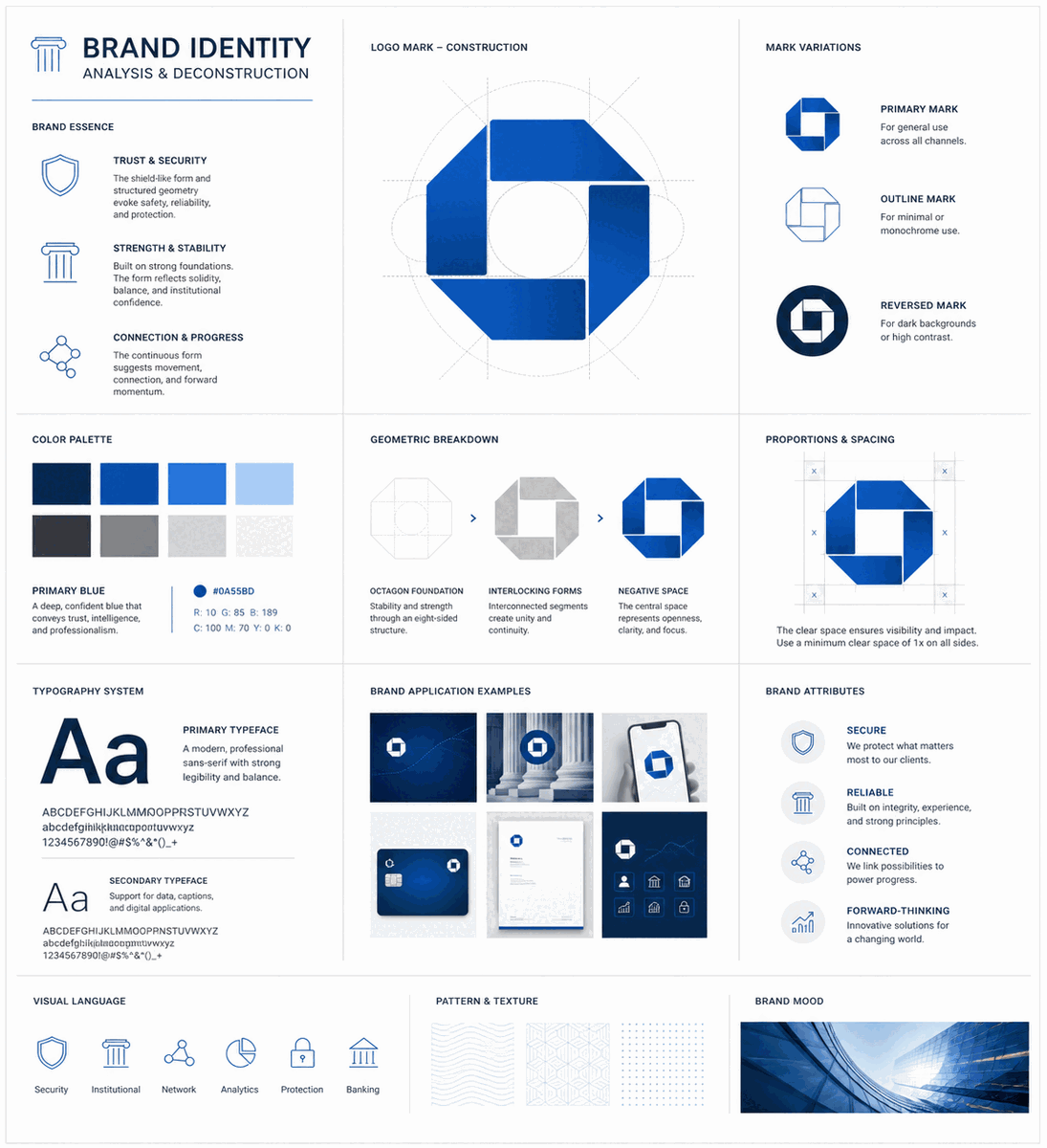
The Chase octagon is not a logo that depicts anything. There are no keys, no columns, no coins, no eagles — none of the visual shorthand that banks had relied on for centuries to signal financial authority. Instead, four trapezoidal shapes arrange themselves around a central white square, forming an octagon that communicates through geometry alone. This was a radical proposition in 1961, when Tom Geismar of Chermayeff & Geismar presented it to the Chase Manhattan Bank board.
The board resisted. Two of the three top executives opposed the very idea of an abstract symbol, arguing that customers needed literal imagery to understand they were looking at a bank. The debate lasted months. Yet within weeks of adoption, those same executives were wearing the octagon on cufflinks and tie tacks. The mark worked precisely because it did not try to illustrate banking — it embodied the qualities banking requires: structure, stability, balance, and permanence.
The octagon's four interlocking parts represent the bank's interconnected divisions operating within a unified system. The negative space at the center — the white square — reinforces openness and transparency, qualities that financial institutions increasingly need to project. The geometry suggests motion contained within structure: value always flowing, always controlled.
Logo Type
Abstract Symbol
Four-quadrant octagon, one of the first abstract bank logos
Created
1961 — Chermayeff & Geismar
Designed by Tom Geismar; unchanged for 60+ years, surviving every corporate merger.
Chase Blue
#117ACA
Trust, stability, security, universal reliability
Negative Space White
#FFFFFF
Transparency, clarity, structural openness
Wordmark Black
#000000
Grounding, authority, visual hierarchy anchor
02 · Color Psychology
Chase Blue and the Architecture of Trust
Chase Blue — hex #117ACA, approximately Pantone 285 C — is not a color chosen by accident. In color psychology research, blue consistently ranks as the most universally trusted color, evoking stability, security, and reliability. These associations are rooted in the natural world: the sky and the ocean, vast and permanent elements that have represented constancy throughout human history.
The original 1961 octagon was multicolored, with the four quadrants rendered in black, brown, green, and blue. This early palette symbolized diversity and organizational complexity. Over time, the mark was simplified to a monochrome blue version, a decision that sharpened recognition and aligned with the brand's evolving positioning as a unified, modern financial institution.
White plays an equally deliberate role. The negative space within the octagon — the central square and the gaps between trapezoids — creates visual clarity and communicates transparency. On a practical level, this white architecture ensures the mark remains legible at every scale, from a 16-pixel app icon to a branch facade.
03 · Typography
From Serif Heritage to Sans-Serif Clarity
The Chase wordmark has undergone a deliberate evolution from ornate serif lettering to a clean, custom sans-serif typeface. Early incarnations used serif typography to convey tradition and institutional authority. As the brand modernized, the shift to sans-serif signaled accessibility, efficiency, and a break from the insular culture of traditional banking.
Pre-1961
Ornate Serif Heritage
Early incarnations of the bank's identity used serif typography to convey tradition and institutional authority — the visual language of 19th-century banking. Text-heavy compositions dominated.
1961–2000s
Transition to Sans-Serif
As the brand modernized, the shift to sans-serif signaled accessibility, efficiency, and a break from the insular culture of traditional banking. The wordmark was periodically updated alongside the enduring octagon.
2005–Present
Custom Sans-Serif Wordmark
The current wordmark uses a proprietary sans-serif typeface, slightly condensed and built for legibility at both small and large scales. Letterforms are geometric but retain subtle warmth, preventing the mark from feeling cold or mechanical.
04 · Historical Evolution
From Water Pipes to Global Banking
From a 1799 water supply company to the largest bank in the United States — the Chase identity carries over two centuries of institutional history. The octagonal emblem, inspired by the cross-section of Manhattan's original wooden water pipes, transforms an arbitrary shape into institutional memory.
1799–1877
The Manhattan Company was founded in 1799 as a water supply enterprise for New York City. The wooden water pipes it laid under Manhattan streets would later inspire the octagonal form — their cross-section is an octagon.
1877–1955
Chase National Bank established in 1877, named after Salmon P. Chase, Secretary of the Treasury under Lincoln. Early logos were text-heavy compositions with ornate serif typography, conventional for the era.
1955–1961
Merger of Chase National Bank and The Bank of the Manhattan Company created Chase Manhattan Bank. The interim logo featured a square frame with a globe and the phrase "World-Wide Banking," signaling international ambition through literal imagery.
1961–2005
Chermayeff & Geismar introduced the octagonal emblem — one of the first abstract corporate logos in American banking history. The four-quadrant octagon replaced all previous imagery. The multicolor version gave way to monochrome blue.
2005–Present
Following the merger of JPMorgan Chase and Bank One, the blue octagon was retained essentially unchanged, paired with a refined black sans-serif wordmark. A 44-year-old symbol required no redesign to serve a newly merged megabank.
05 · Design Highlights
Lessons from a 60-Year Identity
Six principles explain why the Chase logo has endured for over six decades without a redesign — lessons that any brand in a trust-sensitive industry should study.
Abstraction Outperforms Literalism
The octagon communicates stability, structure, and unity without depicting a vault, column, or dollar sign. Abstract marks scale better across contexts and resist dating — the octagon looks as contemporary in 2025 as it did in 1961.
Negative Space as Design Tool
The white center of the Chase octagon actively communicates transparency and openness. What you leave out can carry as much meaning as what you put in — a lesson in restraint that few brands execute this successfully.
Survives Corporate Transformation
The octagon has outlasted multiple mergers, name changes, and restructurings without losing recognition. When JPMorgan Chase and Bank One merged in 2004, the visual system required minimal adjustment.
Color Discipline Builds Equity
Chase's consistent use of blue across decades has created an automatic association between the hue and the brand's promise of reliability. The specific shade is distinctive enough to own within the crowded blue financial sector.
No Redesign Is the Best Redesign
In an industry where competitors refresh their logos every decade, Chase's commitment to its 1961 symbol is a competitive advantage. Every year unchanged, it accumulates another layer of brand equity.
Institutional Memory in Form
The octagonal shape traces back to the cross-section of wooden water pipes laid by The Manhattan Company in 1799 — making the logo an institutional memory, not an arbitrary geometric choice.
06 · Symbol Geometry
The Architecture of the Octagon
The Chase octagon is composed of four trapezoidal shapes arranged around a central white square. Each quadrant represents an interconnected division operating within a unified system. The negative space at the center reinforces openness and transparency.
Four Interlocking Quadrants
Each trapezoid represents a bank division — interconnected yet distinct, forming a unified system.
Central Negative Space
The white square at the center communicates transparency and openness — not emptiness, but deliberate clarity.
Octagonal Form
The complete octagon evokes structural stability and references the cross-section of Manhattan's original wooden water pipes from 1799.
Motion Within Structure
The arrangement suggests rotational energy — value always flowing, always controlled within a stable framework.