01 · Design Philosophy
The Geometry of Connection
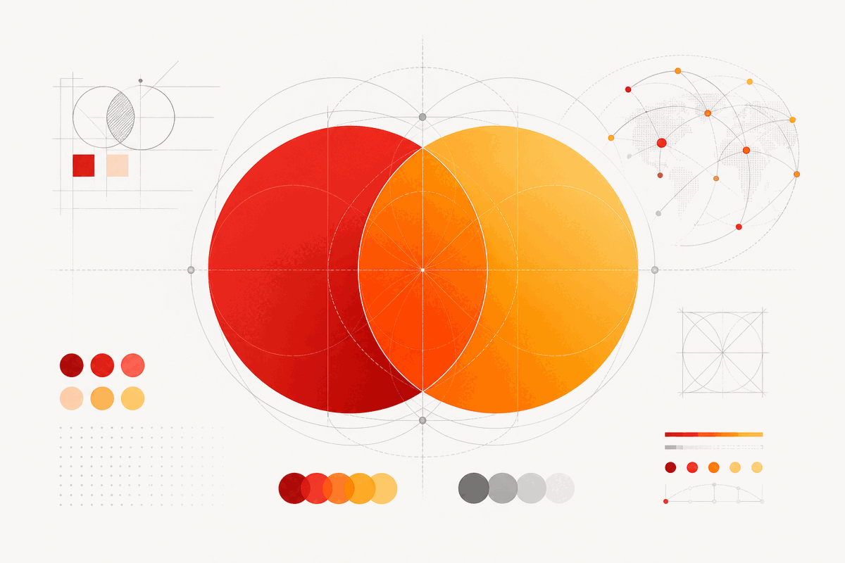
The Mastercard logo is a masterclass in symbolic minimalism. Two overlapping circles—one red, one orange—merge at a shared intersection, creating a visual metaphor for the brand's core promise: connection. Where the circles meet, a third color emerges, representing the space where buyer and seller, bank and merchant, individual and global economy intersect.
When the Interbank Card Association sought a visual identity for its payment network in the late 1960s, it needed a symbol that could communicate partnership without relying on language. The overlapping circles answered with elegant directness—geometric shapes that transcend cultural barriers, a critical requirement for a brand now operating in over 210 countries and territories.
The genius lies in the dual meaning. The circles represent the two parties in every transaction: cardholder and merchant. They also symbolize the broader alliance of member banks. The overlapping area—the visual center of gravity—represents the shared trust that makes commerce possible. No text is needed; the geometry speaks for itself.
Logo Type
Symbol Only
Two overlapping circles, text-free since 2019
Brand Colors
Red · Orange · Blend
A distinctive palette few competitors dare to enter, protected as trademark.
Mastercard Red
#EB001B
Energy, urgency, confidence, authority
Mastercard Orange
#F79E1B
Warmth, optimism, accessibility, invitation
Intersection Blend
#FF5F00
Where two entities connect, something new emerges
02 · Color Psychology
Red Energy Meets Orange Warmth
Mastercard's color palette is one of the most studied in financial branding. The combination of red and orange occupies a distinctive psychological space that few competitors dare to enter.
Red, the primary circle, carries associations of energy, urgency, and confidence. In color psychology, red accelerates heart rate and demands attention—qualities that align with a brand facilitating billions of time-sensitive transactions daily. It also signals authority, reinforcing Mastercard's position as a trusted financial institution.
Orange, the secondary circle, tempers red's intensity with warmth, optimism, and accessibility. Where red demands, orange invites. This balance is strategically significant: a payment brand built solely on red might feel aggressive, while one on orange alone might lack gravitas.
The intersection where these colors blend produces a warmer, deeper tone that visually anchors the composition. This third color, emerging naturally from the overlap, reinforces the partnership message: when two entities connect, something new and valuable is created.
03 · Typography
From ITC Avant Garde to FF Mark
While the overlapping circles have remained the logo's visual anchor, the accompanying wordmark has undergone several transformations, each reflecting the design sensibilities of its era—from geometric sans-serifs to the ultimate decision to remove text entirely.
1979
ITC Avant Garde Bold
Geometric sans-serif with rounded letterforms complementing the circular emblem. Conveyed modernity and confidence as the brand expanded globally.
1990s
Italicized Wordmark
Italic emphasis on speed and forward motion—a visual nod to accelerating electronic payments. Horizontal color bars added to the intersection area.
2016
FF Mark (Pentagram)
Clean, geometric, lowercase 'mastercard' aligned with fintech trends. Lowercase signaled approachability and digital-native sensibility. Inspired by 1920s geometric sans-serifs like Futura.
2019
Text-Free Symbol
Wordmark removed entirely. Research showed 80%+ recognition without text. The ultimate expression of brand confidence—a symbol embedded in global consciousness.
04 · Historical Evolution
Six Decades of Strategic Refinement
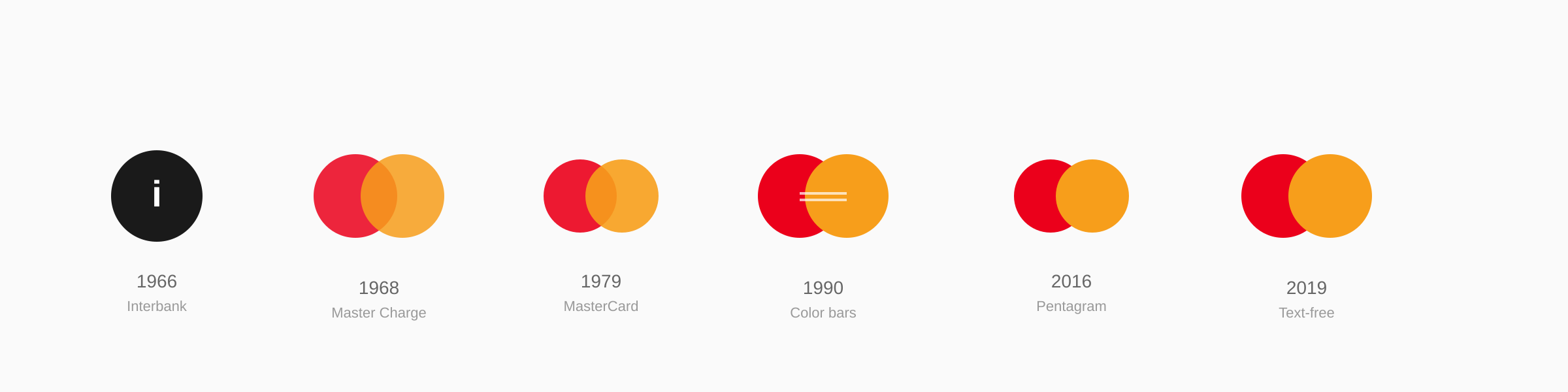
From a bold lowercase "i" inside a black circle to a text-free symbol recognized by billions—the Mastercard logo's evolution spans six eras of strategic refinement, each building on rather than replacing what came before.
1966–1968
The Interbank Card Association formed by seventeen bankers in Buffalo, NY. The original logo featured a bold lowercase 'i' inside a black circle—a functional identifier lacking emotional resonance.
1968–1979
Master Charge name and iconic overlapping circles introduced. Red and orange circles with white lettering symbolized the connection between merchants and customers.
1979–1990
Brand shortened to 'MasterCard' set in ITC Avant Garde Bold. The overlapping circles remained with a more modern, sophisticated wordmark.
1990–1996
Palette shifted to brighter tones. Intersection gained horizontal color bars suggesting motion, paired with italicized wordmark reflecting digital payment energy.
1996–2016
Colors deepened, stripes simplified, subtle shadow added. 2006 variant introduced 'MasterCard Worldwide' with transparent circle signaling international reach.
2016–Present
Pentagram stripped the logo to essentials. Horizontal bars disappeared, circles returned to flat clean design. Lowercase 'mastercard' in FF Mark. 2019: wordmark removed entirely.
05 · Design Highlights
Recognition Beyond Language
Six principles explain why the Mastercard logo became one of the world's most recognized brand symbols. These factors created an identity that transcends language, culture, and context.
Geometric Simplicity Scales
The two-circle motif works equally well on a credit card, a mobile app icon, a stadium banner, and a favicon. Few logos maintain integrity across such an extreme range of sizes and contexts.
Color as Trademark
Mastercard's red-and-orange combination is so distinctive that consumers identify the brand by color alone. In 2021, the EU granted trademark protection for the specific color combination—a rare legal recognition.
Evolution Without Revolution
Unlike brands that abandon their visual heritage, Mastercard has never discarded the overlapping circles. Every redesign refined rather than replaced the core symbol, compounding five decades of brand equity.
Text-Free Recognition
The 2019 decision to drop the wordmark was not a gamble—it was an earned graduation. Research showed over 80% of consumers recognized the symbol without the name. Words were no longer necessary.
Cross-Cultural Geometry
Circles transcend cultural barriers—a critical requirement for a brand operating in 210+ countries. No text means no translation needed. The geometry speaks every language.
Digital-First Optimization
The 2016 Pentagram redesign specifically optimized the symbol for digital environments, where small screens and low resolutions punish complex logos. The flat design echoes the 1968 original while looking forward.
06 · Application System
One Symbol, Infinite Contexts
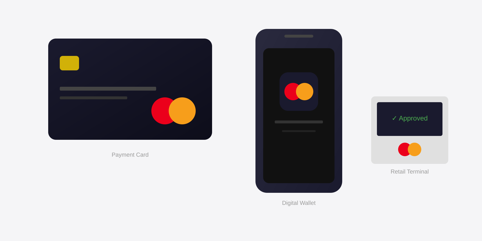
The Mastercard symbol performs across payment cards, digital wallet interfaces, retail terminals, mobile payment contexts, and stadium sponsorships—maintaining instant recognition whether displayed on a physical credit card or a miniature favicon.