01 · Design Philosophy
Connection at the Core of Digital Trust
The PayPal logo is built on a deceptively simple premise: in digital payments, trust is everything. When users send money across the internet, they need visual reassurance that their transaction is safe. The PayPal identity delivers this reassurance not through complex imagery or decorative elements, but through clarity, color, and a monogram that speaks to human connection.
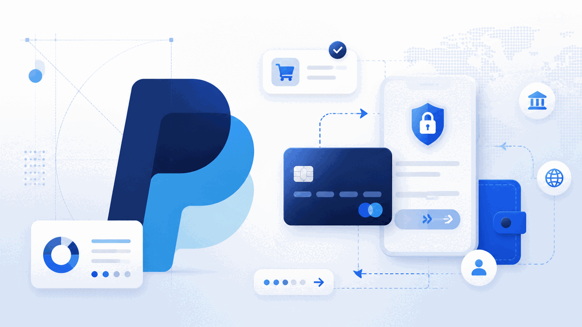
The centerpiece of the current identity is the overlapping double-P monogram, introduced in 2014 by designer Yves Behar and his team at Fuseproject. Two letter Ps overlap with a transparency effect, creating a third tone where they intersect. This is not an arbitrary design choice. The overlapping forms represent the fundamental act that PayPal enables: one person sending money to another. The transparency where the Ps meet symbolizes openness and the seamless flow of funds between parties.
The monogram was designed to function independently as an app icon and checkout button, a critical requirement as mobile payments overtook desktop. The wordmark and monogram form a flexible system: together they represent the full brand, while the monogram alone carries instant recognition on a smartphone screen or checkout button.
Logo Type
Monogram + Wordmark
Overlapping double-P with transparent intersection
Signature Element
Overlapping Ps with transparency
Two letter Ps overlap to create a third tone — representing connection between sender and receiver.
Brand Colors
Pay Blue · Pal Blue · Overlap
Pay Blue
#0070BA
Established authority, institutional stability
Pal Blue
#00A8E1
Energy, modernity, approachability
Overlap Blue
#80BCE6
Transparency, connection, openness
White
#FFFFFF
Clarity, negative space, trust
02 · Color Psychology
Blue as the Language of Security
PayPal's choice of blue is neither accidental nor merely aesthetic. In color psychology, blue is the most universally trusted color, evoking stability, security, and reliability. These associations are deeply rooted in human perception. Blue is the color of the sky and the ocean, vast and constant elements that have represented permanence throughout human history. For a company handling financial transactions, blue communicates exactly what users need to feel before entering their credit card details: this is safe.
The 2014 redesign introduced a two-tone blue system that added nuance to this strategy. Pay Blue, a deep indigo (#0070BA), conveys professional authority and institutional stability. Pal Blue, a brighter shade (#00A8E1), brings energy and modernity. The contrast creates visual dynamism while remaining within a single color family.
The transparency effect where the two blues overlap creates a third, lighter tone (#80BCE6). This deliberate design decision reinforces the brand's core message of connection. Where two parties meet, something new emerges. The layered tones also solved a practical problem: the logo needed to work across diverse backgrounds, from white checkout pages to dark dashboards.
03 · Typography
Sans-Serif Modernity and the Forward Lean
The PayPal wordmark has consistently used sans-serif typography since its inception, a choice that aligns with the brand's identity as a technology company rather than a traditional financial institution. While banks historically relied on serif typefaces to convey heritage and authority, PayPal needed to communicate innovation and accessibility.
Italic Posture (2000–2024)
For 24 years, the wordmark maintained an italic posture. Italic type conveys forward motion, speed, and progressivism. For a payment platform, forward motion is both literal (money moving from one account to another) and metaphorical (the company pushing the boundaries of financial technology).
Modified Futura (2014)
The 2014 version, set in a modified Futura typeface with softened edges, struck a careful balance. Futura is a geometric sans-serif known for clean circles and even strokes, projecting mathematical precision. Fuseproject softened the letterforms to add warmth.
PayPal Pro (2024)
The 2024 refresh by Pentagram removed the italic in favor of an upright wordmark in custom PayPal Pro typeface, with the wordmark color shifting to black. This reflects PayPal's evolution from payment processing to a broader financial ecosystem.
Geometric Precision + Human Warmth
This tension between geometric precision and human warmth mirrors PayPal's position: technologically sophisticated, yet designed for everyday people. The closest open-source cousin is Inter — the same modern, neutral, highly legible temperament.
Primary Font (2014–2024)
Modified Futura
Current Font (2024–Present)
PayPal Pro
Open-source Alternative
Inter
Sample · Italic wordmark in PayPal blue
PayPal
Aa Bb Cc 0123456789
04 · Historical Evolution
From Confinity to Global Standard
PayPal's visual identity has evolved through five major phases over 25 years, from its origins as a security software company to its current position as a comprehensive digital financial services platform. Each iteration preserved core elements while refining the visual language for new eras.
1999–2000
Confinity Era — The first logo was a circular emblem with two mirrored Ps, one inverted, with a motion blur effect. White letters with navy blue borders established the blue-and-white palette that would persist for over two decades.
2000–2007
X.com Merger & eBay Era — After merging with Elon Musk's X.com, the wordmark featured white letterforms with thick blue outlines in italic sans-serif. eBay acquired PayPal in 2002 for $1.5 billion, making this logo synonymous with online auction payments.
2007–2014
Dual-Tone Refinement — The logo shifted to solid blue letterforms in two tones. The typeface became cleaner with improved legibility. A minor 2012 update rounded the letterforms as PayPal prepared for mobile-first experiences.
2014–2024
Fuseproject Revolution — The most significant redesign in PayPal's history. Yves Behar and Fuseproject introduced the overlapping double-P monogram alongside a refined italic wordmark in modified Futura. Two new blues replaced the previous palette.
2024–Present
Pentagram Refresh — Pentagram, led by Andrea Trabucco-Campos, sharpened the monogram's geometry and introduced an upright wordmark in custom PayPal Pro typeface. The wordmark shifted to black while the monogram retained blue.
05 · Design Highlights
Lessons from a Trust-First Identity
The PayPal logo demonstrates several principles valuable for brands in trust-sensitive industries. These lessons extend far beyond digital payments into any sector where credibility and approachability must coexist.
Color-Conditioned Trust
PayPal's consistent use of blue across 25 years has built an automatic association between the color and the brand's promise of security. When users see PayPal blue on a checkout page, they feel reassurance before they consciously process the brand name.
Symbols Encode Values
The overlapping Ps do not depict money or arrows. They represent connection through abstraction. The transparency effect communicates openness without spelling it out — an approach that scales better than literal imagery.
Multi-Scale Modularity
The monogram functions as a 16-pixel app icon, a checkout button, and corporate signage. This modularity is essential for any brand touching users across devices and environments.
Evolution Respects Equity
Each iteration preserved core elements: the blue palette, the sans-serif typography, and the wordmark itself. Users never had to relearn which brand the logo represents, even as the 2024 shift to black marked the most dramatic departure.
Approachability Meets Authority
The softened letterforms and connection-focused monogram make the brand feel accessible. Simultaneously, the disciplined color palette and geometric precision project institutional credibility — a masterclass in holding both.
Transparency as Metaphor
Where the two blues overlap, a third lighter tone emerges. This deliberate design decision reinforces the brand's core message: where two parties meet, something new emerges — the seamless flow of funds between people.
06 · Design Lesson
Balancing Approachability with Authority
For designers, the PayPal identity shows how a fintech brand can balance approachability with authority. The softened letterforms and connection-focused monogram make the brand feel accessible. Simultaneously, the disciplined color palette and geometric precision project institutional credibility. For brands navigating the tension between consumer friendliness and professional trust, PayPal offers a masterclass in holding both.
The PayPal story also demonstrates that color choice is never just aesthetic. A consistent use of blue across 25 years has built an automatic association between the color and the brand's promise of security — a form of color-conditioned trust that takes decades to build and should not be abandoned lightly.