01 · Design Philosophy
The Power of Color Over Symbol
The Nivea logo represents one of the most successful cases of brand identity built primarily on color rather than complex symbolism. Unlike competitors who rely on elaborate monograms, decorative scripts, or pictorial icons, Nivea's visual identity centers on a simple wordmark enclosed in a deep blue circle—a design choice that has remained remarkably consistent for nearly a century.
The circular form itself carries significant meaning. In brand psychology, circles suggest completeness, protection, and wholeness—qualities that align perfectly with a skincare brand promising comprehensive care. The shape feels approachable and inclusive, avoiding the sharp edges or aggressive geometry that might feel clinical or cold in a personal care context.
This philosophy reflects Nivea's founding vision. Dr. Oscar Troplowitz, who acquired Paul C. Beiersdorf's Hamburg laboratory in 1890, believed in creating high-quality products accessible to everyone. The logo's simplicity mirrors that democratic approach. A complicated emblem might suggest luxury or prestige, but a clean wordmark in a friendly circle communicates availability and trust. The design says "this is for you" rather than "this is exclusive."
Logo Type
Circular Wordmark
Blue Circle Identity (1925)
Brand Colors
Blue · White
A restrained two-color palette that proves disciplined simplicity outperforms elaborate schemes.
Nivea Blue
#004A99
Trust, reliability, calmness
White
#FFFFFF
Purity, clarity, contrast
Bright Blue
#0066CC
2021 update - more contemporary
02 · Color Psychology
Why Blue and White Built a Global Brand
The Nivea color palette—deep blue paired with white—was not arbitrary. In 1925, when the first blue tin appeared, the brand made a strategic decision that would define its identity for the next century. Blue, in color psychology, communicates trust, reliability, calmness, and professionalism. These associations are particularly powerful in healthcare, wellness, and personal care categories where consumers seek safety and expertise.
The choice becomes even more meaningful when considered against Nivea's product nature. The brand's name derives from the Latin "nix, nivis," meaning "snow"—a reference to the cream's pure white appearance. Blue and white together evoke imagery of ice, snow, and cleanliness. This visual connection reinforces the brand's core promise: pure, gentle, effective skincare. The palette does not need to explain itself; it communicates purity at a glance.
The 2021 redesign lightened the blue, making it brighter and more contemporary. This adjustment reflects broader design trends toward digital-friendly palettes while maintaining the essential color identity. The update proves that even century-old brands can evolve their visual language without abandoning core recognition elements.
03 · Typography
Sharp Simplicity in Letterform Design
The Nivea wordmark uses a bold sans-serif typeface with distinctive pointed corners at the N, V, and A. This angular detail, introduced in 1935, transforms what might otherwise be a generic sans-serif into something memorable. The sharp corners add character without ornamentation, creating a typeface that feels both modern and slightly technical.
Typography analysis reveals both strengths and quirks in the design. The pointed terminals give the letters visual energy, suggesting precision and clarity—qualities that align with Nivea's scientific heritage. However, some designers have noted inconsistent letter spacing, particularly the wider gap between N and I compared to other character pairs. While technically imperfect, this irregularity has not diminished brand recognition because the overall composition remains clear and the blue circle dominates visual memory.
The typeface evolution tells a story of modernization. Early logos from 1911-1934 used decorative serif fonts with botanical illustrations, positioning the product as a premium, almost medicinal preparation. By 1934-1935, Nivea stripped away ornamentation, adopting the sharp-cornered sans-serif that would define its identity. This shift reflected broader design movements toward modernism and functionality—principles that matched the brand's accessible, practical positioning.
Typeface
Sharp Sans-Serif
Pointed corners at N, V, A (1935)
Characteristics
Bold · Angular · Clean
The distinctive pointed corners create a memorable typeface that communicates precision and clarity.
04 · Historical Evolution
From Botanical Typography to Global Icon
The Nivea logo's history demonstrates evolution through simplification—gradual refinement from ornate beginnings to the iconic blue circle that defines the brand today. This transformation reflects broader design movements and the brand's expansion from a single product to a global skincare empire.
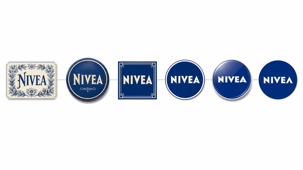
1911-1924
Ornate serif typography with decorative botanical illustrations positioned the cream as a premium, pharmaceutical product.
1925-1934
Blue tin introduction marked a turning point. Simpler sans-serif wordmark within an oval established the iconic blue-and-white color scheme.
1935-1948
Typography refined with characteristic pointed corners that persist today. The logo became more geometric and modern.
1949-2010
Circular logo emerged as standard. Variations included different formats, but core elements remained constant through global expansion.
2011-2020
Yves Behar's fuseproject led comprehensive rebrand for 100th anniversary. Identity standardized across 500+ products.
2021-Present
Current logo introduces brighter, more saturated blue and thinner letterforms, creating a synthesis of heritage and contemporary design.
05 · Design Highlights
Lessons in Brand Consistency
Nivea's logo offers critical lessons for brand designers. These principles created a visual identity that transcends its medium and proves that disciplined simplicity can build one of the world's most recognized brands.
Color Over Symbol
The blue circle is so thoroughly associated with Nivea that the brand could theoretically drop the wordmark entirely in some contexts and remain recognizable. Building this level of color association requires decades of consistent application.
Circular Psychology
The circular form suggests completeness, protection, and wholeness—qualities that align perfectly with a skincare brand promising comprehensive care. The shape feels approachable and inclusive, avoiding clinical coldness.
Scalability Through Simplicity
Nivea's minimalist wordmark works across hundreds of products, dozens of categories, and global markets with different cultural contexts. A more complex logo might have created friction in sub-brand development.
Sharp Typography
The distinctive pointed corners at the N, V, and A transform what might otherwise be a generic sans-serif into something memorable. The sharp corners add character without ornamentation.
Packaging Integration
The logo is inseparable from the blue tin itself. Rather than applying a logo to packaging, Nivea made the packaging part of the logo, creating a physical artifact that reinforces visual memory.
Evolution with Recognition
Each logo update has maintained core elements while adjusting details. This approach allows the brand to stay visually current without requiring consumers to relearn the identity.
06 · Application System
One identity across every customer touchpoint
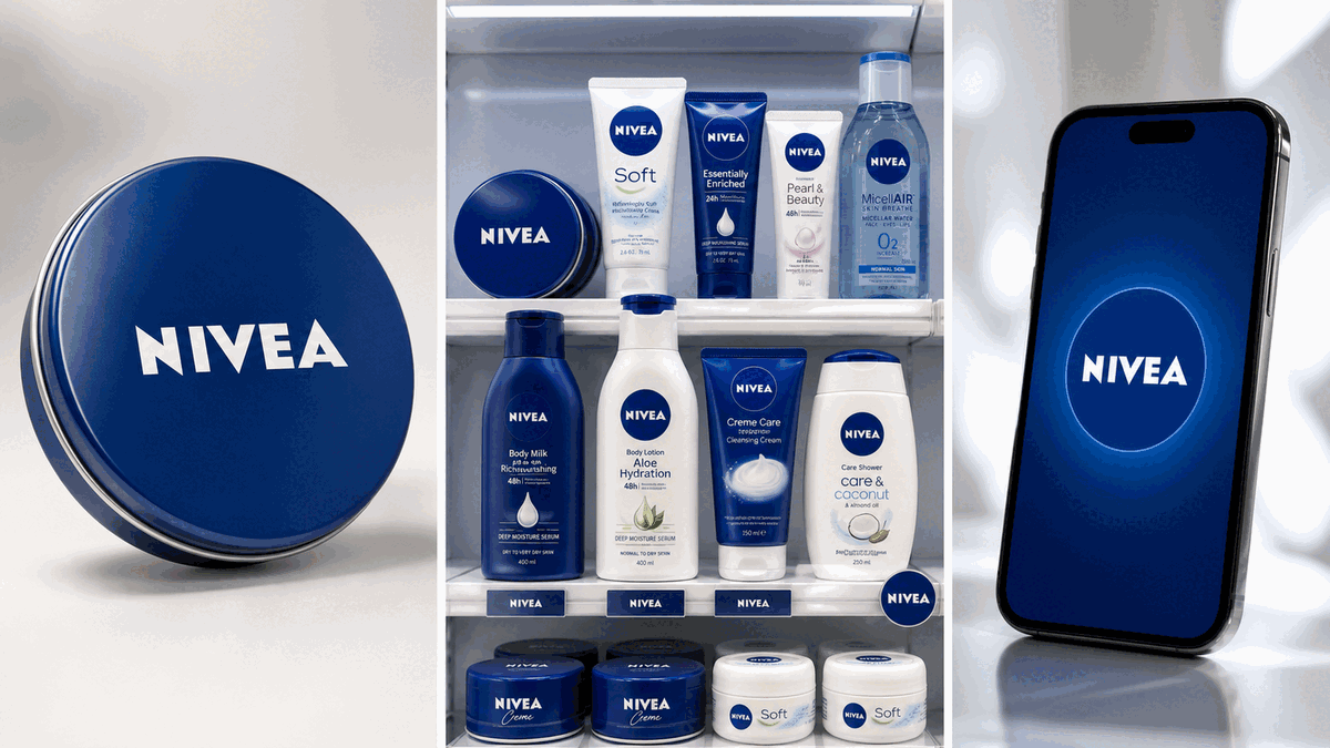
The Nivea logo performs across product packaging, retail environments, digital platforms, and merchandise—maintaining recognition whether printed on the iconic blue tin, displayed on store shelves, or rendered as a mobile app icon. The circular form and blue-white palette create instant recognition at any scale.